This week I’m continuing work on the final render for this character. I like to focus first on the most emotive parts of the figure, and last session I spent some time on the face. It’s not fully finished yet and I’ll be returning to that after a pass on the rest of the character, to give it the final details. This time, I’ll work on his hands and feet.
It’s really not easy to find exactly the hand position and lighting you want, and even more difficult to find that for bare feet (not that there aren’t a lot of foot pictures online, but lots of them are… intended for purposes other than painting reference). For that reason I almost always shoot self reference for hands and feet.
I use a lot of voice shutter selfies for this type of task, and in this case I’ve done just that and then dropped the results right into the file in a Ref folder.
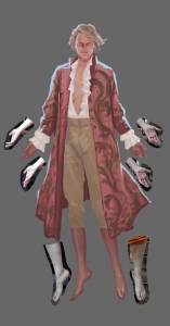
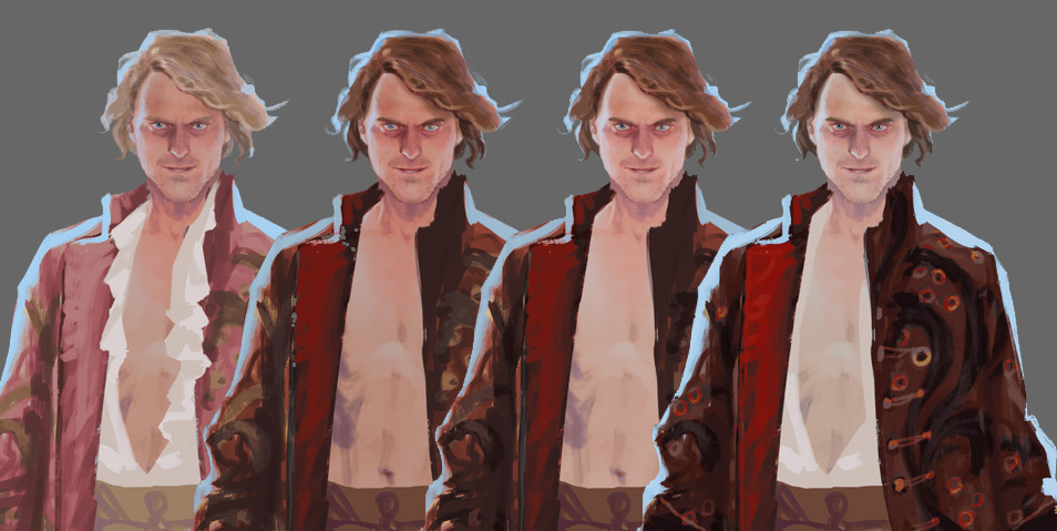
Luckily, I’ve preserved my gradient maps on the banyan layers, so this adjustment is easy!
Here I have double-clicked on the gradient icon on the adjustment layer to open the properties for the main color of the banyan, clicked on the gradient to open the gradient editor, and replaced the dark-to-middle colors. I’m going for a kind of gory-looking dark red.
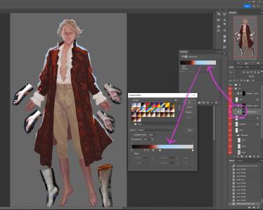
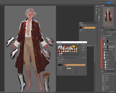
Then a curves adjustment on the Body layer to darken the midtones and increase the amount of red. I can then switch to the head and hair layers each in turn and hit CTRL+SHIFT+M to open the Curves adjustment window with the previous settings already applied, and either accept or adjust more.
I then used Curves and Hue/Saturation to adjust the colors of his breeches… And decided I still want to play with the design more. Here I’ve gotten rid of his shirt, gone darker for his hair, added a new gradient map layer for a lining inside the banyan, changed the colors for the outer fabric again…
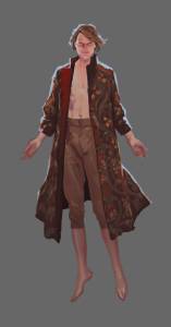

Next time, I’ll paint his hands and feet.






Recent Comments