Unlike a painter, I work primarily in Line to separate shapes, as opposed to value. Unfortunately, lines don’t appear in the natural world that we see, but are an invention used to describe the separation of shapes, values, or produce tones. They must be constructed. Almost akin to the written word, they codify visual information into the symbolic. Also, like the written word, skill and individuality can provide a bit of flair, embellishment, spartan minimalism, supreme lushness, or outright chaos in their execution. To be comprehensive in a commentary on them would be to number the grains of sand on the shore, so here I will only write about some of approaches to linework that I enjoy from a very narrow slice of modern illustration, namely comics, specifically lines made in ink. One mustn’t sermon too distantly outside of the borders of their own expertise, of course.
I always like the classic look of Chic Stone’s slick linework over comics deity Jack Kirby. Chic Stone also has a name that we can all agree is awesome. His work is simultaneously loaded with mass and (heft), but also deftly nimble and full of finesse. Notice the static, rectangular chunk of the outline over the Thing’s rocky flesh, in contrast with the cursive tapers conveying the softness of his trunks. Expertly and minimalistically executed, yet with bold and fatass lines like that, you’re still getting your money’s worth.
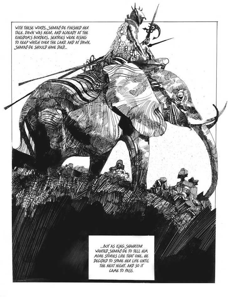
In contrast, sometimes a maximalist approach is in order. Toppi immediately comes to mind- lines on top of lines, waves of lines, each in their own pattern that’s unique to the master. They decorate and embellish, not so much as to follow the form, but effectively creating value and a surplus of interest throughout the image. Thin and sometimes scratchy, and unconcerned with slickness, the lines are rustic. It’s ok to take your time. Keep looking and enjoy. You might catch yourself forgetting these pieces are in boring old black and white.
How about the visceral, blocky, and chunky slashes of this Frank Miller piece? Sometimes the lines connect, sometimes they don’t. There is a rugged, masculine quality to the linework here. The lines are almost chiseled as opposed to pulled. There is a notable heaviness to the lines describing the planes at the top of the figures, suggesting, subtly, that a light from below suspends the figures. Power and immediacy is the goal here. We don’t have time for cursive, winding demarcations here, because Gotham City is waist-deep in filth, and someone has to do something about it.
I love the black silky sexiness that Paul Pope achieves. A rigid piece of architecture gets rendered with the same brush as supple leather pants. Confidence and expression by the velvety truckload. Everything moves, everything lives. When I was a young comics reader, I didn’t immediately understand the skill and mastery Paul employed. I knew it was unique, and effective, but it was a completely different approach than a lot of the very literal linework I was used to at the time. His work has a musical quality, as if the drawing moves through time in a fluid state. Nothing static here, it’s alive.
Almost nobody represents the 90’s style of comic book virtuosity than the marvelous pair of Jim Lee and Scott Williams, pencils and inks respectively. We are talking about precision here, and craftsmanship. Perhaps it’s my age of exposure, but this is what I think of when I think of comic book art. The marks are razor sharp, and usually have a triangular, tapering shape. Sometimes ample and bold, sometimes razor thin, there is a constant dynamic shift in the volume and intensity. Try to pull a line that sharp and lean with a sable brush. It is hard.
How about Moebius. An embarrassment of riches when it came to talent and ability, he changed his line styles quite a few times. He could powerfully impress and explain with understated and decisive clean lines, or he could adorn a piece with virtually infinite marks. Each is effective and I love them the same. The man could describe scale so deftly. He could also turn a form in a way that charms and entertains, never a slave to realism over clarity. The perfect amount of textural ticks and punctuation (I’ve heard either Walt Simonson or Klaus Janson- I can’t remember- call them “activation marks). Virtuosic, and still unmistakably hand drawn.
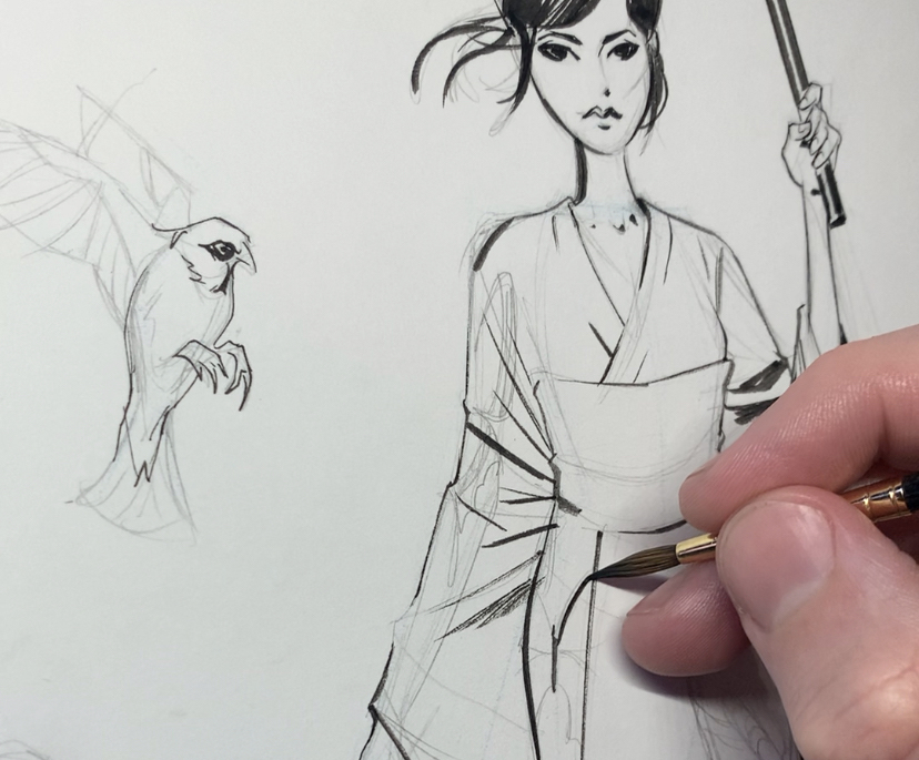
Among this roster of adept masters, I’ll throw my own work up for regard (insert laughing emoji)! I’m doing this not to include myself among such achievements, but to show what emulating some of this work has led me to produce. Jimmy Page called the music of Led Zeppelin “tight, but loose.” That is what I aim for with my drawing style. I do not possess the surgical hands of Scott Williams, or the power and patience of Moebius, but I am learning to embrace my own voice and style of markmaking. I aim for the illusion of precision, but with slashy movements allowing minimal time for wavering.
I left out thousands of impressive voices, maybe you can name some that you like, but my aim was a brief survey to jumpstart you into taking that brush or pen for a spin. Everyone looks great with a brush in their hand.





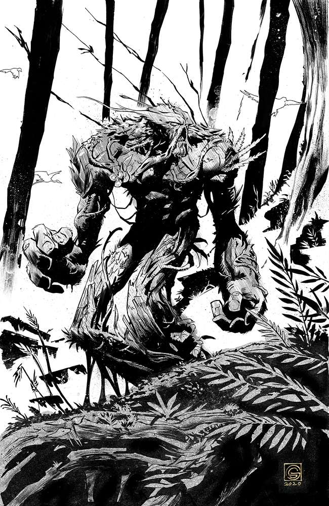

Barry Windsor Smith and Bernie Wrightson!
Yes!
Love the post, Stephen. I add two more from I learned a lot about inking: José Muñoz and Enrique Alcatena.
This thread could go on forever — and that’s far from a complaint.
Toth, Eisner, Kurtzman, Elder, Giordano, Kubert, Heath, Severin, Wildey, Mignola, Gianni, Nelson…
Yeah, I’ve been studying a while.
Shame on me for skipping right over Jack Davis!
I always loved Ernie Chan’s Inking that he did for Conan Magazines, it was a doodlers dream
Alfredo Acala over Buscema (or Acala by himself) or Rudy Nebres over the other Buscema! As a previous poster said this can go on forever. Steve, I don’t know how you were able to limit it to just those guys. You are a much more decisive man than I am. Great article, thank you.
No limits — wanted to save many for others to add — including Alcala!
Jerome Opena’s works on Seven to Eternity has been amazing. The oversized black and white artists proof editions have been such a treat and worth every penny.
Sean Murphy 🙂 I’d read anything that has his art in it 🙂
I LOVE stylied lineart but what always gets me is finding out why the artsits made their choices. With painting I eventually found things like the simple statement, atmospheric perspective, lighting and other fundamentals that are based on reality that they can amp up or downplay for effect. But for lineart I could never find out why they made these beautiful aesthetic choices that for them work but for me just looked wrong. My drawings always feel like their a means to start a painting rather than a finish to be seen by itself. What fundamental were they doing that made their 2 minute sketch a wall hanger while my 1 hour effort still look unfinished? When studying, I could do a pretty good copy, I just couldn’t find the reason for their choices and learned nothing. I couldn’t just look at a still life and do a great inking like I could with an acrylic painting. Are there any resources for not how to make a great line, but why they make their line choices?
Just look at how Moebius did that hair! So many highlights but it still reads so well without being a mess, amazing!.
I always thought that Dark Knight Returns piece was inked by Frank Janson and Miller was the penciller. Am I wrong on that?
Coming around for round two in 2025 – this is still such a delightful post. A wonderful love letter to both a few specific artists and “the line” in general.
Cheers
Great list. There are so many masterful comic creators, no way to list them all. That said Milton Caniff was the foundation for so much brushwork in comics and one that would be at the top of my list, if not the #1 spot. He Influenced countless people like Frazetta, Kirby, Mazzuchelli, Toth, who then inspired countless other creators down the line. And then there is my favorite inker of all time Al Williamson. I have seen a lot of originals in my time but his inking was hands down the cleanest and most elegant I have ever seen. He was a master.