We just lost another of America’s great illustrators, again.
Several years ago, before the pandemic, I’d written about Sandy’s death prematurely. I’d gotten word from a friend that he died. On the same day the post ran, I got a call from Sandy’s grandson, John, that Sandy was alive and well! I was embarrassed, but we celebrated, and planned to all get together, and toast his career and stamina.
The pandemic struck and none of it happened. And as for stamina, Sandy even caught and survived Covid…in his late 90’s. But unfortunately, just last week, Sandy did indeed pass away.
So I’m running this tribute to Sandy and his work again today because you need to know this man’s work. He was an illustrators’ illustrator.
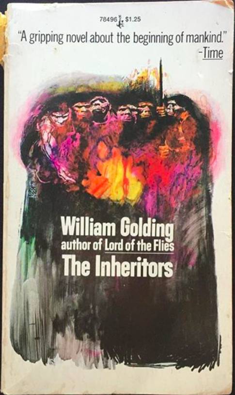
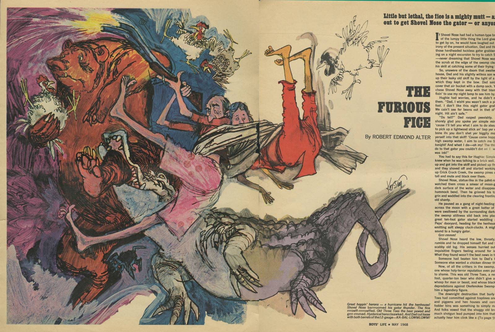
Sanford “Sandy” Kossin was one of the best. You may not remember him because he stopped working professionally some years back, preferring instead to draw from the live model to keep his formidable drawing skills sharp. Selfishly, I never agreed with that. I wanted more and more from him. I wanted to keep running into his work on paperback covers or in Boy’s Life magazine, like I had as a kid.
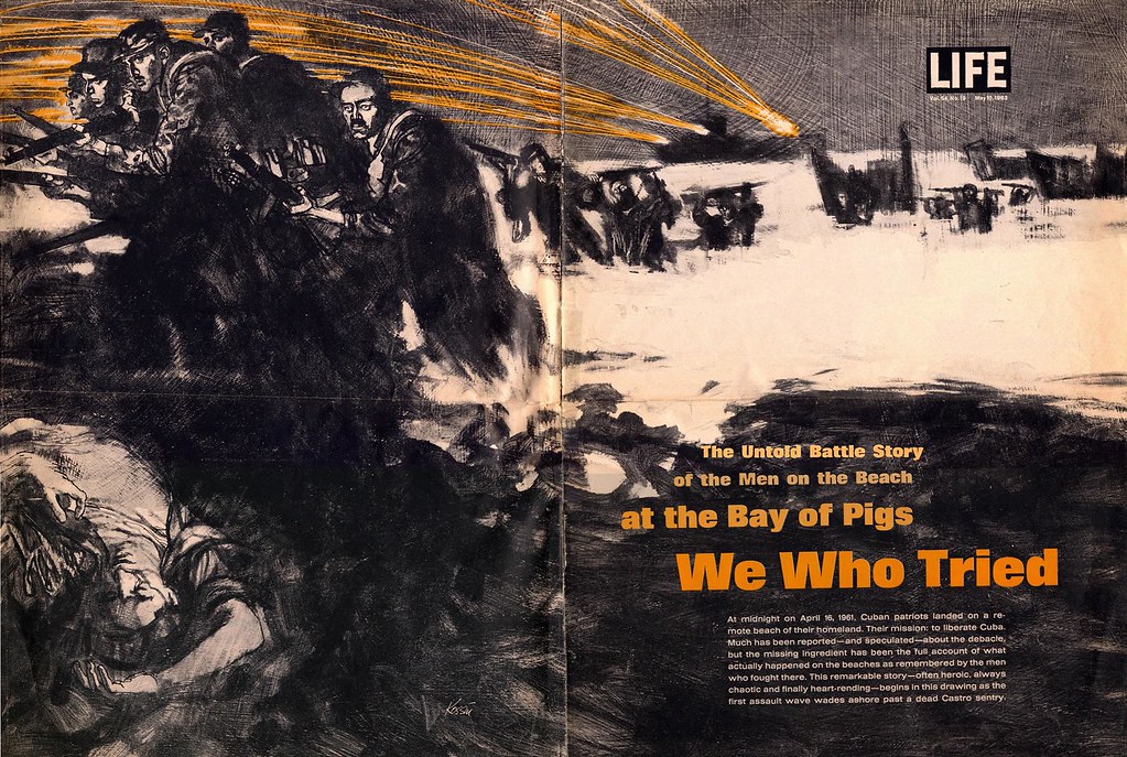
Sandy hit his stride through the 60s and 70s, working for major corporations, major magazines, major movies, and about every major project that appeared over those years. He was hot and in high demand.
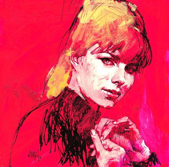
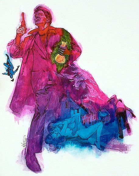
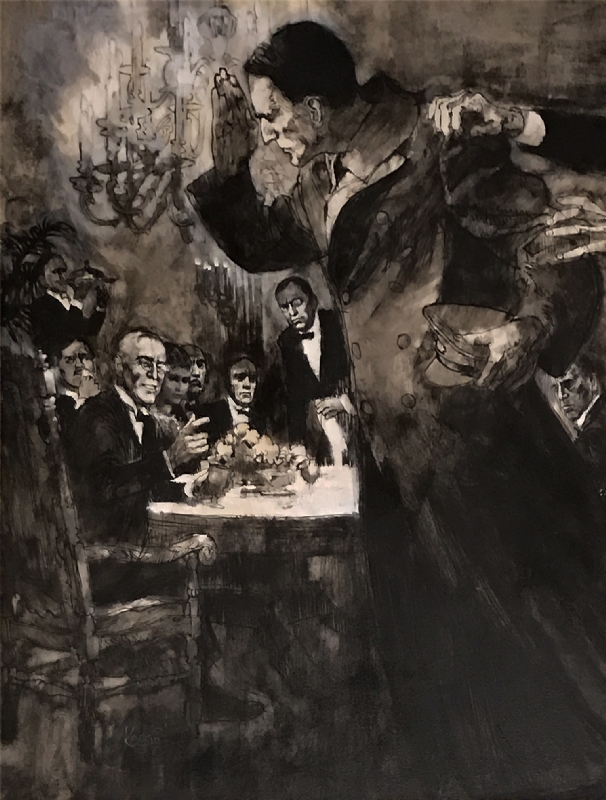
Many paperback publishers then enjoyed using covers of a white background with a colorful splash of illustration enticing the potential reader to pick it up. Sandy’s work was especially suited for this approach. He loved working with bright, vivid colors under a bold drawing, usually in ink or brush, or any other tool.
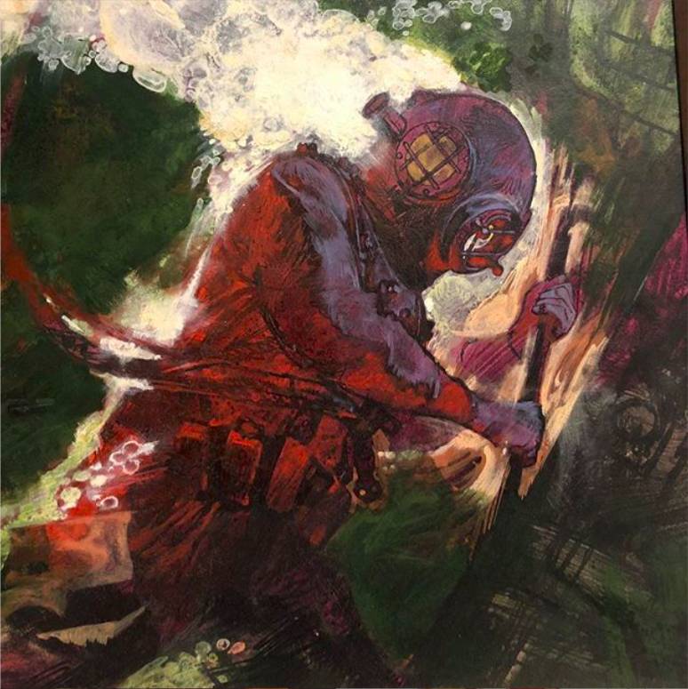
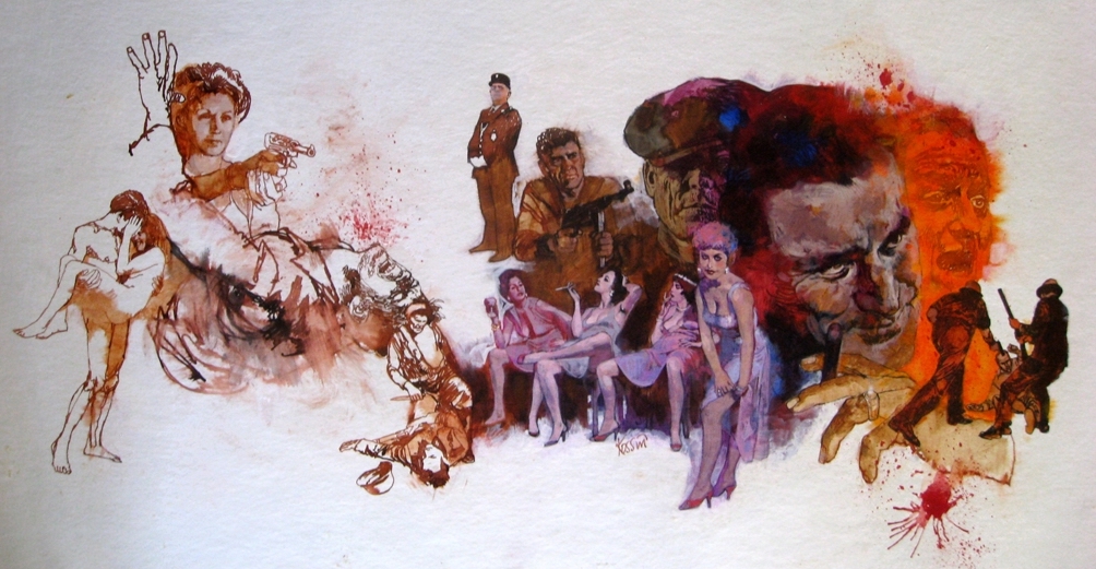
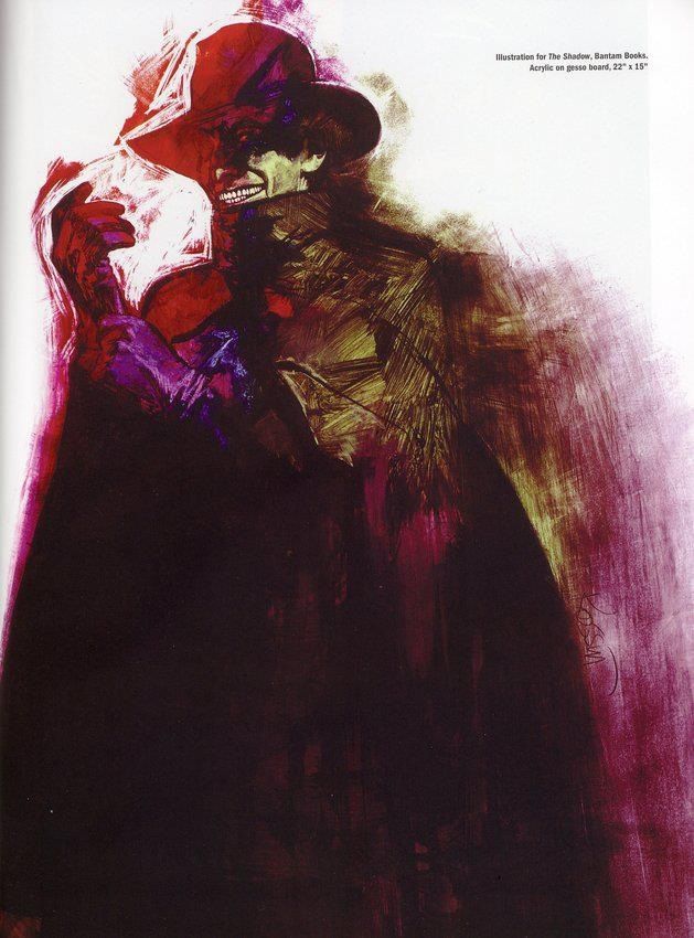
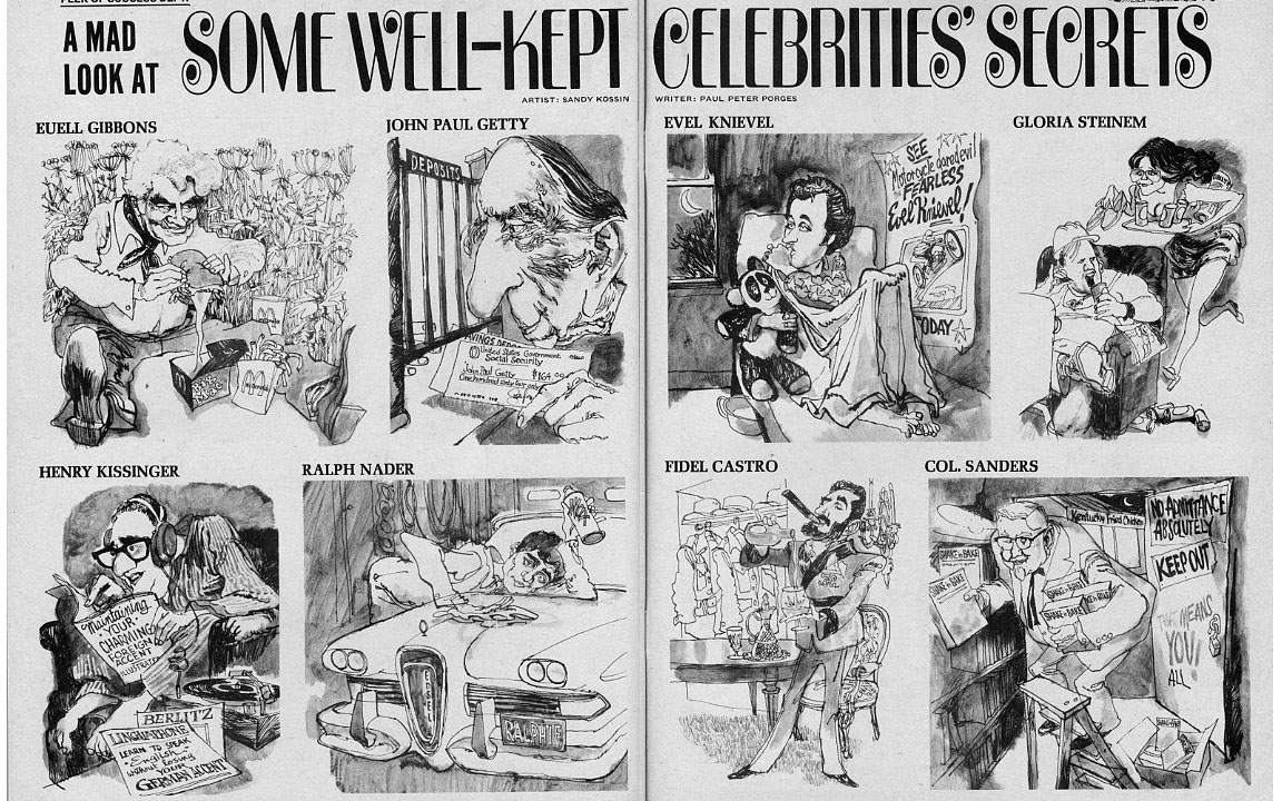
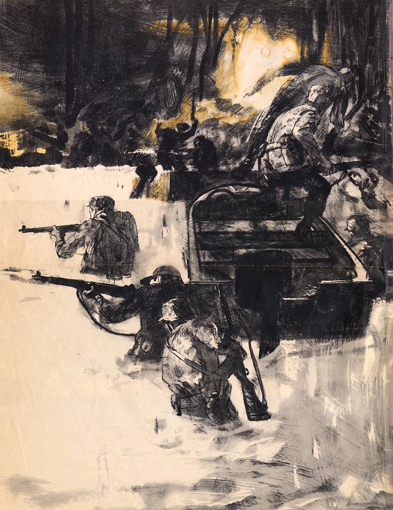
He knew the value of a simple line or gesture with a tool that left an expressive, sometimes primitive mark. You can see his thinking through the instruments he used. You can feel the joy that he must’ve felt laying down those lines because the range of thick vs thin, jagged vs smooth, or curly cue vs pedestrian quality to the line work communicated his temperament. As an artist one can feel his pen touch the board, and then feel when he abruptly changes tack to scratch or pull and challenge the limits of the drawing instrument.
Acrylics were fresh on the market in the early sixty’s and illustrators were keen to push its limits. Sandy was formidable in his search to combine and contrast and mix and shift, sweep, stroke, chisel, rub, and smear his way into new expressions. He experimented vigorously with new and old materials. Some illustrators at the time combined Dr. Martin’s Dyes with acrylics and sometimes gouache to brighten the pigments even further. Sandy was in the lead of that thinking.
And it wasn’t just in the technical side that he drove his career. Sandy was interested in a wide range of subject matter and a wide range of imagery. He could cartoon and exaggerate form masterfully. His cartoons have wonderful, playful, exaggerated shapes, and an incredible range of character. He would combine his technical mainstream prowess with his character work and create spreads for Boy’s Life that combined b/w on one page with color on the other for the same piece of art. I didn’t realize at the time how much that delighted me as a kid, and later as a budding artist, before I even knew what an illustrator was.
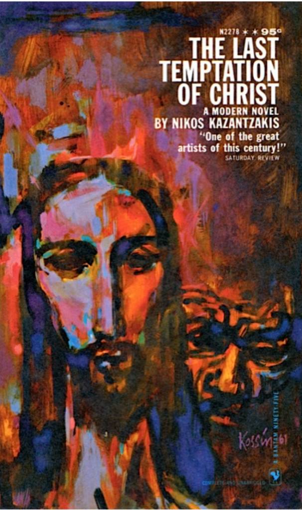
He stretched and pushed his drawing and wasn’t a one-note painter. You might never know that the guy that you just saw cartooning for MAD Magazine was the same guy who did the edgy, painterly cover for The Last Temptation of Christ.
His range and his love of line influenced my own work. To this day I see no reason to isolate myself to one genre or one approach. I want to play in it all, and have been lucky enough to be able to push those boundaries and work in all areas of illustration. Sandy inspired me to find my expression in every arena.
We’d talked about getting together at the Society of Illustrators again for another lunch, trade industry secrets, and discuss the state of the art. And now he’s gone. I missed the opportunity to laugh and learn from him.
One doesn’t stop learning in this business. There are no finite skills. No learning is complete for a visual artist, and illustration still lives despite the so-called visionaries who continue to announce its demise consistently.
Don’t miss the opportunity to study Sandy’s work. You’ll discover a superb drawer that painted with line. The images will work into you; you’ll recognize the human curiosity of mark-making that touches the protohuman in all of us.
Don’t miss the opportunity to connect with generations of painters just ahead of you either. There’s great information and experience to learn from them. After all, we are a small community in a vast world; a family of image-makers.
Don’t let another one go without connecting.
This is an essay I wrote about Sandy for his induction to the Hall of Fame at the NY Society of Illustrators. I think you’ll get a feel for the man himself. He was so much like all of us.








Thanks for writing this nice tribute. Sandy Kossin has a unique and interesting style. Being in my sixties, I am very familiar with his work, but not his name. This article is a wonderful reminder of his fantastic legacy.
A brilliant artist with the most captivating style, you can feel the energy beaming of the scenes he painted.
Rest in Peace Sandy Kossin
A brilliant artist with the most captivating style, you can feel the energy beaming off the scenes he painted.
Rest in Peace Sandy Kossin
Nice comments, Joel and Brian. Thanks. I hope future generations of illustrators study his works. The strength of the compositions invoke curiosity in the storytelling. Masterful.
I appreciate the thoughtfulness of this tribute. Sandy Kossin’s writing style is refreshingly original. I’m in my sixties, and though I don’t know his name, I’m very familiar with his work. This article serves as a fitting tribute to his impressive legacy.