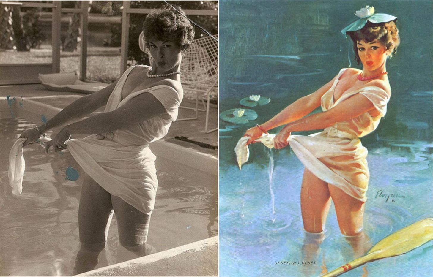
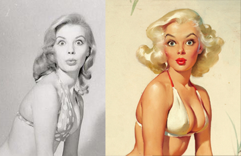
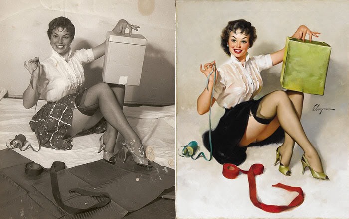
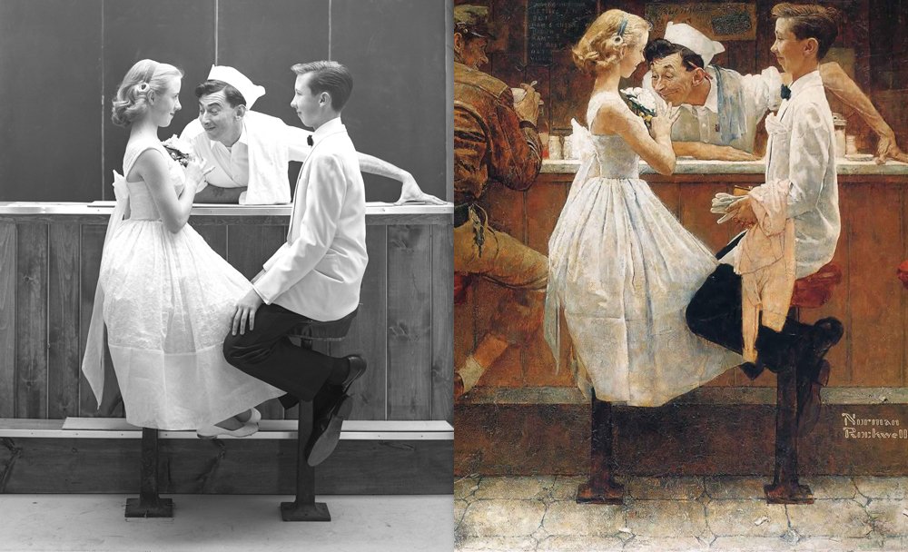
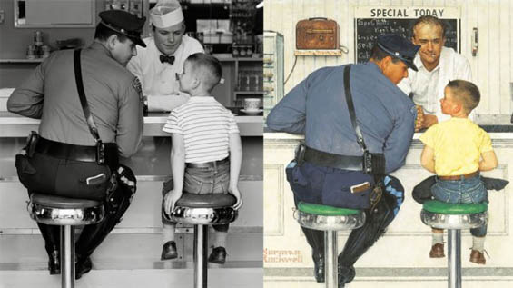
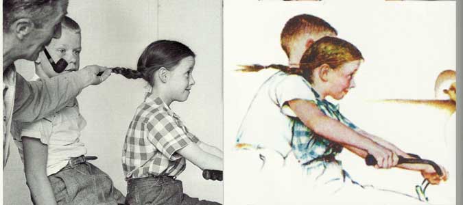
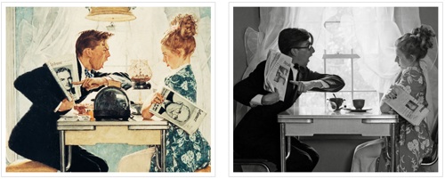
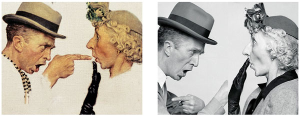
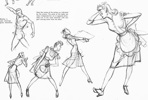
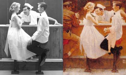
I’d like to start off by showing a few examples of two artists who have these awesome side by side images, with their reference to one side and the painting they completed to the other side, great for us to learn from. Norman Rockwell and Gil Elvgren were both fantastic painters, but also, as you can see by the reference, both were beyond capable of embellishing the reference as needed for their story. They were not a “slave” to the reference and worked hard to deliver their story with clarity.
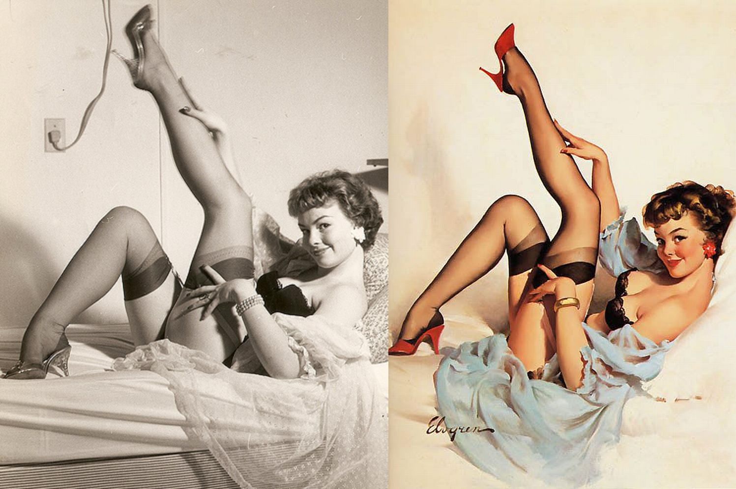
Reference Manipulation-Pushing the Pose or Portrait
Saturday, November 4th, 2017
Few artists can make it all up out of their head and work quickly to define it like Fortuny Motania or Kim Jung Gi, working with a photographic like memory pulling from experience, or having a curiosity and looking anything and everything up at one point in their lives, and then systematically find the reference as they so need it as they work out their images. Some artists can make up some of it and then push the reference in favor of their vision and remove many of the indicators that they took directly from the reference without any changes from it. A few need that reference and cannot complete their piece without it, and then others are totally reliant upon the reference.
For all the types of artists mentioned above, if the idea is well planned to whatever level of ability in thumbnails, and preliminary drawings and these preliminaries were the inspiration for the photo reference then there should be no problem in finishing the work. But do expect that whoever we shoot is not going to give us 100% of our needs in the imagery since they do not understand our goal 100%. Because of this, regardless of how reliant we are on the reference, try and lean towards your vision in whatever way you possibly can. Remember that what you are making is fiction and what you are referencing from is a placeholder for your concept or your idea (the truth).
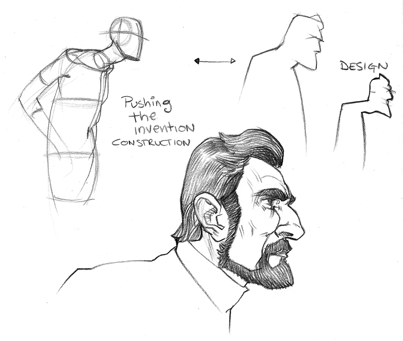
To push the figure or the portrait in a direction we need for our work, a good understanding of the structure or construction of the figure is always handy to help with the what and why part of the design. A descent sense of design, and a confident attitude are helpful as well. Here are a few design tools that can be used to manipulate or influence your drawing and to help capture what “feels” right in your work.
1. Shapes are pliable and can be manipulated to whatever degree needed. Caricature artists are very good at exploiting these characteristics in people and will push them to every extreme possible. Whether you are using abstraction, shape manipulation, construction, projecting, etc. learn to push and pull shapes to find “your” characters, “your” settings, and “your” staging.
Stretching the shapes through construction and shape/contour design
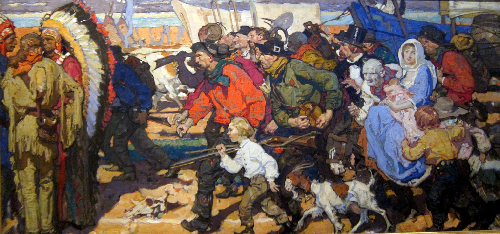
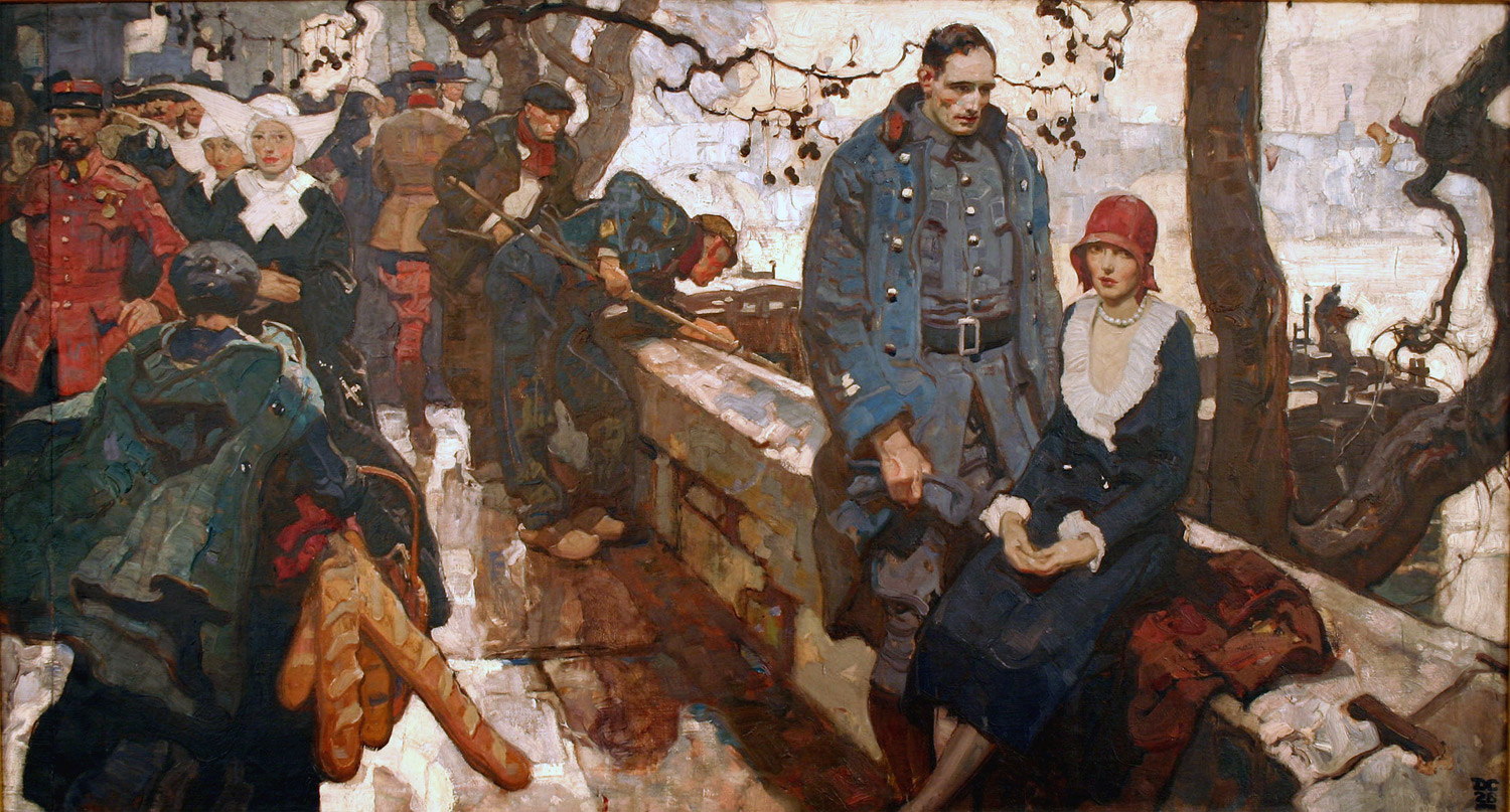
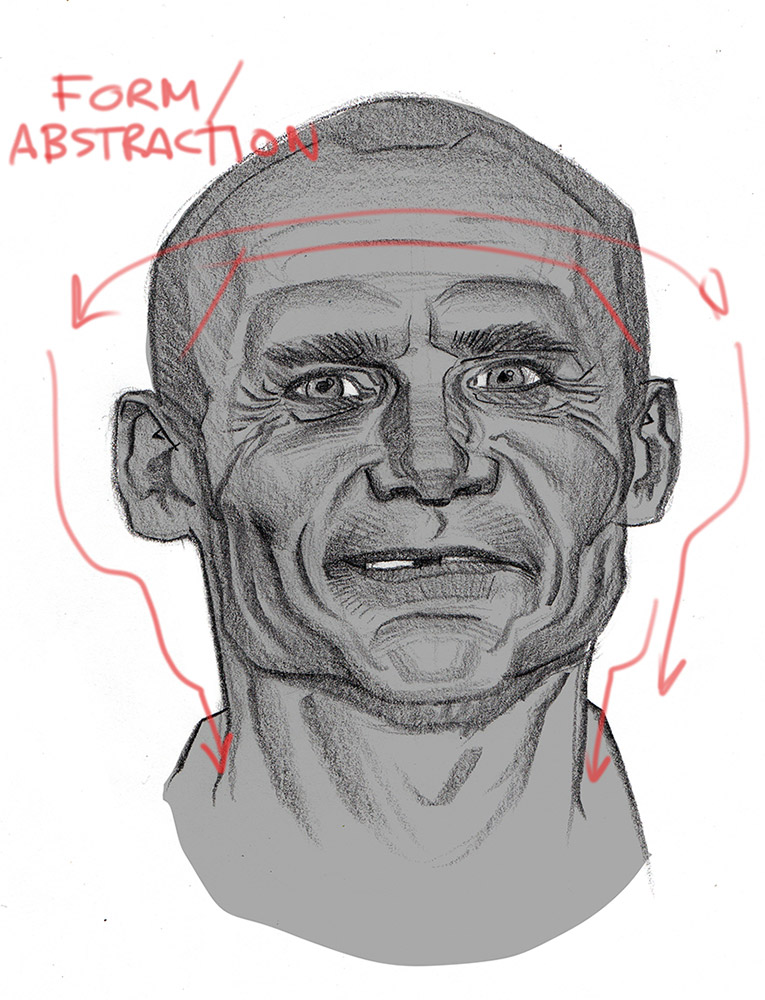
2. Use abstraction to help connect shapes, to define form, and to help tie together all the parts within the whole image. Dean Cornwell was a fantastic designer who exploited abstraction to its fullest. You can find it in almost every brush stroke or shape placed on any of his canvases. Finding the abstract connections can be done obsessively with every edge in your painting, or it can be focused just where the viewer should see something very specific before getting lost in the entire piece. It is up to you to choose how much to use in your work.
Pick any edge in these paintings, now follow it beyond where it was painted and see how many more edges or shape breaks align with it. He was a truly amazing abstraction designer.
Here are two drawings using abstraction to design “thru” the forms.
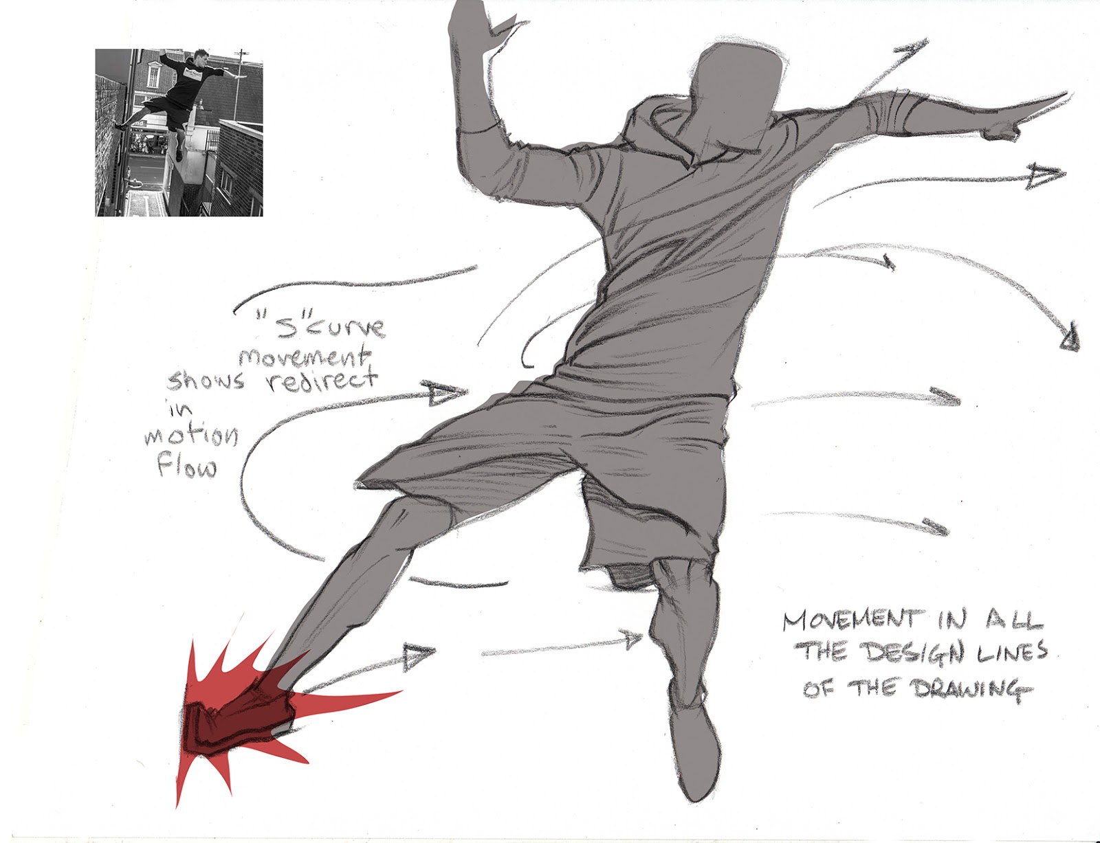
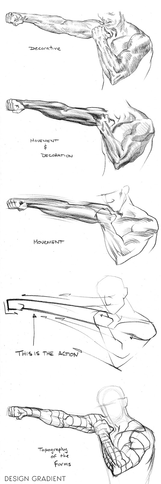
3. Define for yourself whether your piece is more about a frozen moment in time (decorative) or it is about a story beat (action). This will help define how much work will be involved in finishing the piece and what kind of “tweaking” of the reference there needs to be to achieve this look and feel. Slowing down time in art means defining more characteristics and subtle nuances of surface and texture, where pushing action is creating effect and to achieve this look and feel is through experimental process and a process of elimination of details and sometimes structural forms to give something the look of motion or impact.
Here is a design gradient ranging from decorative to action driven. Where does your work fall in this gradient?
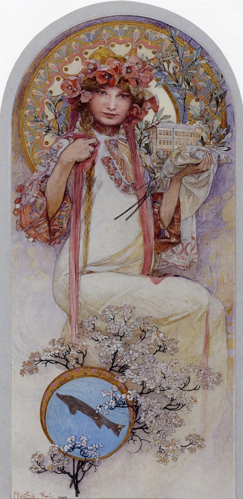
Alphonse Mucha is very much on the Decorative side of the design gradient.
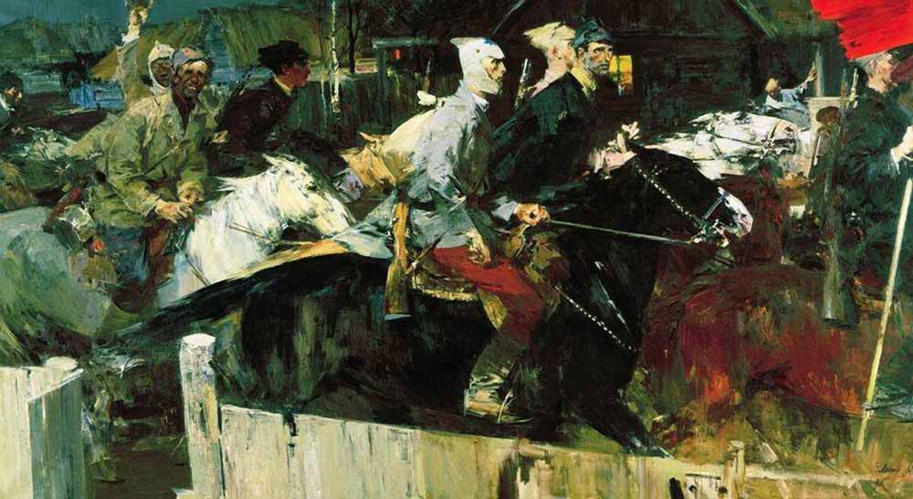
Evsey Moiseenka’s painting “The Red’s Have Arrived” is very much about the motion of the incoming horses and riders.
4. What kind of character are you creating and how would that individual act in your ideal portrayal of whoever you are illustrating? Cross reference several different individuals to get away from it all coming just from “within” you. Ask your model how they would react to said scenario. Ask others to also act it out for you for their physical input.
If you said jump to 6 different people, how would they each react? Do any of these fit your character personality in your image? for your story?
5. Take some acting classes not just so you know how to act more and connect with your character through physical portrayal, but to also remind yourself that what you draw is a performance that others (your audience) might connect with on an emotional level. This can and should heighten the awareness of subtlety but also of the physicality in the posing of everything in the art, from the ground the actors stand upon to the smoke the actors blow when they puff on a cigarette. That emotional connection is why we love the piece so much on so many various levels.
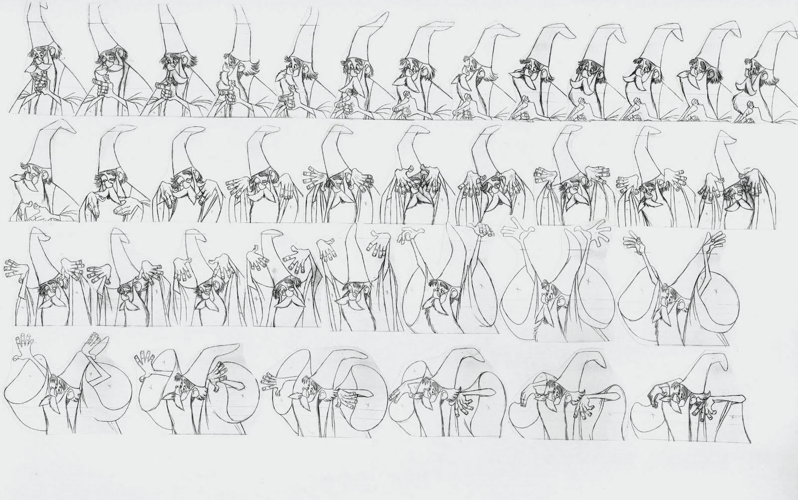
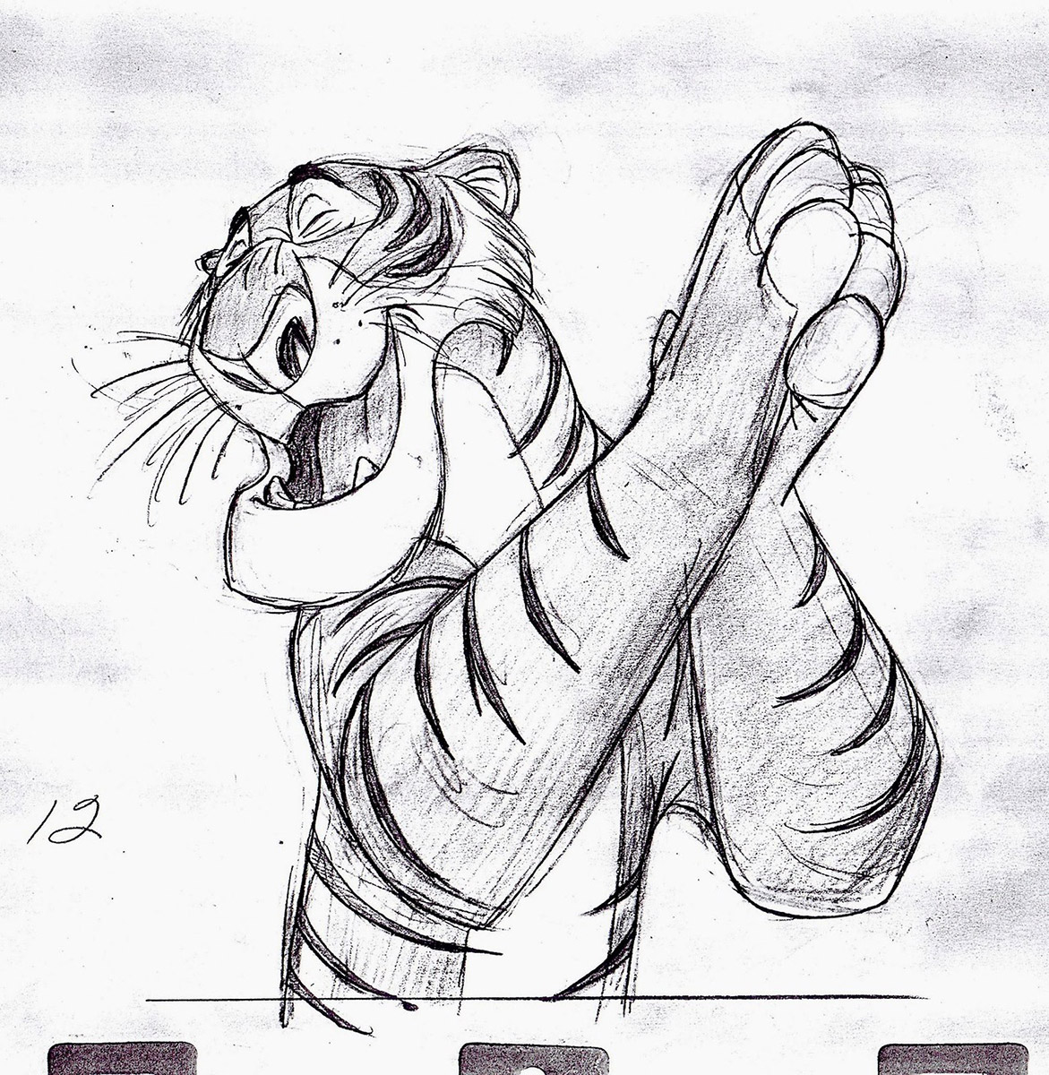
Milt Kahl – Fantastic Artist/Actor
Al Dorne was fantastic at staging and his caricatures were top notch.
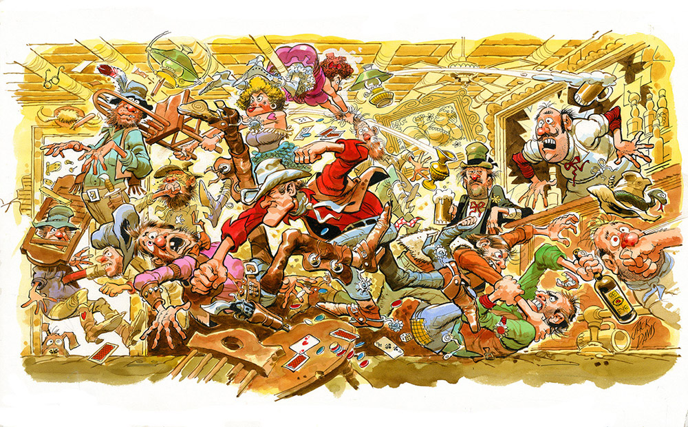
Jack Davis was another fantastic actor behind the pencil.
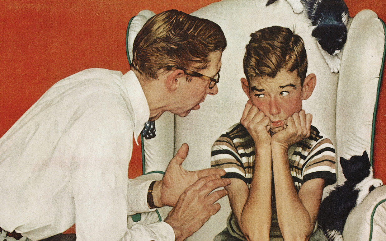
Norman Rockwell, the Master at staging, acting behind the pencil, and directing fantastic narratives.
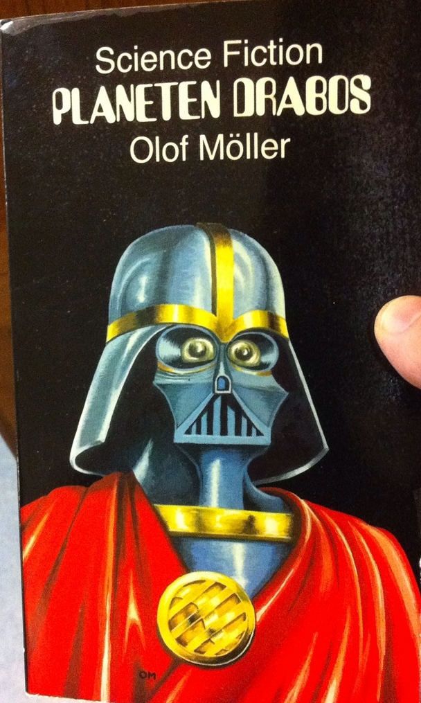
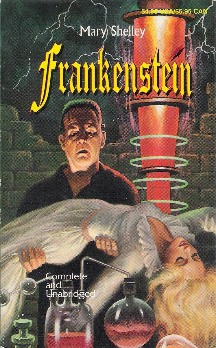
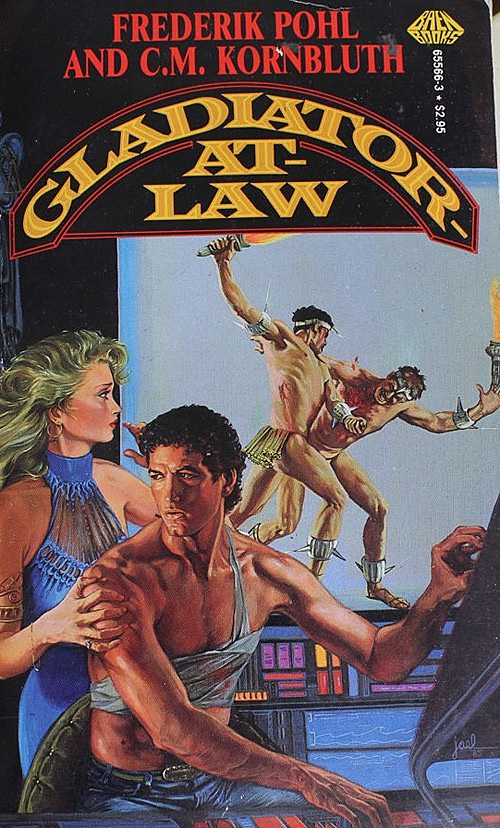
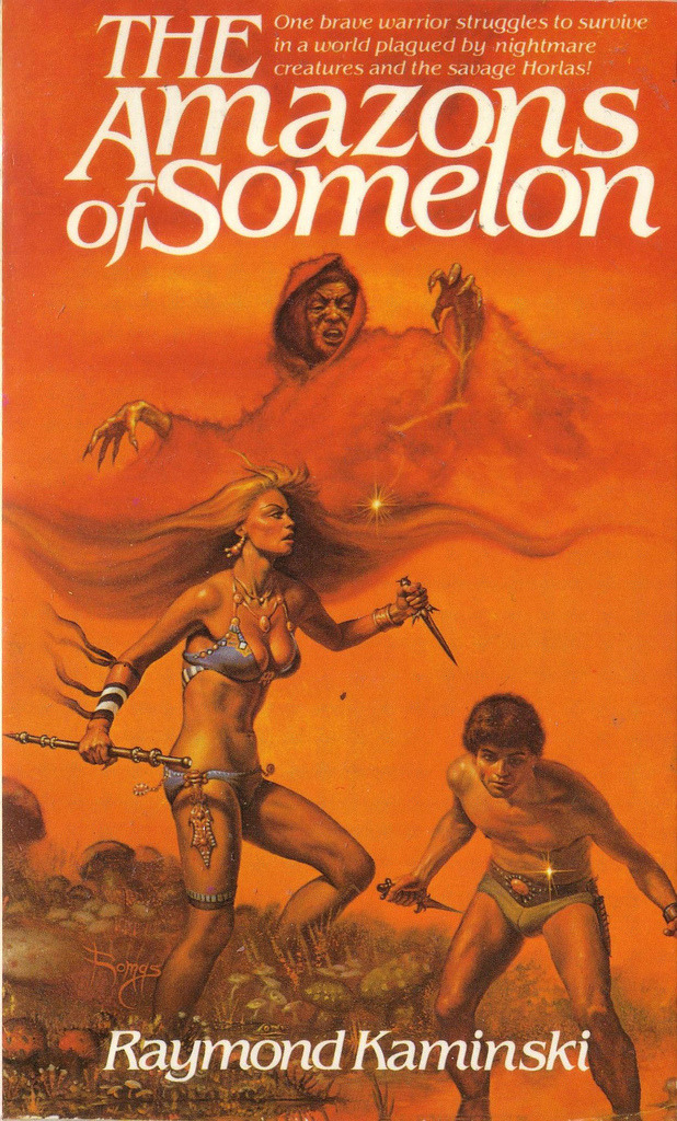
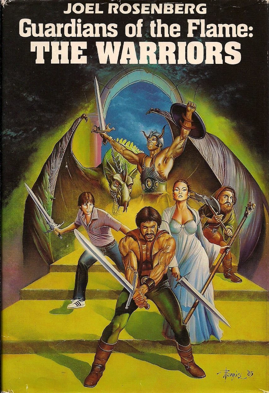
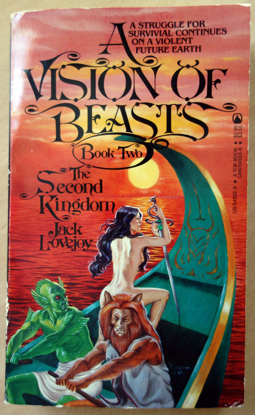
Please, work hard, learn more and race to a career in time. Put in the mileage that it takes to be a skillful and successful artist. Here are a few wonderful reasons why skill building is a must. Taken from two websites on rating book covers; these happen to be near the very bottom of the lists.
Oh, one last beautiful piece to clean your eyes out with. Enjoy.
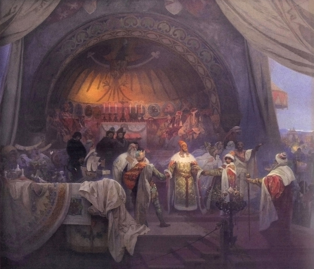
One of the many paintings of “The Slav Epic” by Alphonse Mucha.










Great post, thanks a lot!
Valuable information in this post! Sometimes its great to be given examples to which one can compare one's own work … just to identify & categorise the strengths & weaknesses, what to build on, what include more of, etc.
Great post, thank you!
What website is this that rates book covers? I want to browse.
Thanks for this article . . . it is very helpful. For the last dozen years, I have been painting free for parents portraits of their children killed in the wars since 9-11. So far, I've done about 200 paintings. Obviously, I have to work from photos provided by the family. About half of them are usable. some are quite good, and some are awful. The sad thing is that, in some cases, these are the only photos they have of their child . . . grab shots as they boarded the bus or plane going off to war. So, I'm happy when I run into something like your post that will help me do a better job.
Great post, thank you for sharing
Smany professional artists out there create their tutorials with money in mind, not with teaching other people. Recently I realised that I have been duped by a lot of professionals I look up to. Most of them have either been lying or purposefully leaving out information about their illustration process. By leaving out that vital information they keep people hooked and dependent on them. I mean, look at it this way: if they revealed everything about their process (including the references they secretly keep on a second or third monitor lol) people would stop buying their tutorials after one purchase. They wouldn't need any more.
Furthermore, the same problem is going on at a lot of these illustration and concept art schools and online programs. Keeping people in the dark while demanding a ton of money.
Can't believe how much money people spent on these tutorials. Hundreds of dollars for sure. Unbelievable. Well, I learned my lesson. I need to speak up about this. I am not the only one who fell for this. They tell noobies they have to learn this, this and this to make it and secretly use all the “cheats” available to them. Meanwhile their students are depressed and miserable because they can't seem to get anywhere.
I´m fucking tired of the incomplete fraudulent tutorials by these frauds on gumroad, patreon and so on. This is not what people pay for! Let this be a warning. I am not fucking around. I will post this everywhere. People are sick and tired of this shit. It is time to put an end to this. I will get something rolling that cannot be stopped.
/ic/ is talking about you.
Where, or with whom are you studying? I have studied with quite a few painters, some quite well known, and I have found the opposite of your complaint to be true. Every one with whom I have studied covered every aspect of their subject in greater detail than I could absorb in one sitting. I've gone back to study with a couple of these guys twice. Furthermore, there are several art web sites out there with various levels of art information, including the use of the Munsel color system, use of neutrals, and achieving correct color mixing. My question is, why would an artist dedicated to teaching other withhold the “key” piece of information that would help the studentd be successful? Granted, some of these guy are a bit more difficult to follow, but after studying art in all of its vagueries for a year or three, it seems to me that most of us will have gained enough insight and knowledge to sort out what he/she is driving at.
I find I learn well through examples too. Nothing beats seeing it in action.
Big Bad,
I don't see what your comment has to do with the post above.
So I'll assume this is just a general grievance of yours?
Regardless, I get what you're saying. But the sad thing is, MOST education is extortion these days. Personally, I like to think the artist industry is far more generous than most.
You are, after all, making this complaint on a totally free art education website.
However, once you involve actual production time, retail packaging, sellers fees, and advertising… an artist HAS to make a profit. Otherwise, those tutorials are going to stop existing. And that's much worse.