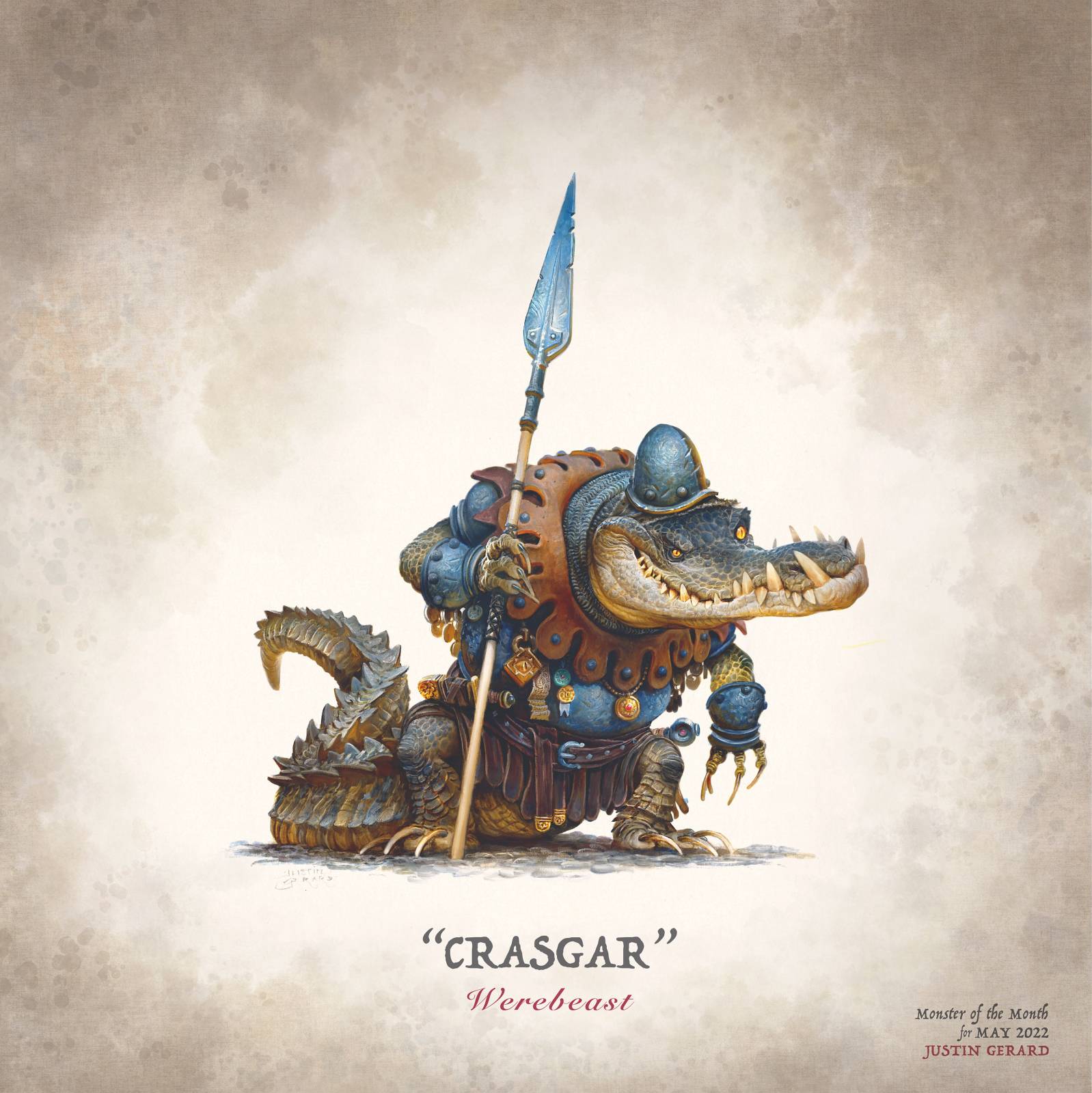
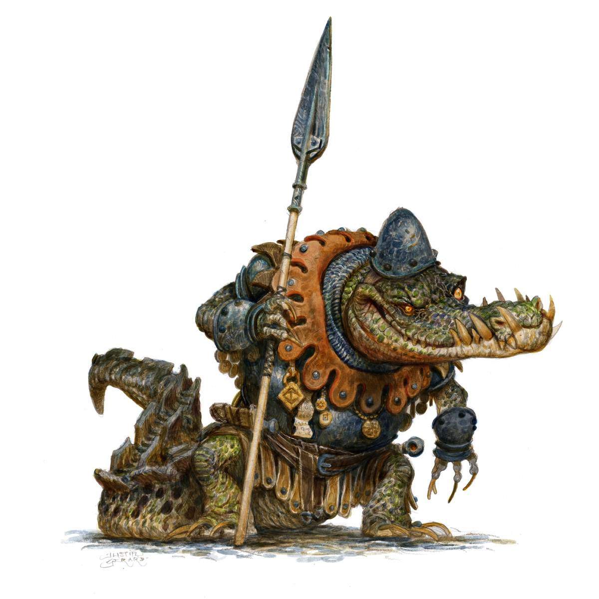
Have you ever wanted to paint a villianous and somewhat comical crocodile in a suit of armor? Well, today you are in luck! I just so happen to have one of those right here!
For this post, I am going to detail the process I used to paint “Crasgar.” And I’m not wasting any more time, so let’s jump right in.
The SKETCH:
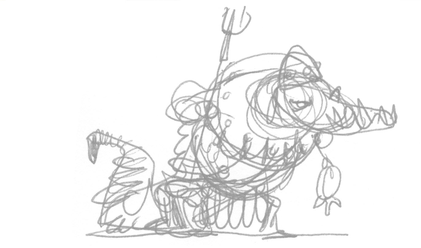
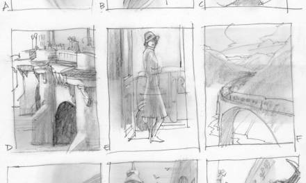
As with all my work, I begin with a scrappy little sketch found in the upper right corner margin of Moby Dick. (A powerful corner in a powerful book.)
The DRAWING:
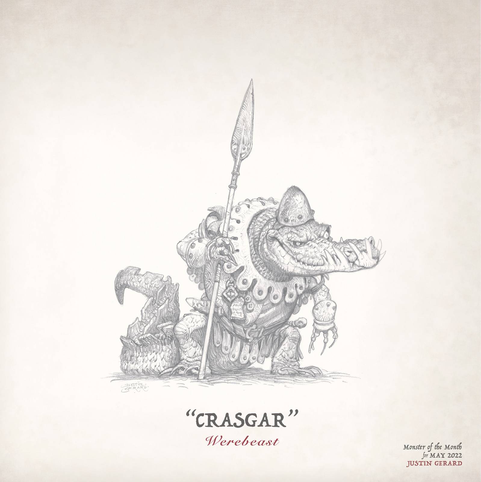
The drawing is where I have to wrestle all that interesting potential into something real. Now all the loose suggestions and possibilities have to be decided upon. I can’t just leave a little squiggle, that in thumbnail could be seen as a fist, a gun, a flower, a Christmas present, or an obscene gesture. All of those options might be interesting on their own, but now I must resolve that squiggle into just one of those things, eliminating the other possibilities. I also need to make it have believable proportions and design.
To do this drawing, I blow my little tiny sketch up (using a scanner and a printer) and then use a light pad to trace it onto a sheet of Bristol paper. I use 2H pencils to first establish the drawing lightly, and then HB pencils to draw over that again, adding sharpness to the lines, and depth to the shadows.
COLOR:
For this image I am working digitally, but using a method derived from traditional watercolor, of slowly building up transparent layers of value and color using multiply layers.
Unless there is a background, I tend to start on the faces of characters since the are the most interesting, and slowly work my way out from there. For this image, I start with the eyes, and work outward along the snout from there. I tend to pick a limited palette of colors when starting to add color to a painting like this. In this case, I used a yellow ochre, a burnt Sienna, and a Prussian blue to make the colors here. After painting with this palette for a while, I begin to get a better feel for the character, and where I want to eventually take the final colors. As I get closer to the end I add in some sap green and ultramarine blue as accents.
FIXING IT
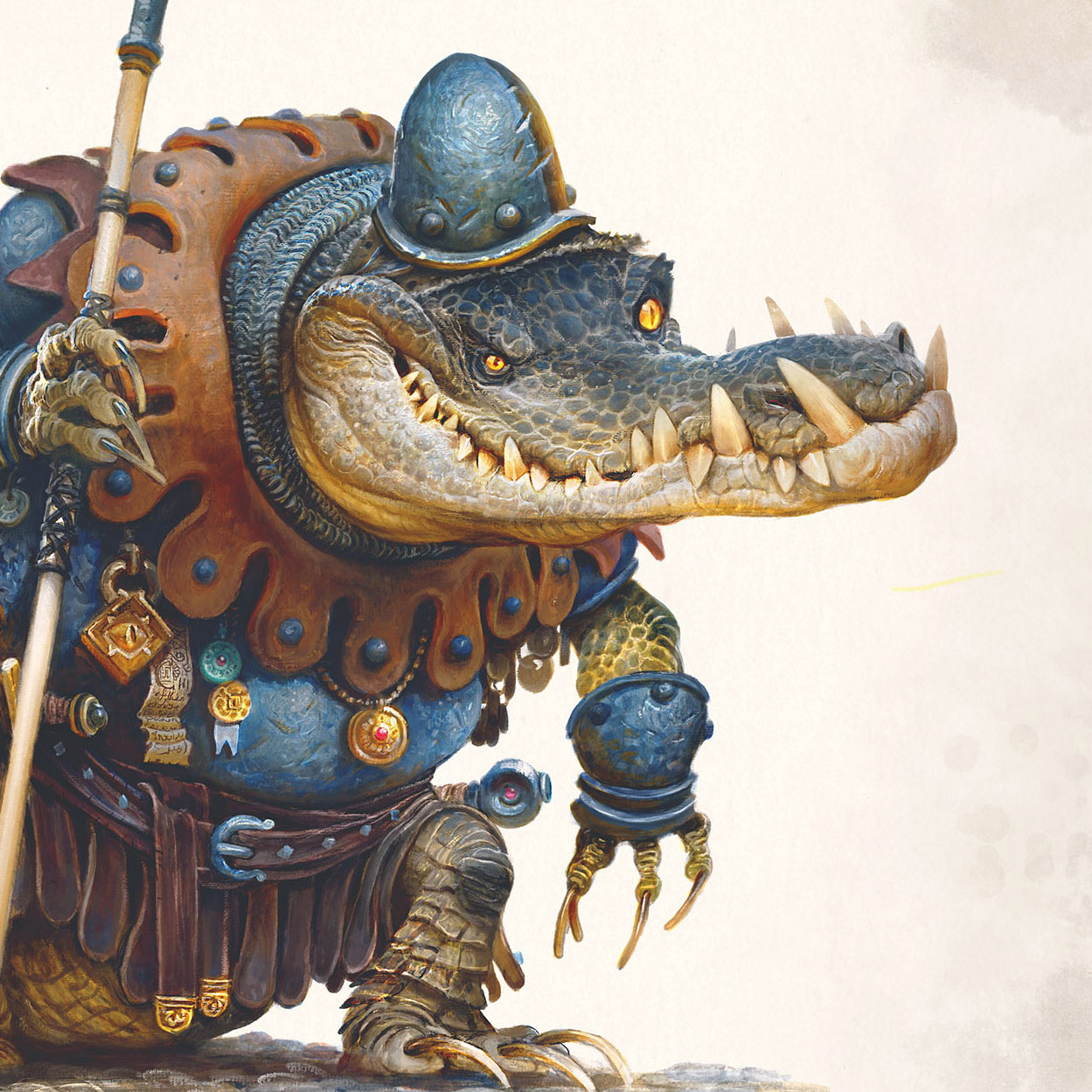
Once the colors have been added the image begins to feel better rendered and shaded, but a little too dark to me. Probably because I paint like I have lead gorilla hands. Because of this I always end up going back afterwards and retouching the detail areas and focal points with highlights. I overdo this highlighting pass too, so it’s essentially like a soft reset for those areas, kind of like an extra life in a video game. This tactic allows my imprecise, low-voltage monkey-brain to slowly hone in on the correct forms. (The more elegant solution is of course, NOT to apply paint like you are paving a road, and instead to have a lighter touch, leaving off the areas you wish to be lighter…)

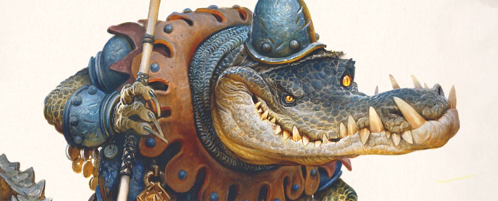
In the above panel you can see a progression where white was added in to detail and correct the face, before color is ultimately added back in. This back and forth makes for a lot more work, but also creates a lot more depth and interest along the way. The semi-opaque passages over this new lighting layer add more refinement and interest to the character. I love how much depth it adds to the image!
To add this color, I am again using my earlier palette of Ochres, Siennas and blues, but now mixed with more white for better control over the values and tones.
I hope this has been helpful (or at least interesting)! And if I leave you with anything here, I hope that it is that mistakes aren’t always the end of a painting. They might be an opportunity to try again, and this time add more detail and love into the areas you messed up!
-jg



Hi, Justin.
This croco is of your your best artworks from my point of view.
Please say hello to your beautiful spouse.
BR, VAL
Thank you Valerii!
Howdy Justin, This is wonderful. You manage to make him scary and funny at the same time. Not an easy thing to achieve. Also, now I have to remember to pay more attention to the squiggles in my drawings. Thanks for the tip. And thanks for the post. It was both helpful and interesting.
Best wishes, Aaron
Thank you Aaron!
That tail is amazing. Well done, that man.
Hey thank you Paul! Hope you are doing well!
I love this guy, and how his eyes make me think of the Stinky Cheese Man characters…particularly from the Chicken Licken chapter!