Been doing some exploring this week. Nothing too major, but just experimenting around with some different stuff, hoping to maybe shake things up and stumble into something new.
I think it can be healthy to implement different materials or working methods from time to time. It’s a good way to leverage what you know to propel you into unfamiliar territory.
It’s a great to have familiarity with your materials so you can steer things toward a predictable result. Its necessary if you’re trying to commercialize your skill. Clients hire you based off of work you’ve done, with the general understanding that if they commission you to do a piece, you will deliver something stylistically in the ballpark of what’s in your portfolio.
It’s a reasonable expectation. Nobody wants to hire someone to experiment around and maybe come up with something. Illustration is pretty cut and dry in that way I feel like. There can be some narrative ambiguity to it, but generally if you’re hired to paint a representative image of a person or scenario, thats what you do.
And thats why it’s on us to continue to expand our knowledge on our own time, nights weekends, in between jobs. One of the coolest things about being in a trade is you never have to stop learning, and sometimes you can open a door and discover whole new wings of ideas to explore.
It never gets old. It doesn’t have to. And if it does, that might mean its time to push ourselves and explore new ideas to make it interesting again.
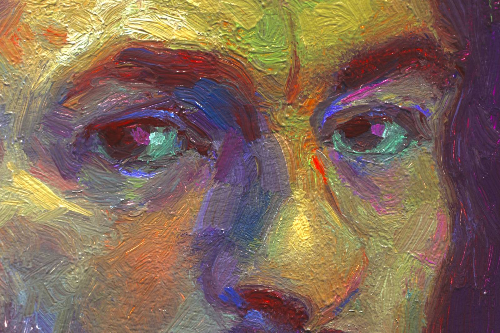
This week I started a little self portrait, but instead of using my usual palette, I chose mostly garish colors I rarely use. Perylene red, manganese blue, permanent green, quinacidrone magenta, really saturated colors that I tried to mix as minimally as possible to maintain as much saturation as I could.
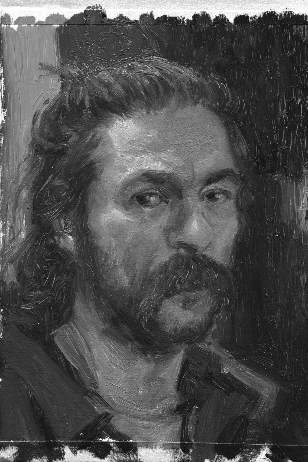
Used alizarin crimson for my darkest darks, and just went nuts color wise, trying to pay attention to the value relationships, but mixing in a random way, alternating between warms and cools and just sorta going by feel. Took a photo of the painting and desaturated it, and It was like the best feeling ever seeing how the values held up.
Dunno where it’s headed yet, but sort of a fun/odd start so far.
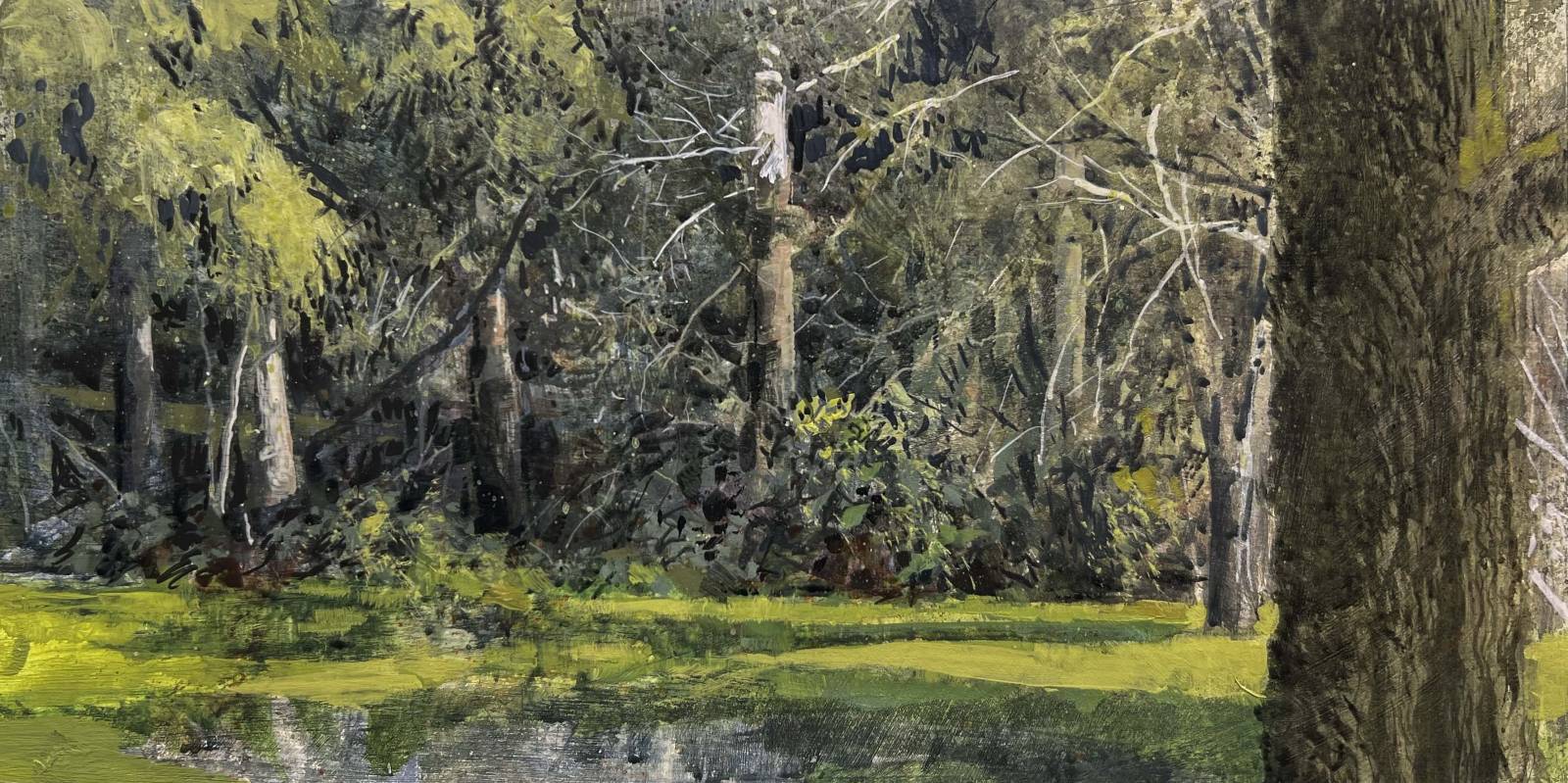
Also painted this little acrylic plein air yesterday . I haven’t painted in acrylics in years. Also haven’t plein air painted in years. So I figured what better way to get back into these things than to combine them and do some acrylic plein air painting!
Started with a rough pencil drawing of the big shapes and jumped right in. Acrylics are fun because you can build up washes so quickly. Oils can be such a waiting game, whereas Acrylics are this accelerated free for all which I feel lends itself well for life studies.
I used a limited palette of lemon yellow, black ,white, bunt sienna, and ultramarine blue, and tried not to get too saturated with it. Basically the opposite of that portrait lol
Will probably try to put another sitting into it and see if I can tighten some areas up a little bit more. Want to start a few others and jump between them. Going to try to keep it going and maybe figure out a few new tricks… Hopefully.




That saturated portrait is absolutely amazing! Successful experimentation really is a great feeling 🙂
How TF the values held up that perfect is insane – bravo bro! This is serious color science – the bridge of wild graffiti colors into classic palette portraiture is worth exploring. I look at SAINER and love when he gets some of that into his Polish colourism super de-sat shadow palettes – just some banging Hot Raspberry out of nowhere. This one feels Alla Prima 1 sitting style which is always my favorite vibes.
The visual interest in that portrait absolutely blows my mind – then seeing the grayscale version? Whoa.