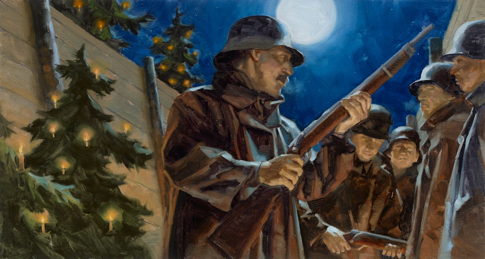
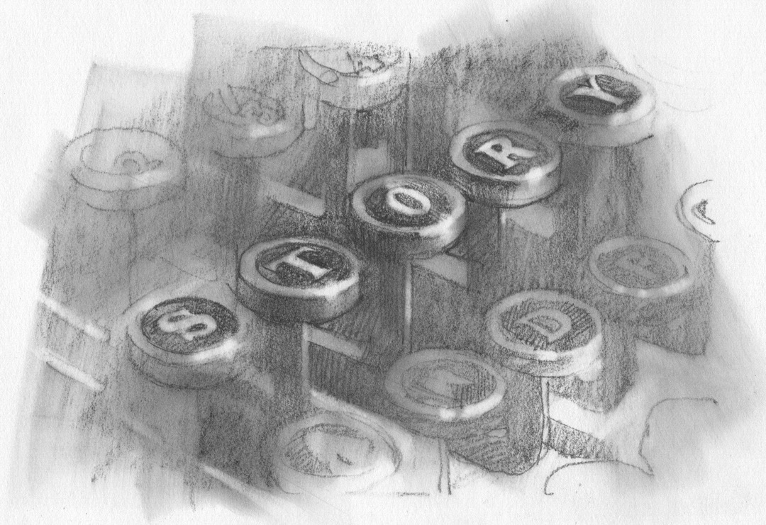
The aspect of cropping an image or element within an image is very similar to crumping. Bunching things together to build rhythm in a composition is the basic approach. And in the action of shifting and moving figures or elements certain objects will naturally get cropped, either by the edges of the frame or by other elements covering them.
Both are important to an intriguing design, but cropping is the more severe.
This will improve your work. It’s simple enough to pull off, and that’s probably why you’re holding back using it. Sometimes we just can’t allow our precious objects to be trimmed off or covered up.
But the viewer gets involved when we do. It allows them to participate by completing things in their mind.
1. Engage the viewer.
Whole figures, centered in the composition. It’s good for posters and advertising, but mostly when reporting is more important than the viewer’s engagement. So many artists place everything in crystal clear view, dead center on the page or within that center diamond shape. It’s fine, but it doesn’t tell story, it shows, or merely reports, story.
Move off the line of attack, as they say in martial arts, and don’t show the whole object.
2. Break the box.
The box is limiting, isn’t it? Hard to design within, right? So what? It’s supposed to be limiting. Thinking outside of it is for concepts, but those concepts must fit back in the box. The box is everything to good composition. Once you grasp its power you will understand how to use it.
Those barriers allow the viewer to be coaxed into your work. The audience will complete the picture in their heads, but they must know where the edge is to understand it. Use it to crop elements, let it’s limitations drive your view.
3. Find the point of view.
Put a figure in the box and crop it. What does it tell you? No, look at it. What’s missing? Does it matter to your idea? Does it push the idea into a different, interesting space? How much can you crop and still tell your story or communicate your idea?
Move things around in the composition; cover things to see what can go or what must stay.
Less is more.
4. Uncover the subject.
Like crumping objects together, let elements trim and cover to add interest. This can be done on background figures for example to pull the eye toward the main subject. Show me what the point of the picture is as quickly as possible. Crop useless elements away and allow the viewer’s eye to find it fast.
5. Use lenses.
Our eyes see a wide, mostly horizontal, view of the world. It feels like we see everything in full detail. We’ve been told that the brain processes all that information.
But the brain can’t focus on everything. It focuses on a very small percentage of the viewing area, only on what you are looking at in that moment of attention. This is processed with the most information. The rest is somewhat there, but with not as much detail. Peripheral vision is less detailed than the point of focus.
Use a camera lens, or binoculars, to help your eye crop extraneous material to find the subject of the picture.
6. Study photography.
Remember that photos are not reality but a simplification of it. They are distortions of your brain’s reality. They record everything, but they also record everything slightly edited. Toulouse-Lautrec was influenced by the way photos cropped reality, so he cropped figures in his paintings as well. They were a leap ahead for him.
Also notice how photos flatten reality and things naturally crop other things by overlapping them.
7. Crop light.
Don’t over-light the picture, shape light creatively. Subjects in the picture do not need to be lit uniformly or even logically as long as the light is consistent within the image. Elements can block light from reaching other elements; trees can diffuse light; offstage objects can block, diffuse, cut, crop, and overlap light and we don’t need to see what it is as long as we understand how it affects the subjects within the picture. Control it.
8. Lose the unessential.
Cropping is also conceptual. Take out what isn’t necessary to the idea of the image.
Crop your elements. Edit, cut, or trim.
9. Crop with abandon.
Crop things you wouldn’t necessarily think could be cropped: heads, cheeks, chins, arms, legs, feet, hair. We don’t need to see the whole animal. Or house. Or car. Or tank, spaceship, submarine.
You are in control when you crop. You are telling me what and how to look at things. Be brave. Use this to create a way to view your work that you alone control. You’re audience will love that about the work.
Have a post with 10 items? Crop one off if it’s not necessary.
ahem.


Special thanks for number 7, Greg! That is a really good way to think about lighting. I struggle with it sometimes, but I think that's because I don't think of it as a design element, but as something to be recreated rather than created. Cheers!
I love that cropping conveys to the viewer “there is more here!”
Used properly, cropping swells numbers. It expands horizons. It enlarges beasts and buildings. It adds energy. It intimates threat, solicits imagination, and hints at wonder… all Just. Off. Screen.
In this digital age of video games and interactive, panoramic media, people are conditioned more than ever to see scenic imagery as a window onto a larger world. This is something I've chatted with friends about… Have you ever found yourself shifting your position slightly to see beyond the border of an static image, as if it were a window? As if you had Deckard's viewer in “Bladerunner” or that it was more than a single flat picture? Cropping encourages that response, I think.
Thank you Greg! So much to think about!