I’ve been hard at work evenings and days off, getting Chapter 2 of my comic Cut Flowers finished. It’s finally complete and off to the printers!
One of the great side benefits of a big personal project like this is the opportunity to experiment. Since this isn’t for a client or art director, I’m only risking wasting my own time by trying out new mediums and techniques.
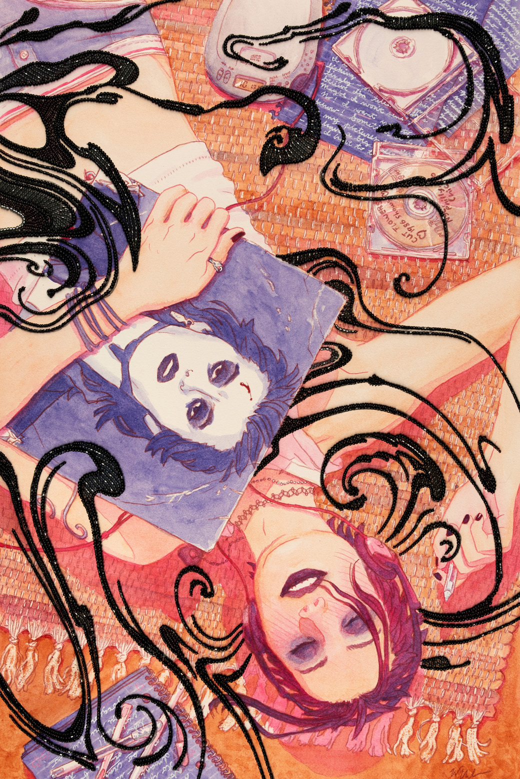
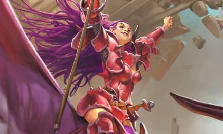
So I decided to bring beadwork into the cover depicting my Native American point-of-view character, the ghost Jamie, back when she was still alive.
The story takes place in 2003 and has a lot of nostalgia for that time and the age I was then. I remember the intensity of lighting some incense and listening to music and writing my thoughts and dreams in a notebook with Gelly Roll pens. I wanted the image to capture a moment like that of Jamie writing a fan letter to her beloved Roger “Azazel” Vitt. I wanted a touch of psychedelic unease, to reflect some of the fantastical and scary moments, but mainly a feeling of breathless teenage romance in the colors and her expression.
After a few thumbnails I had one I really liked. I knew the beadwork element I wanted to add would be as a sort of swirly floating design over this composition.
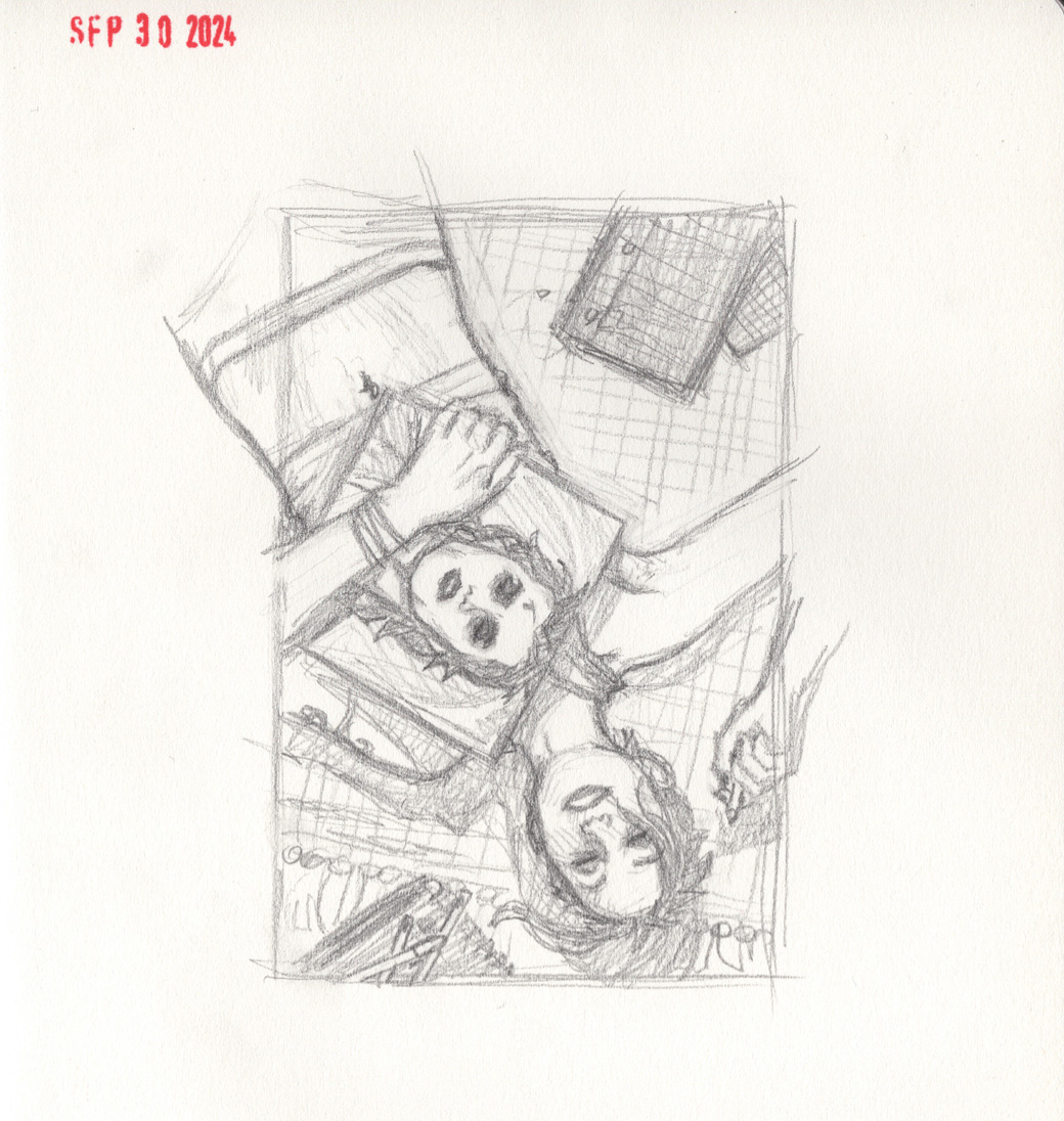
I scanned the thumbnail, blew it up at a good size for drawing the detailed sketch, and printed that. Then I shot self-reference for the pose, collected reference for the various props, and did the detailed sketch on two separate pieces of Duralar – one for the smoke swirls and one for everything else. After scanning them I colorized the main drawing to better separate the swirls. I decided they would be black, like oil floating on water. I posted a long time ago about experimenting with poured acrylic inks and paper marbling, and those experiments are still returning dividends – I used some of the marbles paper swirls as reference while sketching these.

I printed the combined sketch at a smaller size onto some scrap watercolor paper. I printed 4 of them, so that I could do my color studies in the same materials I’d be using for the finals. I knew I wanted to keep a limited but vibrant palette, to hearken back to screen printed concert posters. I had a feeling maybe burnt sienna and one other color, either permanent rose or ultramarine violet would be interesting. Then I tried a couple variations using all three pigments.

Then I printed the detailed sketch at fullsize for the final and used a lightbox to draw over it with Prismacolor pencil onto the watercolor paper before mounting and stretching it. Then I soaked the paper, applied matte medium to only the back, placed cotton muslin over that, and applied more water and matte medium to affix the fabric to the paper – then flipped that over, put it over canvas stretcher bars, and stretched the fabric and paper together and stapled it to the stretcher bars. After giving it all time to dry until it had shrunken a little and stretched taut, I then painted the colors over the colored pencil lines.

I used resist crayon on the rug strings before painting the color in, which I had never used before. It’s just clear wax in the shape of a crayon, and as the name suggests, it keeps watercolor from adhering to or staining the paper. It leaves a shiny texture, but that can be removed by placing a clean paper towel over the piece and then ironing it at a low heat. The heat melts the wax and absorbs into the paper towel. The thing I was excited about was I knew it would have irregular edges and look kind of retro, and I love how it turned out! The other really fun new material I used on this was real Gelly Roll pen on the notebook and in some parts of the painting. Used them a lot in high school, but never have on a piece of artwork before this.
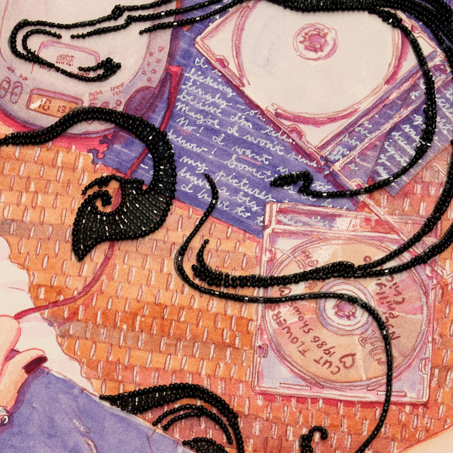
Finally, I spent by far the longest chunk of time sewing beads through the paper. Beading needles are too thin to pierce the paper, so I use a sewing needle to poke a hole first, then pass the beading needle and thread through. This process took around 60 hours. Not a very reasonable technique to use on a client piece at that pace (though I had already done an entire children’s book with it (it took a very very long time)), but since this is for me, I wanted to make it something no one else in the world could, or would, make.
Here’s the finish, without- and with- the title text.

My print copies should arrive around Valentine’s day and ship out to those who preordered a few days thereafter. There’s still time to get your order in if you’d like to be among that first batch mailing out! Check the online store (and read online for free) here!

Recent Comments