The Character In Context Show first opened in 2024 at the A. R. Mitchell Museum in Trinidad, Colorado, and becomes an annual show with it’s return this coming May. The show is curated by fellow illustrator Elliot Lang, and has a unique focus on the process that goes into artists creating human-made, hand-crafted artwork. Each artwork is accompanied by an artifact of the preliminary process, hanging alongside the final.
Starting this new painting during the relatively quiet winter months provided the opportunity to take the painting at its own pace. I wanted to slow down and embrace the spirit of the show by fully exploring each aspect of the painting and step of the planning process. Because each step is a fork in the road, I do much of my preliminary work digitally so that concepts and solutions can branch and be pruned quickly. When we get a peek at an artist’s process, we often see their original thumbnail sketches, and then we jump right into the evolution of the painting on canvas, perhaps with a drawing as a stepping stone between. A lot happens between those two (at least for me) so today I’ll share each of those iterative steps and decisions in planning my most recent project.
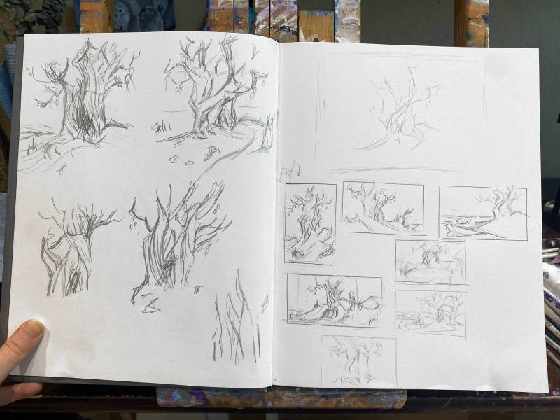
Everything starts in the sketchbook as messy sketches. I love western landscapes and since the show is hosted in a western art museum, I wanted to leverage memories and photos from a trip to southern Utah a few years ago. The dry, twisted trees growing out of the sand there had me thinking about an early painting of mine titled The Last Standing. It had been inspired by a documentary about the extinction of neanderthals, in which an anthropologist speculated about what it would be like to be the last, as your companions dwindled to few and then none. I wanted to give the idea another go.
The Last Standing, 2019
While sketching, I remembered a shoe-laden tree I saw as a kid on a car trip through Arkansas. Places with the evidence of people no longer there are magnetic to me, as are the questions that arise and the stories they imply. There’s something quirky and a bit silly about a shoe-tree, but it’s also a monument to discarded, abandoned things who’s owners have moved on.
This last living thing standing in a barren landscape will be adorned with the discarded possessions of those who gave up their search for others. In no way do I intend to depict a logical story or series of events, but instead I would attempt to capture the emotions I felt in hearing the anthropologist’s speculations. It’s that dog at the train station every day, long after their owner passed away…. or the episode of Futurama where Fry, Bender, and Dr. Farnsworth watch the universe spread out, fade, and die.
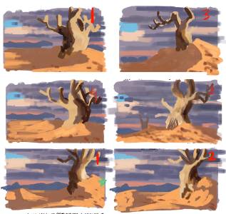
After the rough sketches in my sketchbook, I move to Procreate and play with different lighting and color schemes to try to capture the right emotion. I scrawl a few sentences down to keep me focused on the goal of the painting. (The words are not associated with the thumbnail they’re underneath- their distribution was just an attempt at keeping the file smaller.) Since the canvas was vertically-oriented last time I approached this concept, this time it would be horizontal. With a wider composition, the tree would still be the subject, but the desolate landscape would play a bigger role.
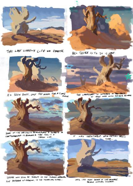
At this point, I am not worried about composition, canvas dimensions, tree design, camera angle…nothing but the color and light. All of these contribute to how the painting feels, but none more than color and light in my opinion. I’ve never been able to start with values first and assign color later, like I see so many artists do.
Low vs high horizon & shadows cast into vs out of center
I chose a color palette, but now I need to make sure the light direction and camera angle were working toward the goal. Should the tree cast the shadow into the painting, or out? One felt more harsh and dry, the other felt more lonely. Should the horizon sit low, with the camera pointed more upward toward the branches and the things that’ll hang in them? Or should the horizon go higher, and place a greater emphasis on the open, barren land?
Until now, the design of the tree didn’t matter much, and focusing on it could be a distraction from the other things I was trying to work out. After all, there is no one “best” design for a tree, so choosing what the tree should look like must be done with consideration to where the light would come from, how the shadows would fall on it, etc. In addition, the position of the tree within the canvas and in relation to other elements will change its balance within the composition.
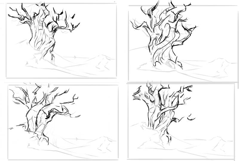
Narrowing in on a tree design
Now, however, it’s time to solve for the tree. All of the sketches have a lean in toward the center of the canvas, even when they technically don’t (the one in the top left leans out, but its weight leans in, for example). It’s like the point of balance on a sword, where if it is heavier on one side, it must be longer on the other. The bottom left tree, for example, is too symmetrically balanced to be that far to the left in the canvas, even with the heavier limb coming off to the right.
As a sketch, I liked the top left design and proceeded with it.
The clouds I had up until this point had not been intentionally chosen or shaped for the composition, so I took the time to play around and find the best option. The clouds in the top right followed a gesture similar to the horizon of the mountains…creating right-ward motion. I expanded the canvas to give that motion room.
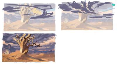
Working out the clouds to compliment the composition
I wasn’t loving the tree when lit and placed in the landscape as much as I did as a sketch. Normally I don’t render a thumbnail this far, but I kept going in an attempt to push the tree into a more interesting shape. Eventually I started painting in one of the other tree sketches to see if it can fit better. It did.
Second-guessing my decisions
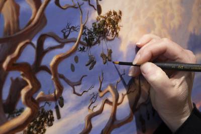
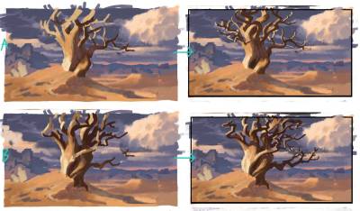
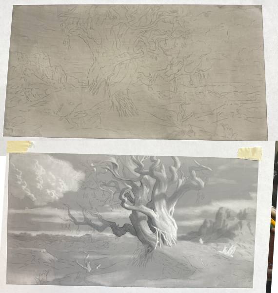
I draw a clean sketch over the final color thumbnail, and project it onto the canvas with a cheap projector. It’s tedious, and doesn’t allow for detailed transfer, so I am looking at the transfer drawing as reference as I go.
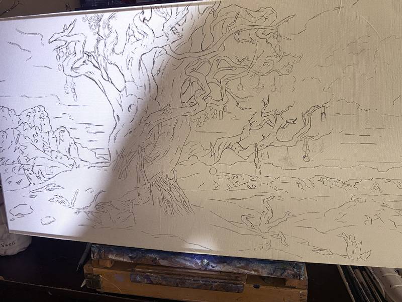
The tree is to be littered with the discarded burdens of those who are gone, dangling like wind chimes. People who wandered in hopes of finding others, stop here to die in companionship with the only living thing they find left: the tree. At first I intended this to be mostly canteens and water bottles, perhaps from across different time periods and cultures to capture the magnitude of what’s been lost, and leave out the shoes since shoe-trees might seem comical.
I like the environmental message in focusing on water, and running out of water, in this desolation. The goal of this painting isn’t as a dire warning about climate change, but when contemplating a dead earth, it is an uncomfortable, unspoken question that hangs in the air. Was it…because of us? Life won’t (can’t) last forever, and this painting is about the grief and quiet of that inevitability, not about how it came to be. But I think for most people, the ‘why’ will still tugs at us.
As I looked at shoe-trees, I saw a pair that hung perfectly side-by-side, where most usually dangle asymmetrically. They were like the shoes of a hanged man, the feet long gone. That’s somber enough, and complements my intent, so the shoes are back in.
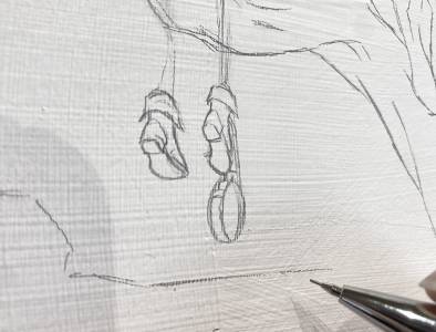
Shoes are back in.
I do my best work when using maquettes for reference, but I’m not sculptor and have never found a method that made it an easy part of my process. Using wire for tree branches was always very frustrating, leading me to try GravitySketch, Blender, etc when trying to make a model, none of which I liked. I just wanted to get into painting already! For this piece, however, I would slow down and give it all the effort it needed, which meant making a maquette.
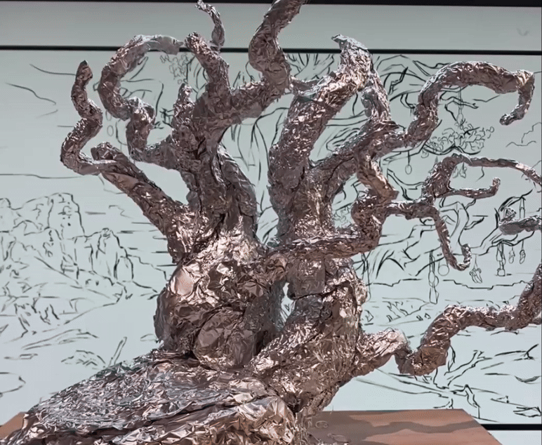
Over the holidays, I stumbled across a video of Kim Beaton of Weta Workshop sharing her use of tin foil and hot glue, and it seemed like a possible solution. It worked fantastically! The tree went quickly, the branches were stable and held their own weight, but remained flexible. I later coated parts of it with clay to get reference photos, but in the interest of time did not finish sculpting it. I hope to return to it and finish it eventually.
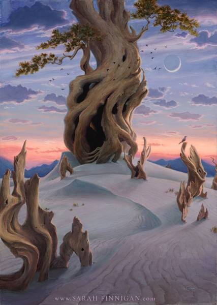
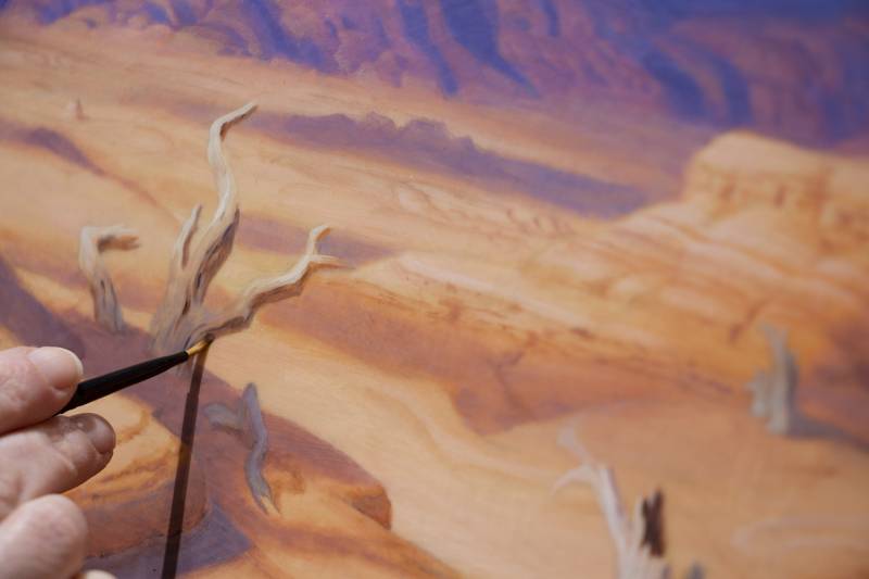
That concluded all of my planning work, and I was ready to move onto paint. However, Character in Context displays a traditional preliminary next to the final work, and almost everything leading up to this had been digital. I was tempted to complete the model as my preliminary piece, but I’ve been wanting to figure out drawing for myself. I thought it would be interesting to create an artwork that presented the process, instead of augmenting it to create an artifact in a way I normally would not.
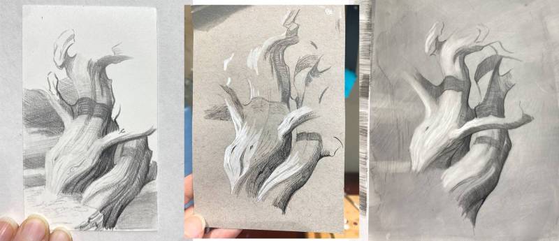
Testing out different approaches, paper types, etc
I’ve never really spent time with pencils or graphite, so I never figured out how to draw. I do loose gestural sketches in my sketchbook and a very utilitarian transfer drawing, and nothing in-between. It’s so important to take the time to experiment without presenting the results to the world, to allow yourself to finish experiments even if they’re not working out (yet), to copy a variety of styles, try different materials, and find what’s you. That’s incredibly difficult to make time for once you’re making art to feed your family. I’m grateful I was forced to take time learning to paint, but I never did that for drawing. I hope to eke out the time for it this year, starting with this.
I wonder what my drawings look like…are they line art and capture details, or will my edges sometimes be soft or lost, prioritizing the capture of light? What works better for landscapes? Do I do contour lines? Try graphite powder? Do I prefer smooth or textured or toned, or something unique like duralar, yupo, or limestone paper? Frankly, I’ll have to try them all many times and in many combinations to find out. For now, I played around on a few different types of paper and with a small variety of tools.
Drawing on Duralar, front & back
I found the duralar to be fun where the others were tedious. (Duralar is a non-absorbent polyester film that is transparent, allowing work to be done on both sides). If I brushed acrylic ink on as it dried, I could get an even coat, and use erasers to softly remove the ink and work back to white. One side holds all of the dark values, and the other all of the light. I thought I’d prefer the ink-side up, but seeing the contour shading with more definition turned out best, so my preliminary is a mirror image of the final.
From there, I mounted the sheet to a prepped and gessoed piece of wood. There’s a unique trick that I shared in Part 2 of my Acrylics article here on Muddy Colors, where I can erase dry paint without touching anything on an earlier layer. I’ve effectively used this to peel back the layers on a painting, exposing the drawing underneath the color study.
You’ll have to wait for the Character in Context show to see!


This is fascinating. I might have to try some of these steps to see how they work. The transition from black and white to color while still preserving value relationships is challenging. I especially loved seeing how much you played with color to get the right mood, and didn’t worry so much about the composition at that point. It seems very freeing. Thanks for sharing. I’m excited to see the finished piece!
Sarah, the iterative and testing part of the art process does indeed seem to get glossed over. Thank you for sharing the whole thing. As for plotting the color/mood first, then the design of the tree… I wouldn’t have guessed! And when you write the whole thing out, it is so much work and trial and error–but it does explain why your finished pieces look like *chef’s kiss*
“I’ve never really spent time with pencils or graphite, so I never figured out how to draw. I do loose gestural sketches in my sketchbook and a very utilitarian transfer drawing, and nothing in-between.” Wow! Yet the drawing looks great.
I WISH I could come see the show in Colorado. Hope it goes great for y’all!
(Also, yay Futurama reference!)