An illustration is like a movie: if there are too many special effects and explosions, the story seems to be less of the focus or sometimes even missing.
When you are creating an illustration, aim at the most important part of the storytelling, rather than shooting all over the place. Adding details and rendering everything to perfection is, for the most part, something you do out insecurity or lack of focus and control.
Tell the story, with as little sidetracks as possible, as little colour, elements and lines as you can. Use only deadly force when needed. Highlights are only for the important parts.
In illustration, it is all about the story.
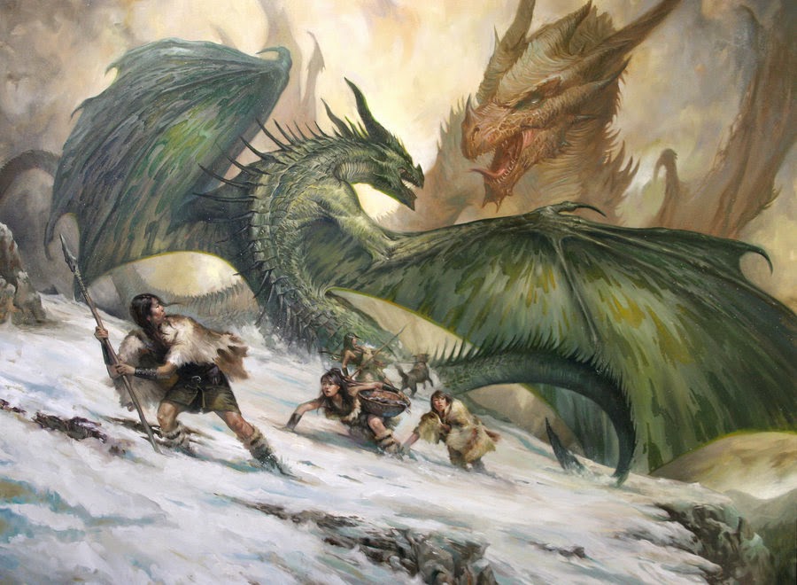 |
| Lucas Grasiano |
I have this painting by Lucas Grasiano in my mind. The painting has so much story in it that I cannot help to put myself in the situation of the fleeing people. Notice how he did not try to arrange the figures in a heroic pose or made them look pretty. They are story pieces rather than decorations.
I always go back to this painting and try to make up version of a scene like this, in my mind, that I want to paint too…when I get the time. A painting that keeps living in the mind after your eyes have gone to look again on real life.
I have one illustration for magic that I think sums up most of what I think a good illustration needs.
It is a thief/assassin spying through the window of a ship. The colours are minimal, the use of warm light acts as a spotlight for the focal point and the level of details is muted down and kept within reason by the use of the simple palette. All lines point into the picture either towards the face or the area between the head and the window, to frame the character.
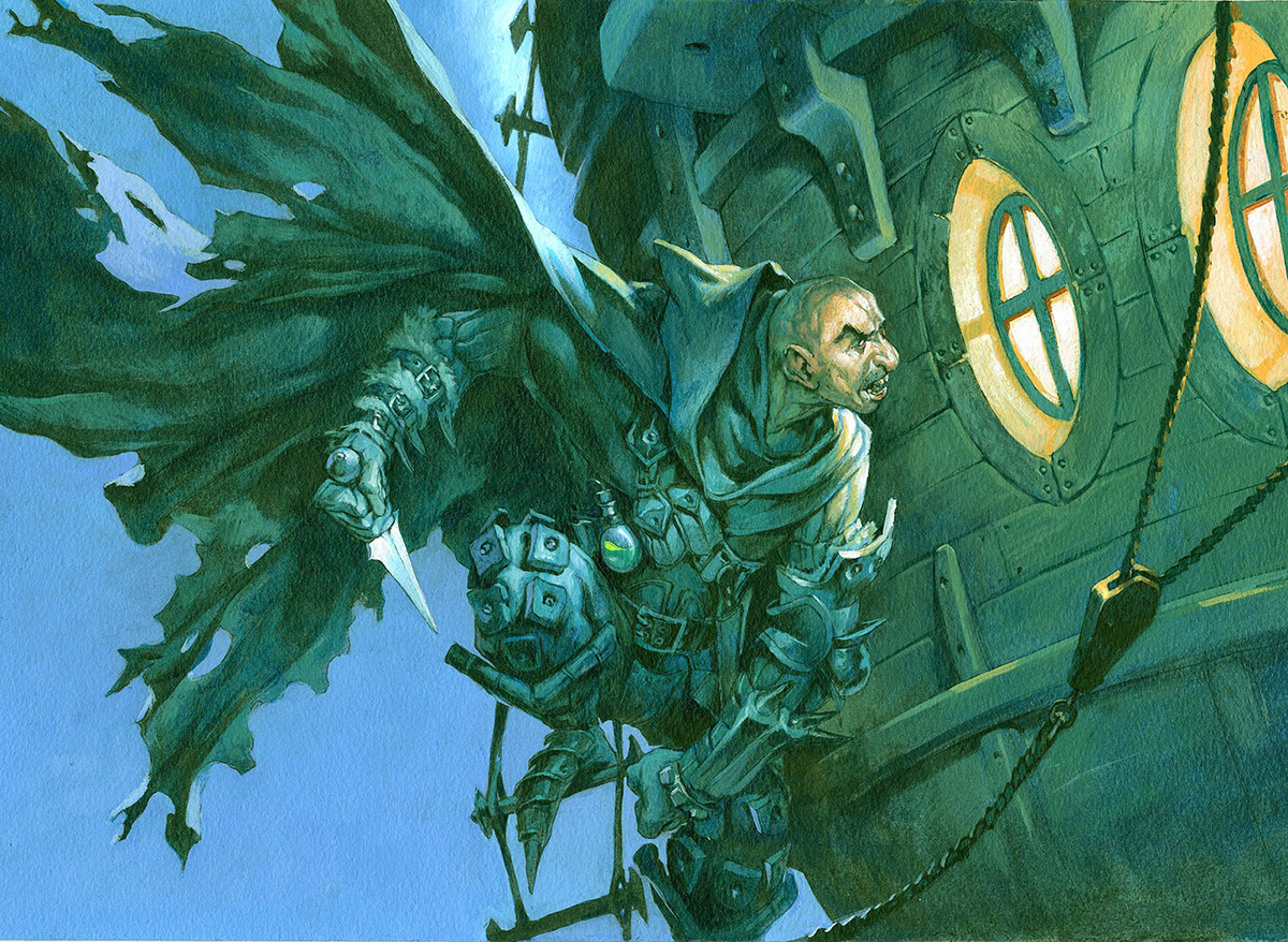 |
| Harbor Bandit – Magic the Gathering |
Just remember: If you can tone down, or even remove elements in your illustration, it lends so much more focus and power to the things that are left in.


Will try these techquies on my next piece. Thank you for the post.
I noticed in your illustration that you capes are always dramatic and right spot on. A thing I struggle with. How do you go about doing that, do you use live reference?
This is so damn true, yet so fucking hard to achieve.
“Less is more” as you can hear, but you have to be flawless on what you decide to show, or at least feel confident enough to go beyond this point of drowning your message into a detail storm.
I believe that is one of the reasons why it's so difficult to achieve (at least to me), sometimes it's hard to feel confident enough to go through this temptation.
putting details, or as you perfectly pointed “not try to arrange the figures in a heroic pose or made them look pretty” is a mental security, a comfort zone.
Thank you for this very informative post Jesper :).
While I agree with Jesper's opening points, that too many effects kill the image (the reason many digital stuff fail for me) and there needs to be a focus on the story, I wouldn't be too quick to go to the other extreme like you are Johan. There's a ton of images in the history of this genre that do the job as well if not better by using heroic poses. A complementary article to Jesper's could be written showing how with simple heroic poses the story or character comes across, without a need to do so much to tell a story, that doing more may kill it. It swings both ways.
He wants you all to Himself to put His loving, divine
arms around you. See the link below for more info.
#wants
http://www.ufgop.org
Oh I didn't want to sound that extreme, excuse me if i hadn't been clear michael 🙂 .
I am myself a big lover of heroïc poses in illustration and uses them a lot ( i mean a LOT! ).
When you're a young professionnal artists you want to make things looks nice before anything else, and telling a story can be a little bit out of the frame sometimes.
I believe it's the same with heroïc poses, with the obsession of making it pretty you can easily stay stuck into an heroïc pose when something different can bring a lot to your picture.
I think that a posing has to be on the right context if you want it to be efficient.
But i believe these are things that comes with confidence in your craft.
You have to let go the “this have to look good” feel to embrace the storytelling and the rest will come naturaly.
This is a matter of priorities.
I agree with you about digital stuff, i think that the nature of the tool make it easy to go into ctrl+/sharpen/textures forgetting the big picture but this is another topic ;).
Have a nice day Michael.
We agree Johan, context and priorities guide the decisions as to the posing,
lighting and whatever else may tell the story or not. Trouble is, many of the
products for which fantasy illustration in particular is available (I'm talking the
TCG and RPGs here) require too much of the posed thing. There's little space
for story in a card game, especially one with very very particular requirements.
Anyway…
Have a good one too 😉
I really love your blog there's a lot to share. Keep it up.Visit my site too.
n8fan.net
http://www.n8fan.net