 |
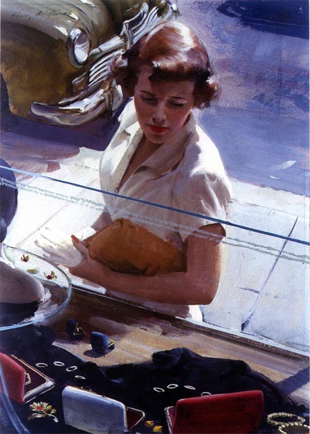
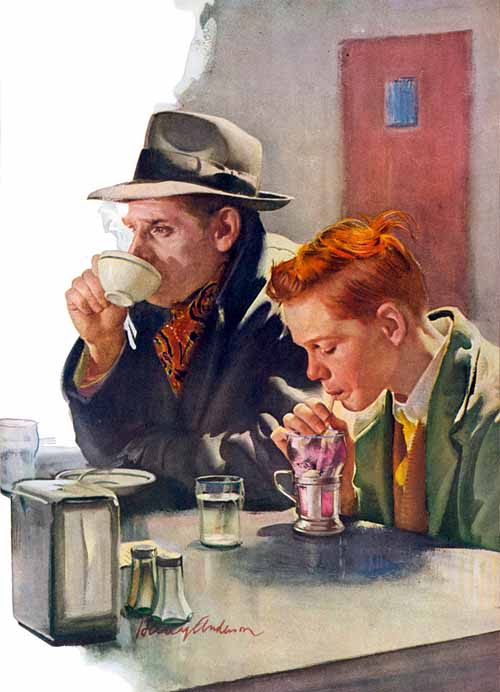
| I love the camera angle and the honesty of details in this piece, something I find in much of his work |
Harry Anderson (not to be confused with the illustrator Harold Anderson) ranks right up there with Haddon Sundblom and Mead Schaeffer for me, but maybe a little less well known. I first saw his work as a kid at church. Anderson was devout in his faith and did many religious paintings, and that is probably what he is best known for, but he did a huge amount of commercial illustration work.
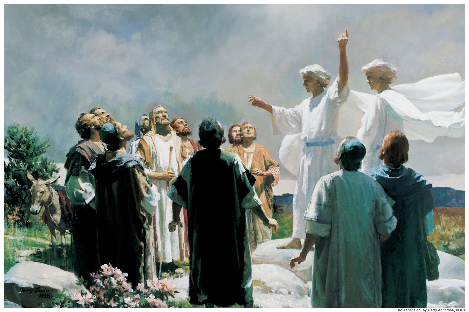 |
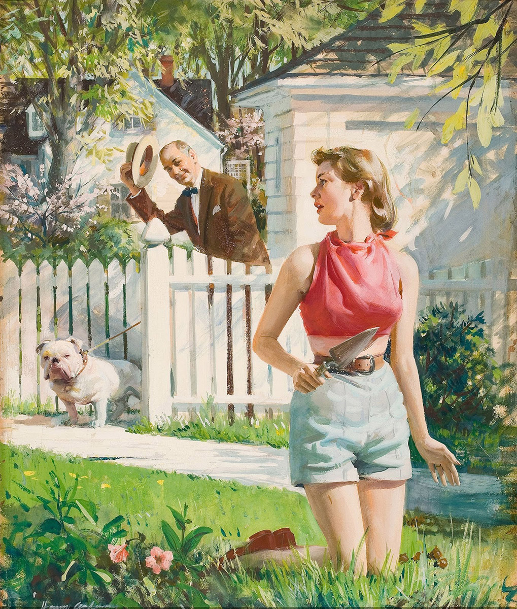
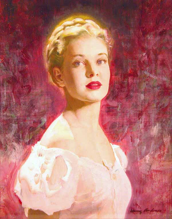
| This painting was one of the first of his paintings I saw as a child. I love this composition. |
Anderson did work for clients such as Exxon Oil, Collier’s, Cosmopolitan, Good Housekeeping, The Saturday Evening Post and more. He didn’t start out to be a painter though. His initial schooling was as a mathematician, but discovered his love for drawing while in school and switched to the Syracuse School of Art in 1927.
While in school, he was roommates with Tom Lovell (you can read about Tom here). Harry started painted with oils, but found that he had an allergy and switched for a time to egg tempera. It was a less forgiving media for him, but it made him more decisive in his work. Later on he painted with gouache and acrylics, but ended up painting many of his illustrations with casein. It gave Anderson some benefits similar to oil, but without the turpentine.
In the 60’s he was able to start using oils again with the introduction of alternate solvents to turpentine.
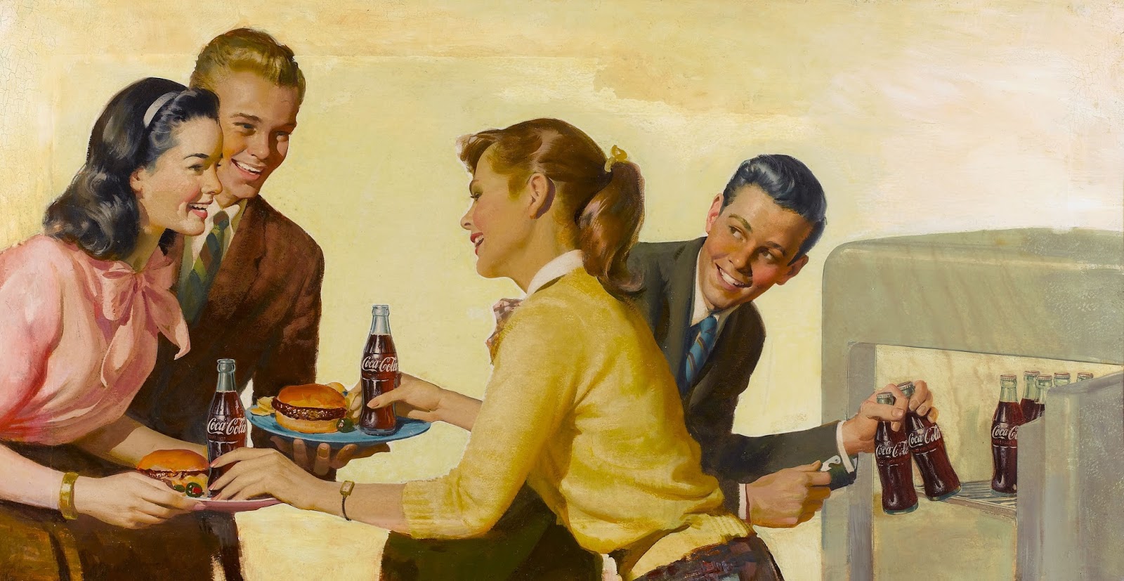 |
| Great Coke ad, reminding me of Haddon Sundblom, but I think there is nicer brushwork here. This looks like a casein or gouache painting to me. I am assuming casein since it was his working medium for so many years. |
Here is an excerpt taken from “the Art of Loose Realism” by Kent Steine that describes some of his working habits and palette. source
Harry would produce dozens of small sketches in casein creating a variety of compositional color and lighting possibilities. In completing a finished painting, he would refer to these as well as his photographs. They were in fact the blueprints from which all of his research and reference materials were created. After his preliminary studies, research, photography, and processing, Harry would purchase a new brush. This particular ritual was repeated every time he started a new painting. Hence, there was a massive collection of brushes in the artist’s studio at any given time. Standing at his easel, with photo or sketch in his left hand, he would begin sketching directly onto a handmade watercolor paper mounted on board, using a small round or flat sable brush loaded with a thin, watery neutral dark value. This preliminary sketch onto the watercolor paper was done in lieu of the customary penciled version employed by many artists. This was achieved by merely dipping his brush into a water/mixing bowl that was almost never changed. Harry preferring to replenish with fresh water when necessary. After time, the resulting effect was a soupy mixture of paint and water.
His palette was arranged in an orderly manner and was consistent from painting to painting. It was comprised of absolutely permanent colors, specifically: burnt sienna, burnt umber, raw umber, yellow ochre, cadmium yellow, lemon yellow, permanent green light, permanent green deep, pogany blue, cobalt blue, ultramarine blue, alizarin crimson, vermilion, show card white, (for absolute permanence). Harry never used violets, purples, or blacks of any type. For his darks, he mixed pogany blue and alizarin crimson or permanent deep green and alizarin crimson.
At this point he would begin to block in the mass shapes and forms as quickly as possible, concentrating on locating the correct hues and values. At these early stages of a painting, Harry used sable brushes of various size and shape. Later on as he began to apply the heavier more opaque brush strokes and passages, he used oil bristles. The next stage was to make any corrections to the drawing, value, and hues. The inclusion of detail began at this point, as well as the attention to edge definition and modulation.
Soft edges and shapes behind sharp forms or shapes create depth and volume. His process of blending paint was not limited to the more traditional methods or techniques. Harry employed a system which is sometimes referred to as the split brush or double load technique. This was done by dipping or loading a flat brush on one side with a color, then loading the opposite side of the bristles with another color. As he pulled the brush stroke, the two hues would automatically blend with each other. He used this method in particular for turning cylinders, such as a stocking on a leg.
I hope you enjoy the images here and if you are familiar with his work that maybe there is a new treasure or two!
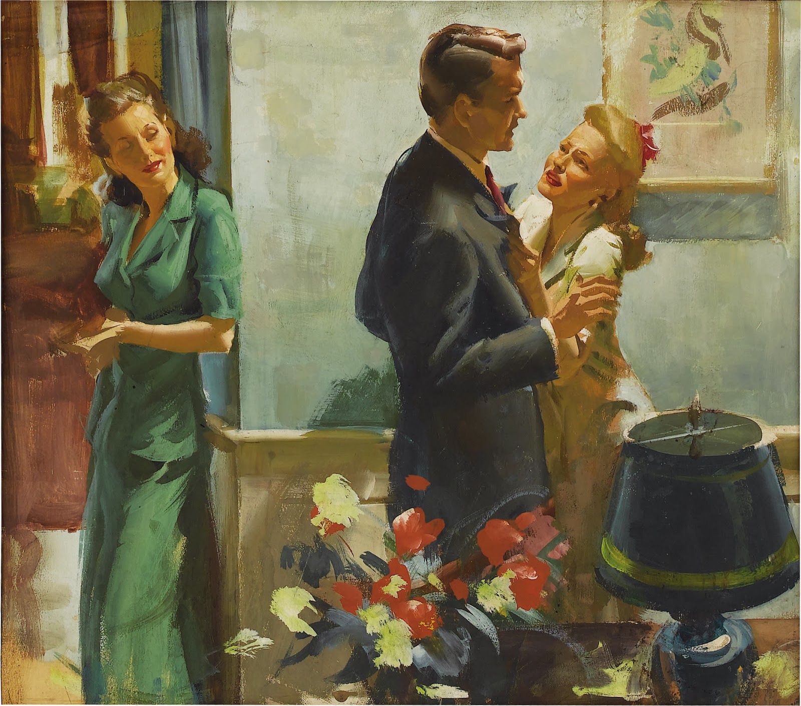 |
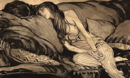
| I like the reduction of information in the face of the woman on the left. Just enough information is given to convey a great expression. This piece also appears to be a casein painting, but that is just my guess. |

 |


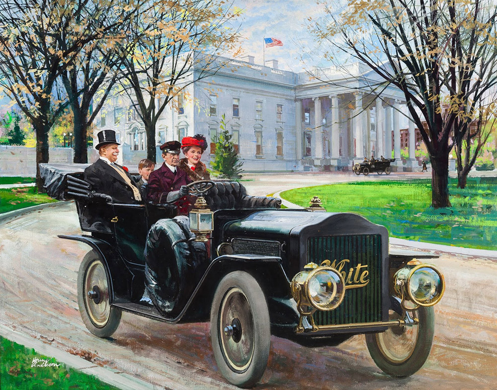 |
| Great details in the car and in the background. I don’t know the background of this illustration, but I suspect that it is President Taft in the car on the left. If anyone knows, please respond in the comments! |
Thanks for giving this post a read! For more information on Harry Anderson, here are some links:
I love his work. I saw that window shopping original once and it was amazing. I recently picked up a copy of his biography 'harry anderson, the man behind the paintings'
I assume it was originally sold in Christian bookstores since the majority of the images in it are of his religious artwork. He talks a bit about technique and his friendship with Lovell though and it also has a lot of pencil drawings that he did to illustrate the text. The book actually made me want to seek out his other books since the majority of his religious stuff doesn't seem to be online anywhere I can find at least ;).
Great work. That's awesome how much information there is on his working method. Thanks for sharing!
I loved his scene composition and color pallet, thanks for shared it. 🙂
Instagram – @rod_luper
I'm teaching a color foundations course right now. We just looked at this post. Thank you so much for the great post and great information!
One question: What is Pogany blue? I've heard of it before. Is this in reference to the artist? I did some quick internet looking and really couldn't find anything out about that particular color.
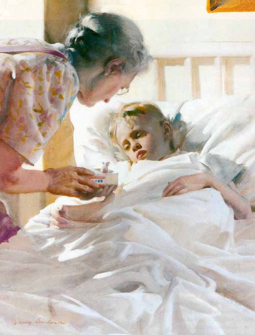
Thanks Howard. A lot of his pieces that I haven't seen before. I especially like the one of the boy sick in bed? (and what does 'grandma' have in that matchbox? Is it a mouse? Why??? I can't quite tell). That one reminds me a bit of one of my favorite children's illustrators, Frances Tipton Hunter – who works in watercolor, but looks a bit like Haddon Sundblom. Darling rosy-apple cheeks and lots of 1930's sweaters and dogs…
So, with regard to the presidential painting. Title is “The Chief Executive Goes For a Spin White Steamer”, Great Moments in Early American Motoring calendar illustration, 1909 http://www.artnet.com/artists/harry-anderson/the-chief-executive-goes-for-a-spin-white-steamer-et1fYfnArABwFFJoqbN5ZA2 Taft was indeed president in 1909.
Correct, it is President Taft. It was done for a Humble Oil’s 1967 calendar. The artist Peter Helck did three of the pictures for the project. In his memoirs he relates some circumstances about Harry Anderson and the Taft picture.
http://peterhelck.com/memoirs/memoirs.html — click “Part 2” and scroll down about 80% to see the part about Anderson.