Determining a camera angle to illustrate a narrative scene from a story is nearly as important as the choice of what precise content to illuminate. The point of view within an illustration can dramatically affect the viewers engagement with the concept as well as change its meaning. Importance of foci can also be affected by shifting the relative scale of mass/size between figures, objects and elements. Then there is cropping. Did I mention lighting? Oh, and color… SO much to consider! I just want to paint a good picture…
There is never a perfect nor correct way to choose the right composition and execution for an image. Rather the implied interpretation from the artist (and/or art director and marketing executives) t of the story is what determines the final perspective -figurative and literal – of the work. It is with a specific interpretation in mind that I approach many of my pictorial problems and attempt to bring clarity to my concept. Sometimes you have to cut away parts of the larger story to reveal and focus upon a more singular theme or emotion.
The clarity of the intent of the creator is what matters most. It is with that concept in mind that we should engage a work of art, decipher it, and then criticize. Far too often I hear critiques of a work recommending a change which is nothing more than a statement of personal preference – the face isn’t angry enough, change the perspective, turn the figure away from the viewer, etc… While these comments may be all valid, they tend to represent an alternative resolution to the image, a different path chosen, rather than adding to the integrity of the existing art, building to greater clarity.
Camera angle is one of those aspects of a work which goes unnoticed by many viewers and under used by many artists, but it plays an important part of the emotional and narrative clarity of a work. I credit my many years reading and absorbing comics and graphic novels as a refining source of dynamic camera angle viewpoints and story telling. Within a single graphic novel, a typical artist has to solve approximately 270 compositions, avoid repetition and keep the reader engaged. That is a challenge and a way to build experience with compositions!
Below are a few favorite camera eye viewpoints created to further the story within these projects:
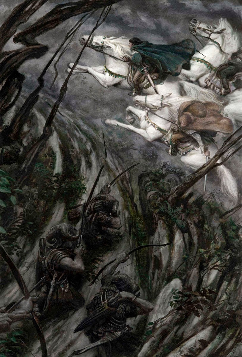 |
| Eragon – Ambush 18″ x 27″ Oil on Board |
Eragon-Ambush – I have placed the viewpoint within a wooded slope overlooking a path/roadway upon which the three elven horsemen are galloping. This aspect of the narrative is derived from the author’s, Christopher Paolini’s, own words. The upward movement of all action makes every vertical element fight against the downward pull of ‘gravity’, directed towards the bottom of the page. Every arrow and step of the horses is a struggle.
And while obviously an archer shooting downward has gravity to their advantage, my intent here was to show both the strain and difficulty the Urguls (the creatures in the forest) have in hitting a moving target and the desperation the riders feel in fleeing the arrows (which they finally succumb to as suggested by the hit on the back right horse.
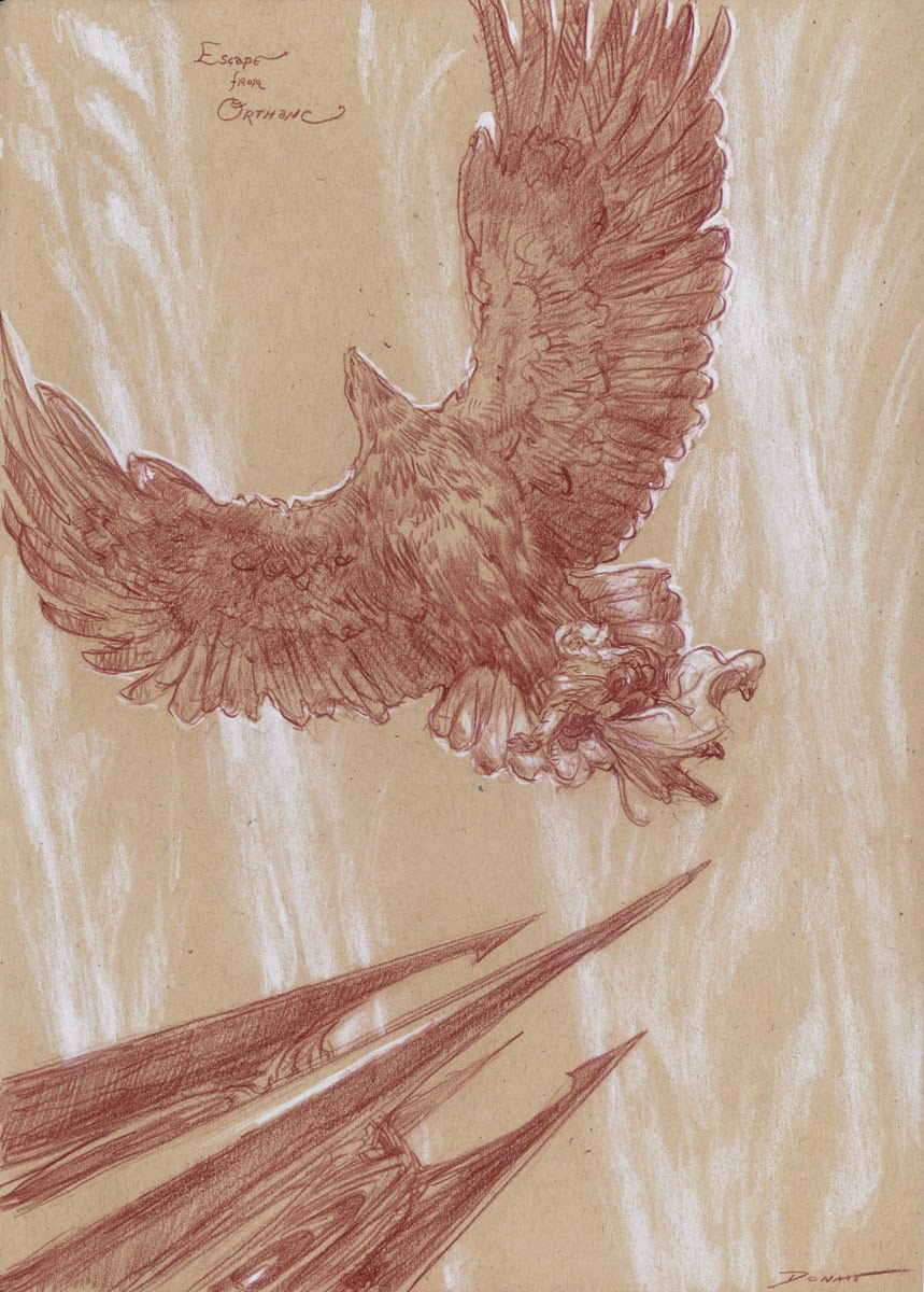 |
| Escape from Orthanc 8″ x 11″ Pencil on toned paper |
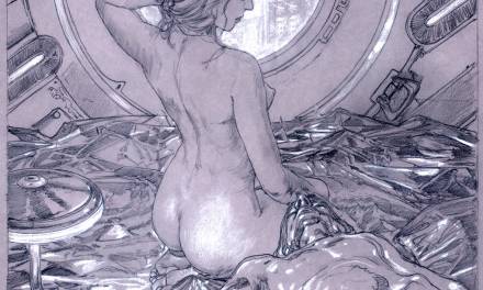
Escape from Orthanc – A fairly simple, but not always optional, upward facing camera angle. Viewed as if you were laying on your back near the base of the Tower of Orthanc. Even though gravity would be ‘coming’ at us, the tilt of the tower and upward thrust of the eagle’s wing implies gravity to be ‘down’ towards the bottom of the page. The compositional choice to not overlay the tower helps it to ‘fall’ away from the eagle and thus effecting Gandalf’s escape.
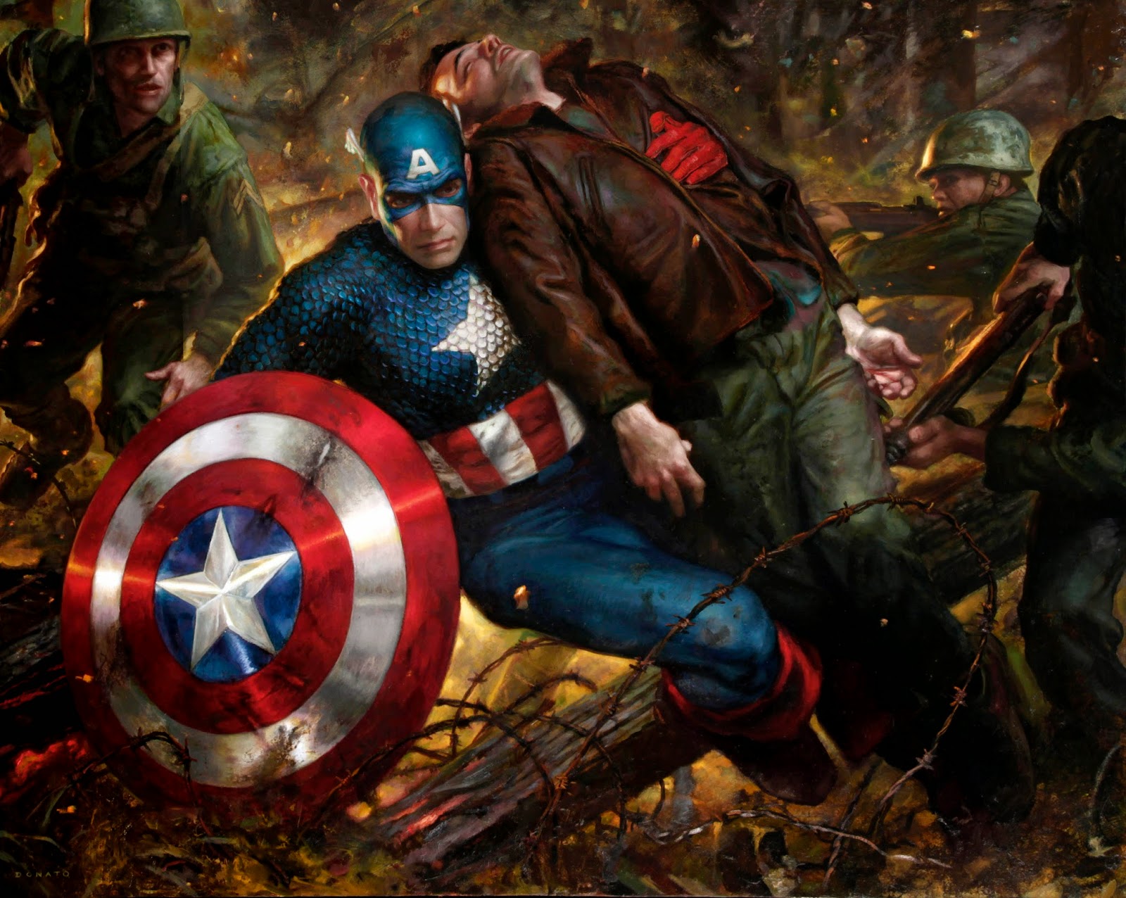 |
| Captain America : Duty 48″ x 36″ Oil on Panel |
Captain America : Duty – With a low camera angle, I place us on the ground in front of the Captain and a little below his eye level as if we are stooped down or in a foxhole, similar in action and point of view as the soldiers around him. We are one of the soldiers accompanying him on this rescue mission. The heavily cropped and overlapping figures impart an intimate feel to the image while at the same time chaotic arrangement of shapes, reinforce the uncomfortable feelings on a battlefield.
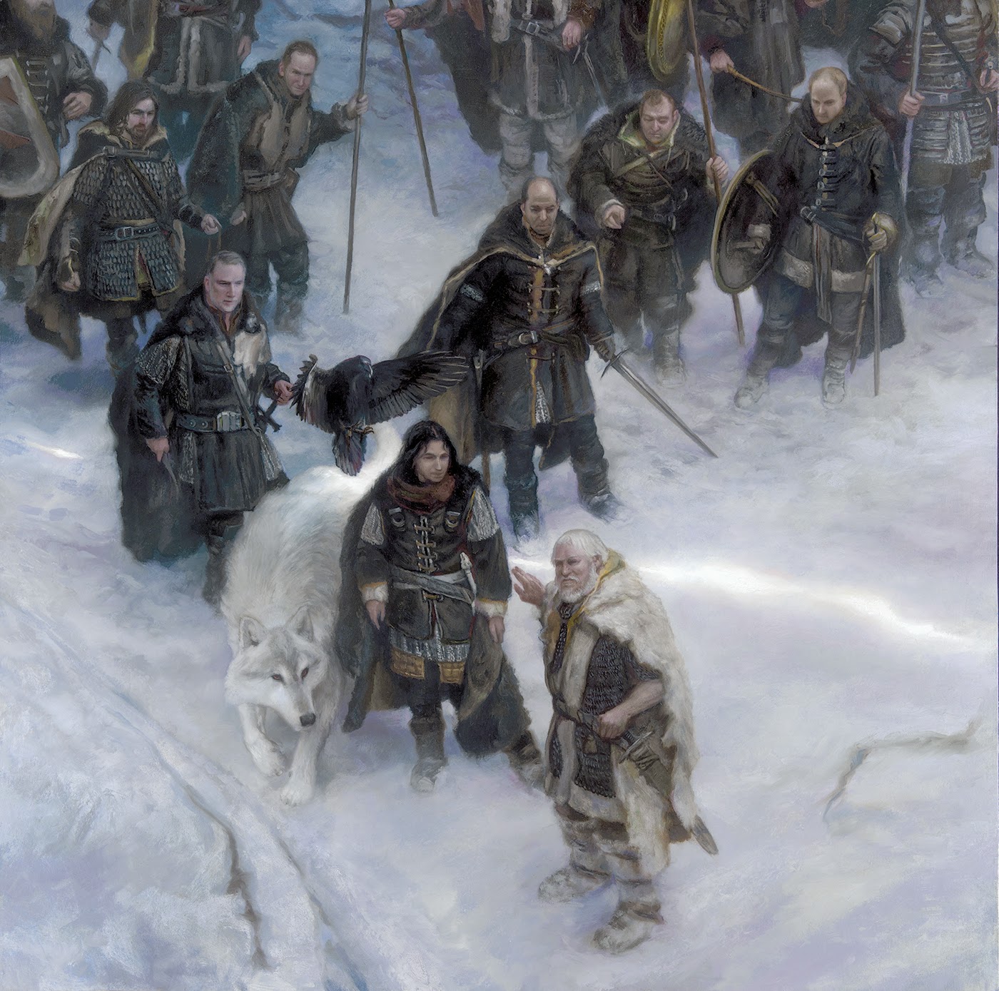 |
| Jon Snow and the Night’s Watch 30″ x 30″ Oil on Panel |
Jon Snow and the Night’s Watch – Floating a few score feet about the snow fields north of the Wall, provided the perfect view point to take in Jon Snow as Commander of the Night’s Watch in discussion with Tormund Giantsbane. The openness of the compositional bottom implies the continuous snow covered expanses of the North, while the line of black soldiers represents the Wall as a barrier to the North. The thin slice of sunlight suggests time is running out before the darkness of night and a coming change.
Thank you to all the comic book artists who helped nurture my developing artistic eye!


I believe camera angles are less used because reference is harder to shoot or come by. Do you have any tips as to shooting and researching and using reference at “odd” angles? I know this is an issue I struggle with and any answer would be greatly appreciated.
Watching good films is also an excellent way to enhance composition skills. A recent discovery for me has been the Turkish director Nuri Bilge Ceylan. His work is a reminder that film is an art form – a medium for self expression. Anyone interested in composing scenes should definitely watch a couple of his movies.
I always turn scenes around and around in my head until I find the right angle (and staging). It's second nature to me now, so I'm always a bit surprised when people comment on it. Being able to work without reference makes this a lot, well, quicker I guess, but whether you use reference or not it's an important skill to develop, so thanks for this Donato.
The easy answer, and therefore the hardest to execute, is to shoot your own reference. I am not joking. It is something I constantly am doing, thus providing my work with a unique approach on content. It take quite a bit of time to set up, light the figures and objects, but the payoff is later when the piece really comes together.
Too funny… I read this just as I took a break from working on a sketch. My big break-through was taking my composition (which I felt was lacking something) and simply doing a version from a higher angle and then a lower angle. So much better! As I type this, I'm thinking of the best combination of furniture to stand on so I can shoot my model from above.
Watch Cartoon Full Episodes 2015 :
Doc Mcstuffins Sofia the First Tom Jerry Full Games Episodes 2015