Welcome back for
Part 2 of our series on the craft of comics storytelling, and Happy
2015! If you want to catch up, you can find the earlier installment,
(Part 1) HERE:
So. Assuming you’ve been playing around with short stories and interpretive translations of prose to comics, this outing will discuss the dynamic versus the subtle strengths of comics. Again the goal here is not so much to teach the individual physical rules of comics (as any rule that can be broken is not really a rule anymore and all rules in comics can be broken), but to speak to the understanding of why and when to use them in telling your story. As a disclaimer, all of this is merely my own personal view and manner of approaching comics, and not meant to be a doctrine. I can swiftly list at least a dozen peers who would not agree with any of this, so grains of salt should be included. If this doesn’t speak to your way, please go find a path that does as it really helps to have a few exercises to take around the block before the plunge.
Comics do the fabulous very well. It’s a big reason why despite the forced ubiquity of them beyond their actual import, superhero stories work so well and are so dominate in American in comics. But with the shiny punchy cape books are a lot of tempting devices that will siren-sing you to shipwreck. Big angular panels, the ever present splash page, breaking the fourth wall and leaping from the strictures of the panel. Personally I look unkindly on nearly all of this kind of thing, and I think at this stage, you should as well. They are the comics version of the explosive set piece in every Die Hard movie and a button you should only press when necessary and when earned. A lot of bad comics try to hide behind these flourishes of color and insane storytelling trickery, but personally I think your time is better spent learning the nuts and bolts of the craft. Think of a Michael bay movie without the minimal plot and character development. There’s enough of that malarky out there, and if you’re going to distinguish yourself from the pectorally obsessed, work a bit harder to get the basics. Here are two basic categories towards this end:
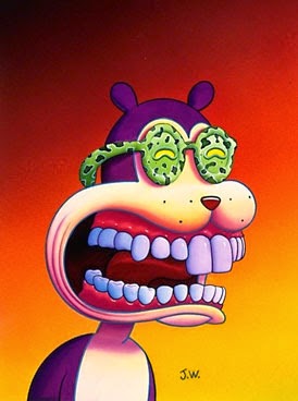
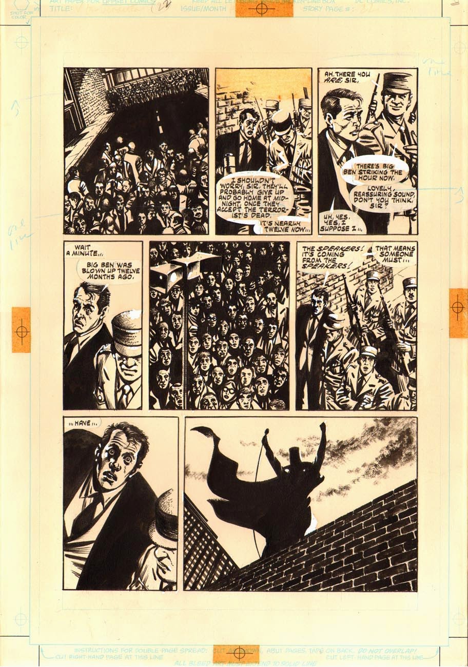
I often cite David Lynch or Roman Polanski as an example of this in film. Carl Theodor Dryer is another favorite, but their comics counterparts can be found in David Lloyd, Dave Gibbons, older Mazzuchelli and even weird as it sounds, Jim Woodring to name a few. The thing all of these storytelling masters have in common is an elegantly conservative use of dynamic trickery. Lynch and Polanski manage to make the slightest of off center tweaks to how they present an image that informs the mood and place of that image without being overt. The result is far more effective even if it’s hard to notice specifically. A room seen from throat level is a different room from one shot from a standard sit-com style eye level. Polanski’s most exquisitely weird and subtle film, THE TENANT is nothing but a catalogue of this example, using especially the close up not just for a scene of shock or reaction, but as a place to cram the viewer so close to the character as to be within his or her own psyche. Think of dynamic trickery as a firecracker: a single black cat, lit thrown too late and exploding brings a longer and more memorable moment of drama than lighting the whole string over and over again endlessly. If you’re going to utilize the dynamic tricks, surround them with more basic and mundane modes of story so they really stand out. A rose amidst a field of cobblestone is more meaningful than a single rose in a field of rose bushes. Use your boom-booms only when needed and they’ll reward you with a louder bang every time.
 |
|
LONE WOLF AND CUB
by Kazuo Koike and Goseki Kojima
|
 |
|
LONE WOLF AND CUB
by Kazuo Koike
and Goseki Kojima
|
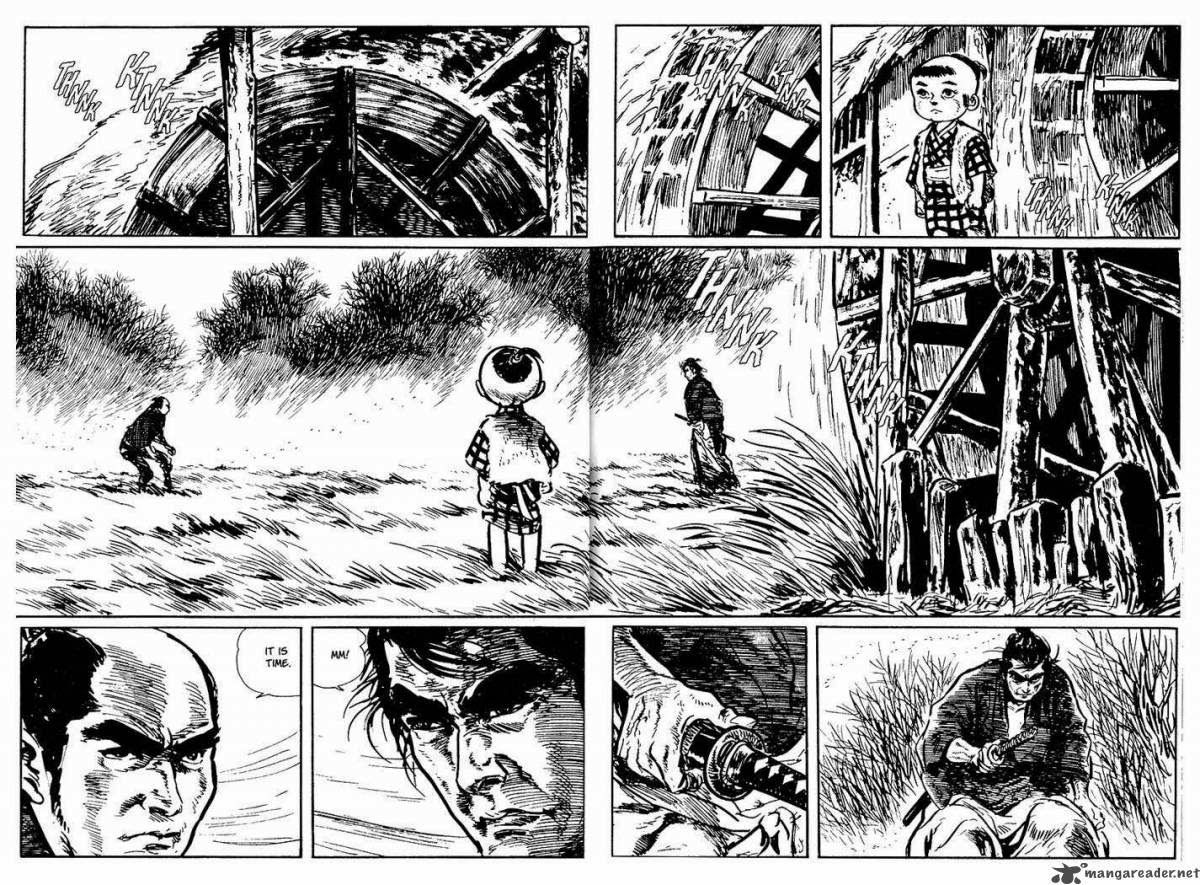
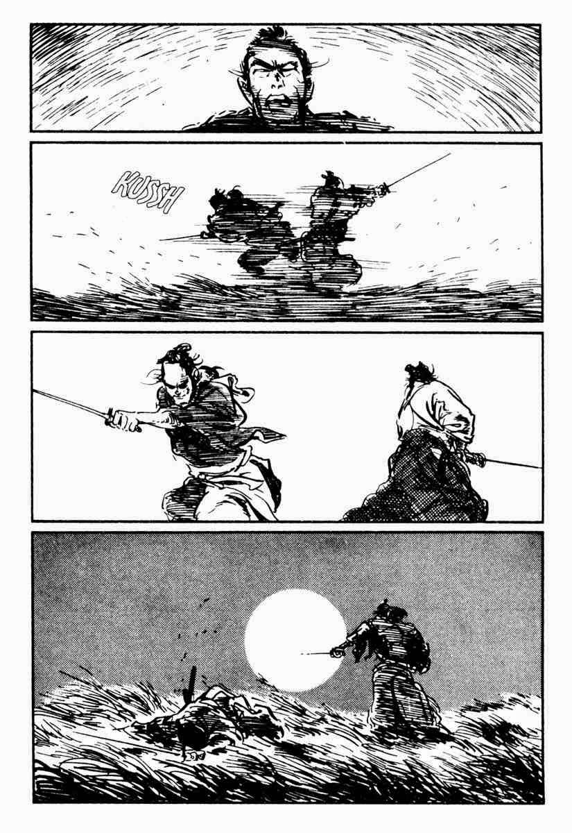
This is a lesson for those of you passionate about cape comics especially. This mostly surrounds the core point of superhero comics- the fight scene. Again I’ll refer to the the insanely important LONE WOLF & CUB series by Kazuo Koike and Goseki Kojima as one of the great expressions of this. Action scenes should be like music, and music contains movements lows and highs, variances and mundanities that make the song feel alive and unpredictable. As an exercise I would heartily recommend drawing a boxing scene, or if you feel like more of a challenge, a sword fight between two different types of swords and styles. Watch Raging Bull, study those scenes, note the way the fight is told. The same for LW&C scenes, most especially the big fight in the end that runs for hundreds of pages and never once bores. It’s not just about the punch in the face or the overused “Liefeldian O-Face-of-Infinite-Anguish”, it’s the way a foot digs into the sand, a knee locks in preparing to defend, the way a hand twists around the hilt, the sight focuses and sets its gaze before the coiled spring of action. It’s also about response. So many action comics in folios fail when shown at cons or to editors because they are all essentially a series of poses rather than a telling of story. When Ang Lee writes in his script for Crouching Tiger “fight scene” and leaves it at that, he’s not being dismissive of the need for narrative int hat scene, but a trust in his fight master, Yuen Wo-Ping to deliver it perfectly. Every hit should have a reaction and a response. Even ignoring the hit is a reaction. I’m a particular fan of the Indiana Jones school of fight scenes: a series of miscalculations, powerful thrusts and lucky accidents ending in victory from exploiting a sudden opening than because of any perfect mastery of fighting. Jones fights rough and clumsily. His punches sometimes miss and provide by sheer accident the opportunity for success than as a result of skilled planning. He wins be being clever than by being strong. It makes these scenes impossible not to watch. Conversely in the final scene where Love Wolf fights his nemesis, the insanely high level of skill they share creates a similar dynamic- in these instances, such a high level of skill means victory can only come from the smallest errors or sacrifices in strategy.
 |
||
| from THE LOST BOY |
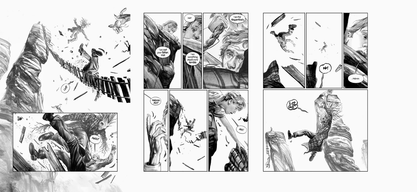
Think about action as music, plot out the scene as if it were a mini story unto itself with a beginning middle and end. Try setting up a moment of obvious victory by turning it on its head. Much like the craft of suspense of good horror narratives, think about the assumptions of the audience and flip those. A technical trick would be to tell a fight scene without ever really showing any kind of full bodies splash page moment. Get in close, show faces, pull back and show places. Adjust panel sizes and exploit the physics of tall and narrow panels against the long wide ones that feel more at rest. Give us a twisted foot, an arm torn open by a weapon, a favored stance responding to injury. Fight and action sequences will, if done right, gobble up more pages of the story than almost any other kind of scene. They are always the hardest things for me to do and take longer than any other type of scene to craft. When I was working on THE LOST BOY, the big set piece fight on the tattered rope bridges at Harker’s Drop provided as much opportunity as difficulty. It was essentially a wide open and vast landscape that also severely restricted movement due to the narrow bridges and tony footholds on the rocks. The need to consistently fortify a sense of vertigo and danger from falling on top of the actual conflict was extremely tricky to manage and relied upon achieving a level of gravity- (but we’ll get into that in the next section). My children’s picture book, COMING HOME is in and of itself an entire act of coordinating a single movement of action from the explosive burst of the boy running, through the emotional ups and downs navigating the crowds to the final crash into his long absent parent, and is to date the hardest most involved children’s picture book I have ever done as a result.
 |
| from CONAN: BORN ON THE BATTLEFIELD by Kurt Busiek and Greg Ruth |
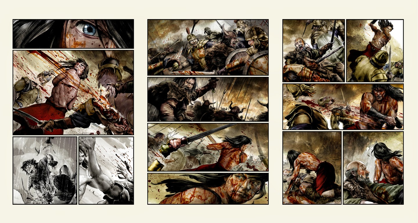
With Conan, the necessary variances of wide swings and chops of Cimmerian broad-sword fighting versus the shorter pig-sticker thrusts and parry’s of Aquilonian short sword forms was a likewise difficult exercise to tackle. But those kinds of subtle variances will always lend a deeper sense of place, character and trust from a reader, even if those variances remain subtle and behind the scenes.
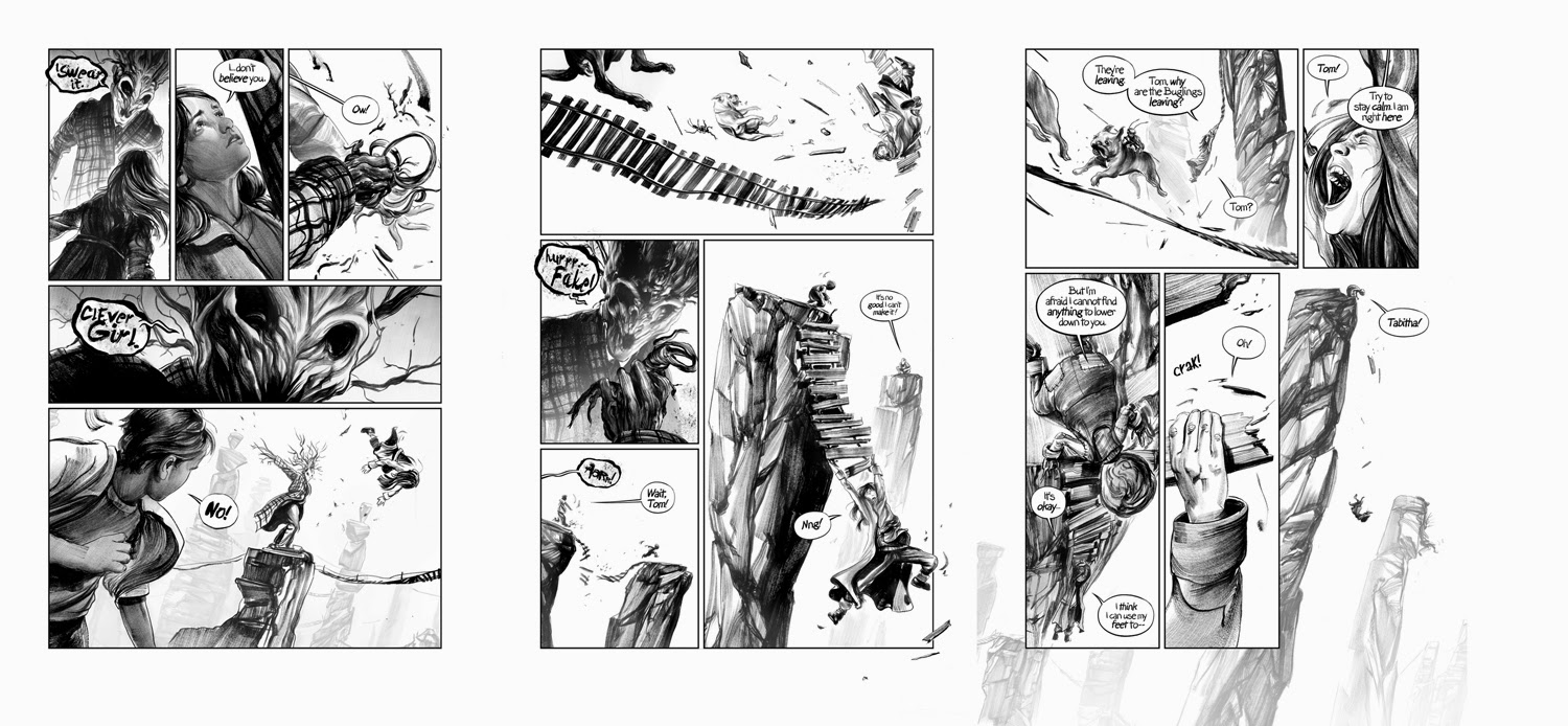 |
| from THE LOST BOY |
The best rule as taught to me by my good friend and former editor, Spencer Lamm, was that every single panel of a comic should tell us something new. I’ve never found this to be false, especially if you broaden the spectrum of what “new” means. Each panel is an opportunity to tell us about the moment, the world, the character or the story. Forgetting this means you end up subtracting from all of the above. Pay attention to your normal tricks, and don’t over use them. Tray to tell even insane action scenes without angled border panels or breaking the regular lines of the panel structure. If you can make something exciting under those circumstances, you won’t need those visual crutches and your tale will be better for it in the long run. Woodring’s FRANK is one of the most well told and effectively weird comics in all of human history, and yet he never once breaks from his grid structure or his panel rules. If he doesn’t need to do it, neither do you.
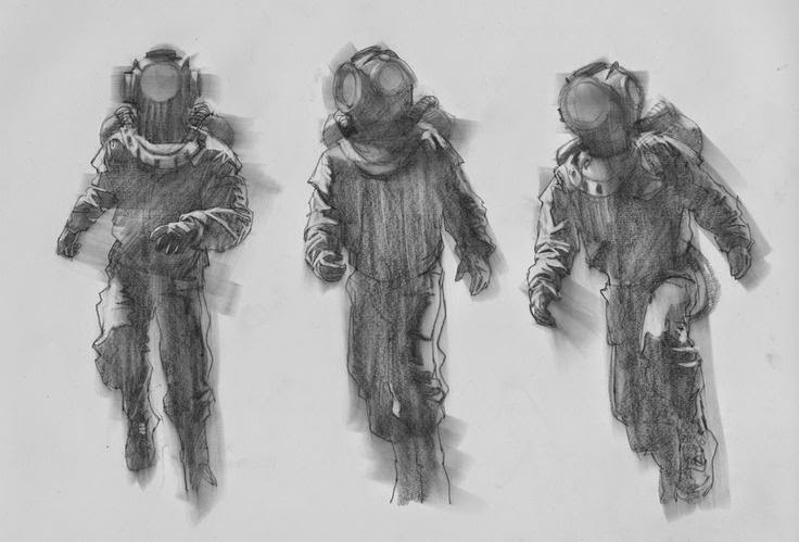 |
| Greg Manchess |
One of the biggest errors made by up and coming cartoonists and comics creators when looking at say, Chris Ware, Charles Schultz or Bill Waterson is to mistake their simple efficiency for simplicity. It’s easy to look at Jimmy Corrigan’s round head and polka dot eyes and think if you can just do that, you can tell a story. All of these folks, each and every one is a master of formal drafting and painting. Look at any of their sketch books and non comics work and you’ll see they have been classically trained in figure drawing, landscape, light color and design. Their efficient simplicity is a result of learning the rules of complex formalism, and then consciously dismissing them and boiling it all down until the perfect single note is found. You can’t apply and dismiss a rule unless you learn it first. So, get thee to a figure drawing class, and study anatomy and classic painting. Learn color and light from the oldest of masters and practice practice practice. There is no better and more available opportunity to learn all of this than in figure drawing. Not just nude models, but in walkabout everyday circumstances. Capture the way a sleeve crumples and folds at a bent elbow, or a skirt whips around a leg while walking. Study the seams bulging of a sneaker under the weight of a foot or how a hat sits upon the head of its wearer. The human body is one of the most difficult and complex machines you will ever draw and while some have a natural talent for it, talent is not required. It’s a craft anyone can learn, so learn it.
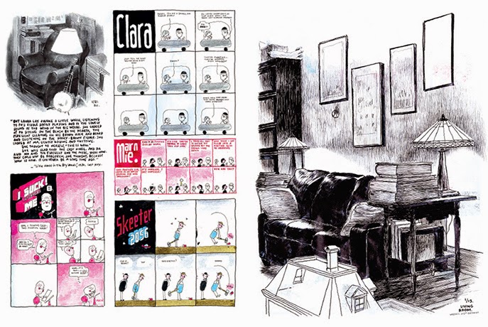 |
| CHRIS WARE from his sketchbooks |
One of the key ruins of comics narratives is when you interrupt, quite by accident, the flow of the story to a poorly drawn figure, and awkward neck turn or a wonky hand. When in doubt get a mirror and check yourself, or take your drawing and hold it to a mirror. While we are not in reality perfectly bilateral, this will quickly show you weirdo anatomical mistakes that your regular way of seeing will miss. Mike Mignola’s iconoclastic figures follow their own anatomy but they never break from their own rules. Likewise the anatomically expressive figures in Disney’s 101 Dalmations can teach you a ton about the rules of anatomy: long impossibly bony fingers and arms that never bely their impossibility because they are derived from an intimate understanding of response human anatomy.
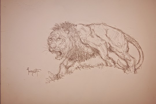 |
| Frank Frazetta |
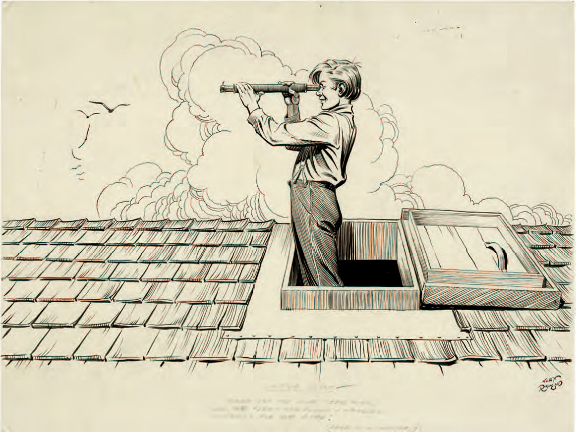
One of the hardest things to convey is a sense of weight to a drawing. It’s not just the foot touching the ground, it’s the way a foot flattens under the weight of it’s owner, or the way the earth buckles or sinks in response to that weight. A human form stepping on its right foot looks very different throughout its form as one using its left. I’ve found studying horses, lions and especially climbing panthers to be extremely helpful in learning about the effect of gravity on a figure.



Greg, you keep writing articles like this and you're going to have material for a book.
I don't draw comics, but it is easy to apply this advice to a single panel image. Thanks again.
Thanks- Yeah I really think nearly everything here and any advice surrounding the craft of making comics can be imported to other mediums. The lessons and knowledge gained by mastering comics is nearly universal and will backfill into surprising places indeed. Currently I'm planning on running this series for a full tear- 12 articles. Though interspliced I am sure, with other topics as they come up.
Thank Greg for this article… Now I know exactly what I should practice to become a better artist 🙂
Well crafted and well written Greg. The time and effort it takes to put information like this together is truly appreciated.
Thanks again- glad it makes some kind of sense. I gotta confess though these are less an exoression of long pondered and pored over dissertative theoreticals as they are just random notions jotted down in freeform writing. More like bees snatched out of the swarm in my head and pinned to wax. One of the things i both love and am exhausted by in comics is that all these and forthcoming issues are ever present while making them. It's a memtal gymnastic exercise that can lead to overthinking and stiltification if not watched carefully. Whatever dictates I espouse are speaking as much to myself as to everyone else. I do think that while mechanical step by step guides, sort of like make-your-own-comics starter kits, while desired by many are not particularly helpful to someone taking comics seriously. There's a lot more to explore and learn by shoving your hands in the mud and getting dirty than by following rules and exercises. There's a eletro-mechanical aspect to comics I really appreciate: you can glue a bunch of crazy stuff together that should even be in the same room, but sometimes they make the light come on anyway. You always know it's working simply by seeing it work. It's very rewarding if not unforgiving in that way as far as creative mediums go.
I believe that this kind of “how to” is much more helpful in the long run than a step by step tutorial. We see too much of the step by step evidence online. This is also what I believe in when it comes to teaching. Laying out possibilities, motivating, and massaging.
Exactly right. Plus I honestly believe that while it is an entirely good and helpful thing to ape another's process as a way towards parsing out one's own, the best comics come from a more individual personal weirdo way. But this is a lone of approach not necessarily suited for Marvel or DC cape stuff. Those books do require a certain schooled and specific manner to best service those particular brands. I turned down a big Batmen gig years back because I could see I just wasn't qualified to take on that particular kind of narrative given its requisite laws of physics. A least not in a way they really needed or I am sure, the readers of the book wanted.
I am glad I found your blog, I will return.
Cross Fit RXD