One of the projects on my desk is a book with scenes featuring a lot of…. green. In gardening, textiles, and decorating, green hues flow for me. I incorporate them generously so much so that I think of green as a neutral color – a backdrop of life on Earth. But this romantic thought comes to a screaming halt when I’m planning a composition with a lot of green.
When I’m stuck with a problem like this, I usually head out to see what solutions I can be inspired by with a trip to my bookstore. So come along and let’s see what I find.
Naturally, I started in the SFF section looking for green. Green is an iconic color in SFF. It’s funny how a color that is so present in our lives, is known for looking otherworldly. I suppose when a storm or tornado makes the lighting feel greenish, we do feel a little like we are on another planet.

That day, not much there was helping me with my problem. On to children’s and young readers. Where I feel the green is calling…
Green is everywhere and nowhere at the same time… I’m hunting illustrations where the dominant color is green.
The tinted green, or kelly green on the cover of Heartstopper is a hue I’ve seen in fast fashion the last few seasons and it’s sprinkled throughout the store. You’ll see it in the background of some pictures. I appreciate the addition of red on the shorts and dappled on the map. In the illustration I’m planning, I also have aspects of red.
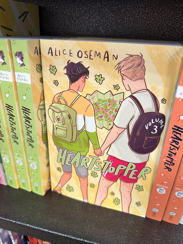
Green and red are opposites on the color wheel, making them vibrate here. Complimentary colors can be an anchor for a palette and often where I get stared. Red and Green can be tricky though. I’m not getting any Christmas vibes on this cover – which is great. I’m also noting the red in the shorts leans a cooler red.
I like the red-orange tint, or some might describe this color as “coral” on the spine next door. It’s in the red family too. Pink touches on the map and skin ties in the family of reds. The yellow bridges all the colors together. Yellow is one part of green, one part of coral and the background color here though the overall vibe to me, is green. Well done, Alice Oseman.
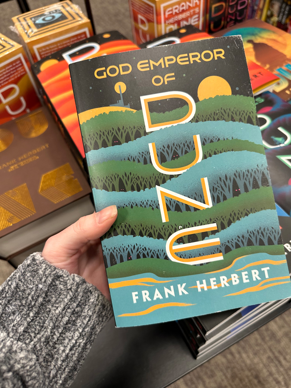
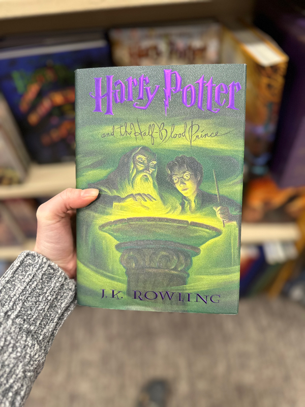
When I talk about iconic SFF green, this is what I’m talking about, Mary GrandPré does it with flare. An option, though not an appropriate palette for the job I’m on.
The wonderful thing about green is that the cool-er and warm-er variations of green are fairly easy to work with. In warm light, green brings on more yellow, which is easy to pull from green. Cool light on green objects will have blue-greens, it feels very natural I think for most artists when mixing. Blues feel natural to use with a green palette. It’s a beautiful coincidence… as it is the next color we see the most out our front door. Green and blue.
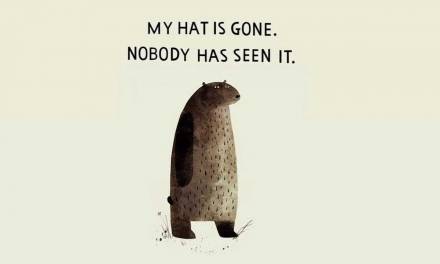
Oh hey, who did this one?
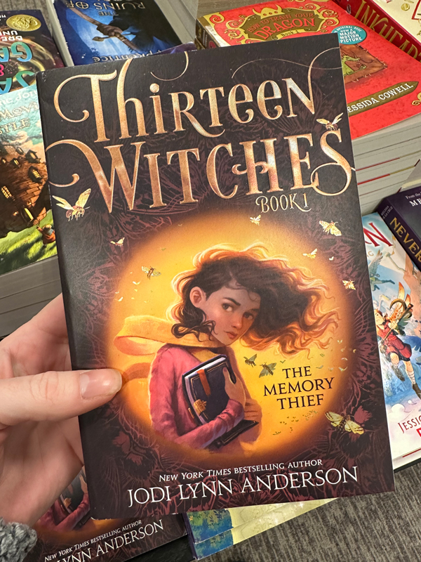
Memory Thief is out in paperback. Trips to the bookstore are usually how I find out how my covers are doing… and it’s great to see!
Anyways, back to the project at hand. Green.
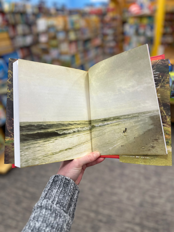
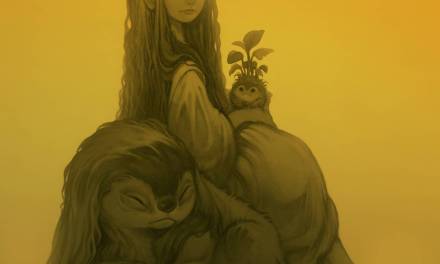
The Eyes & The Impossible… show-stopping. Illustrated by Shaun Harris.
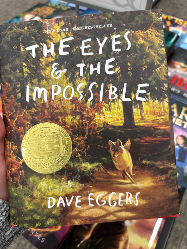 An explosion of green. You can feel this scene because of how closely they nail value and spot on with native color. Among the grey, the more saturated greens shimmer throughout.
Sigh….

I had to hit my home book collection to see what else I might find that would help me approach this project.
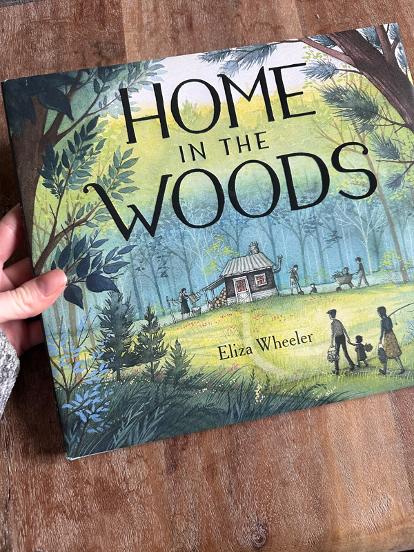
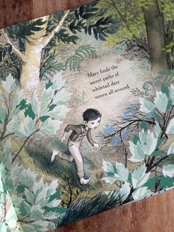
A look at author/illustrator Eliza Wheeler… Home In The Woods, I remembered there were greens but I forgot about this spread. How could I?
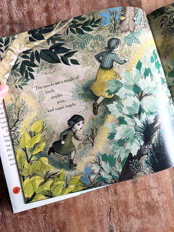
I find it strikingly inventive. The cooler and warmer greens are used throughout. The cooler blue-greens are less saturated, and the warmer greens, the more saturated yellow-greens, which some might describe as “lime green” are woven together in a way you truly don’t see often. I love it. I especially enjoy how the yellow-green was carefully chosen for the skirt of the character. This is where the artist, is creating repetition and harmony with both warm and cool greens in this big spread.
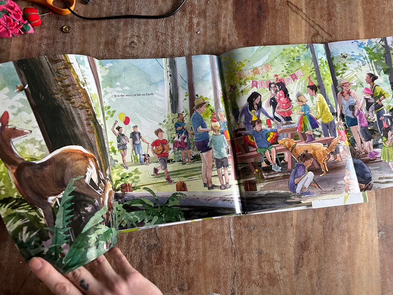
Another book I dug around at home for…. Making More by author/illustrator Katherine Roy.
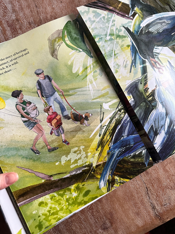
Talk about a big spread. Here’s what I love here…pink, purple and red. Pink and purple relate closely to red, green’s complement. Too much red among the figures would have been, just that, too much and not the focus.
The dark blue-greens are restrained in the foreground and warmer in the back. This is more of the classical approach of warm and cool greens. Roy creates atmospheric perspective by isolating the temperatures between the planes. The foreground is cool, the mid ground warm (see the yellow-greens,) and the way the background is desaturated blues and blue-greens.
I’m inspired, are you? I hope if you can’t get to your library or bookstore these pictures will inspire you. If you are interested in learning more about green, or you have a green problem of your own, I highly recommend these two links.
James Gurney – The Green Problem
Kristine Poole – Keen on Green
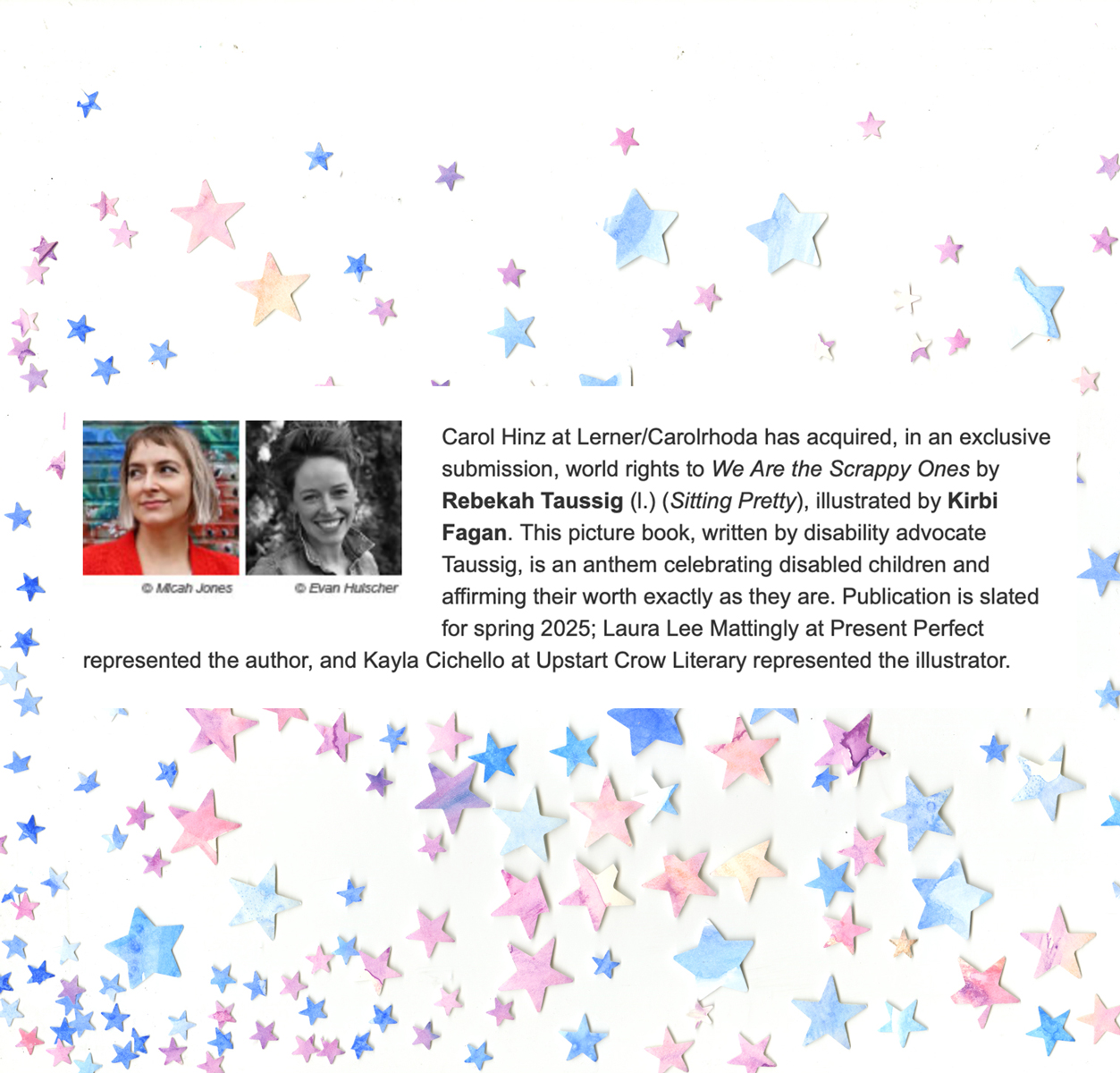
Lastly, I wanted to share with Muddy Colors the great news about a new project of mine…
Good luck with the greens and stay out of the mud.
Smiles,
Kirbi

Recent Comments