This month I’m taking a break from my Freelance Finance series to share some process science!
Recently I’ve been testing out traditional techniques that allow me to work in layers, similar to my digital process. I previously wrote about using laser print transfers, and today’s post looks at layering colour pencils with acrylic mediums (and grounds).
This technique came about because I wanted to use acrylics and laser transfers as a base layer, and then draw with colour pencils on top. Matte medium and acrylic paint will take some amount pencil, but the smooth, non-porous surface makes it difficult to build up layers of shading. What I really wanted was some sort of transparent ground that would allow the layers underneath to show through, while also making the surface suitable for pencil. Enter: clear gesso and Liquitex ultra matte medium!
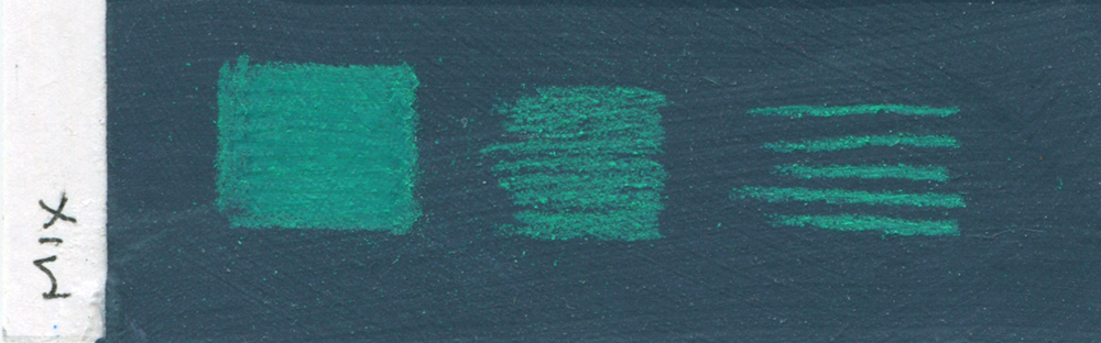
Here are some swatches to show how colour pencil behaves over these mediums. For each of these, the medium was applied over an acrylic base colour, with Derwent Studio pencils used on top:
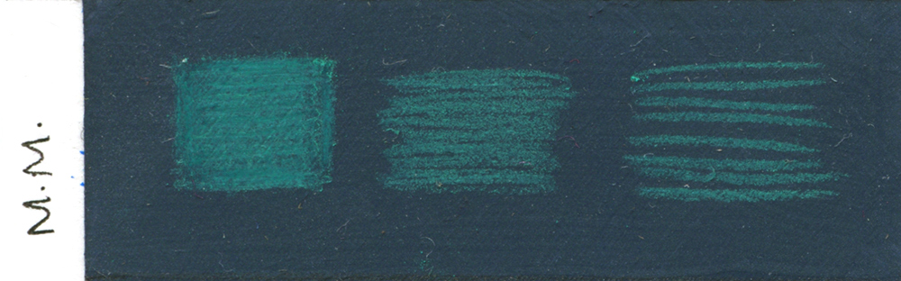
Regular matte medium.
Regular matte medium (and acrylic paint) can take a small amount of colour pencil, but the plastic-y surface makes it difficult for the pencil to adhere. As a result, the colours are dull, and it is hard to build up shading without the surface becoming weirdly smudgy.
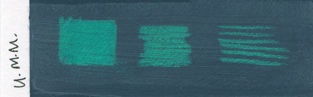
Ultra matte medium.
Ultra matte medium on the other hand, creates a smooth but chalky surface that is extremely pleasant to work on. There is not much visible texture, but the added grit in the medium gives the pencil something to hold onto, so the colour comes out richer, and you can achieve a very even tone when shading. I would say this surface is akin to hot press watercolour paper.

Clear gesso.
Clear gesso similarly provides something for the pencil to adhere to, but creates a rougher, more pronounced texture. If the surface of ultra matte medium is comparable to hot press watercolour paper, clear gesso is the cold press counterpart. Because of this texture, the pencil lines are not as crisp, but it does allow you to build up shading, resulting in more vivid colours.
Equal parts mix of ultra matte medium, clear gesso, and airbrush medium.
Lastly, I tried a mix of equal parts ultra matte medium, clear gesso, and airbrush medium (UM/CG mix going forward). This is the best of both worlds – a slightly more subtle texture than the clear gesso, with the buttery-smoothness of ultra matte medium. Airbush medium is optional, but it makes the mixture more fluid, preventing streaky brush marks.
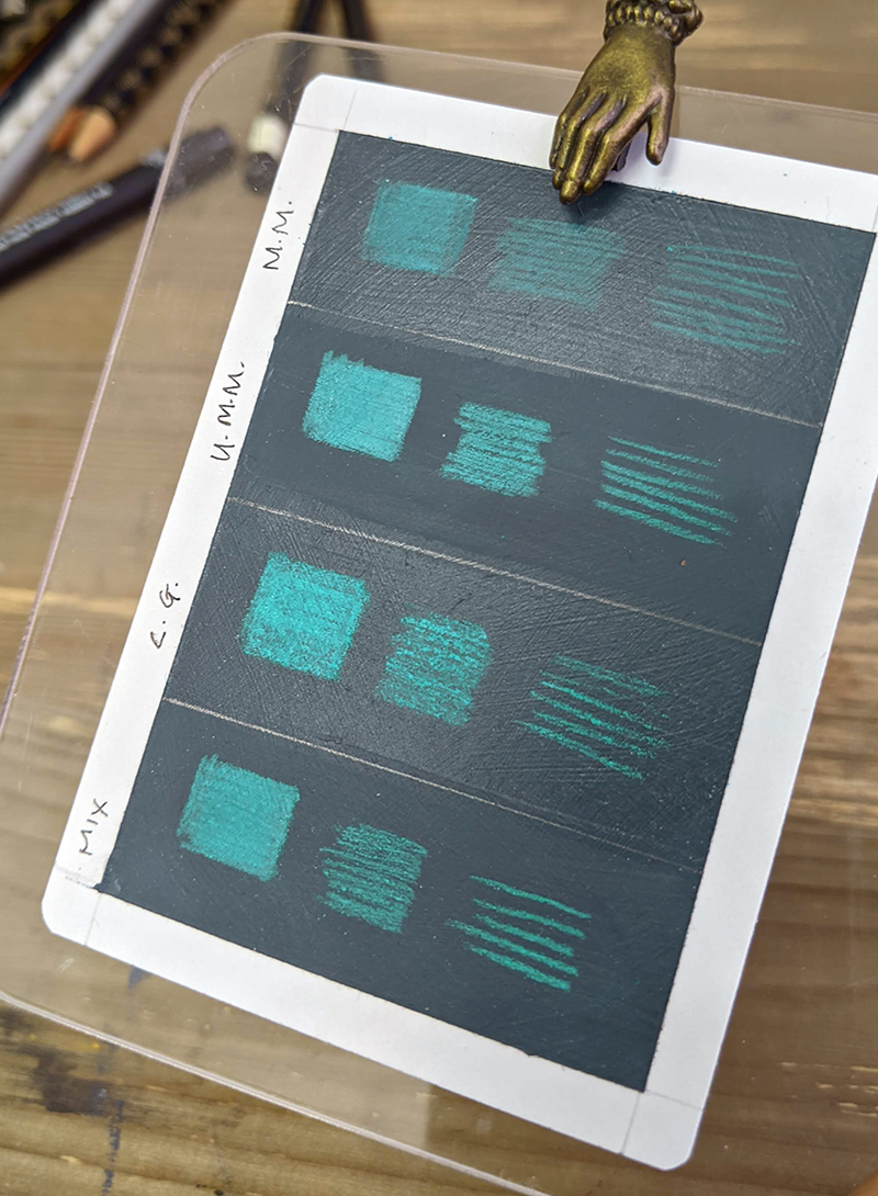
Photo of swatches showing difference in surface texture and sheen.
I am partial to using the UM/CG mix in my initial layers to build texture, then using pure ultra matte medium for subsequent layers. Beyond using them as a transparent ground, these mediums are also effective when used on top of pencil. If you’ve worked with colour pencils before, you know that there are only so many layers you can build up before the surface becomes waxy, and will no longer take more colour. Workable fixative can help, but layering opaquely, especially from a dark to light colour is still difficult. These problems disappear when using ultra matte medium (or the UM/CG mix) in between layers! See these example swatches:
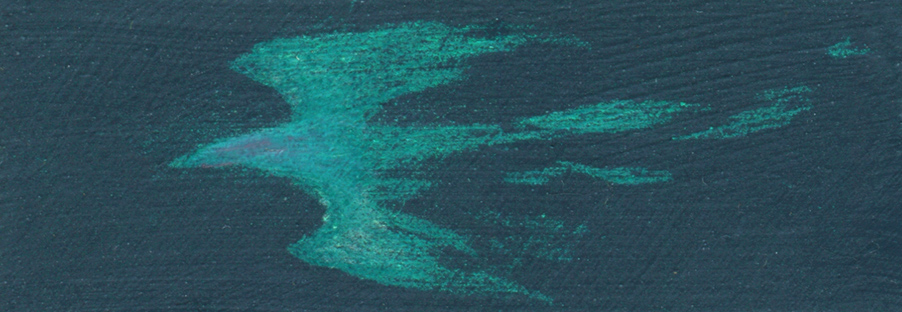
In the above swatch, I attempted to layer a lighter teal, and then pink, on top of a base layer of green colour pencil – you can barely see the lighter layers of shading.
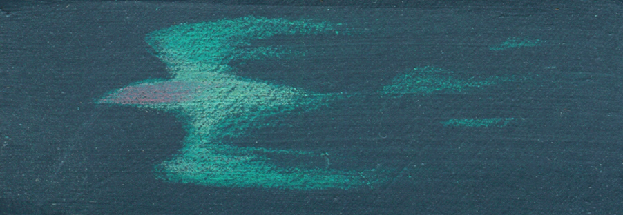
But in this swatch, I applied a layer of ultra matte medium between each colour pencil layer, and all three colour layers show up cleanly. The medium basically ‘resets’ the surface texture, allowing it to take more layers of pencil.
Ultra matte medium can appear quite cloudy and chalky (like in these swatches), but applying a layer of gloss medium or similar will correct this and bring back the richness in the darks. It’s worth noting though that building up too many layers of anything with matting agents can result in cloudiness, so some restraint is necessary!
Top half of swatch: no gloss medium. Lower half of swatch: gloss medium will counter the chalkiness of ultra matte medium.
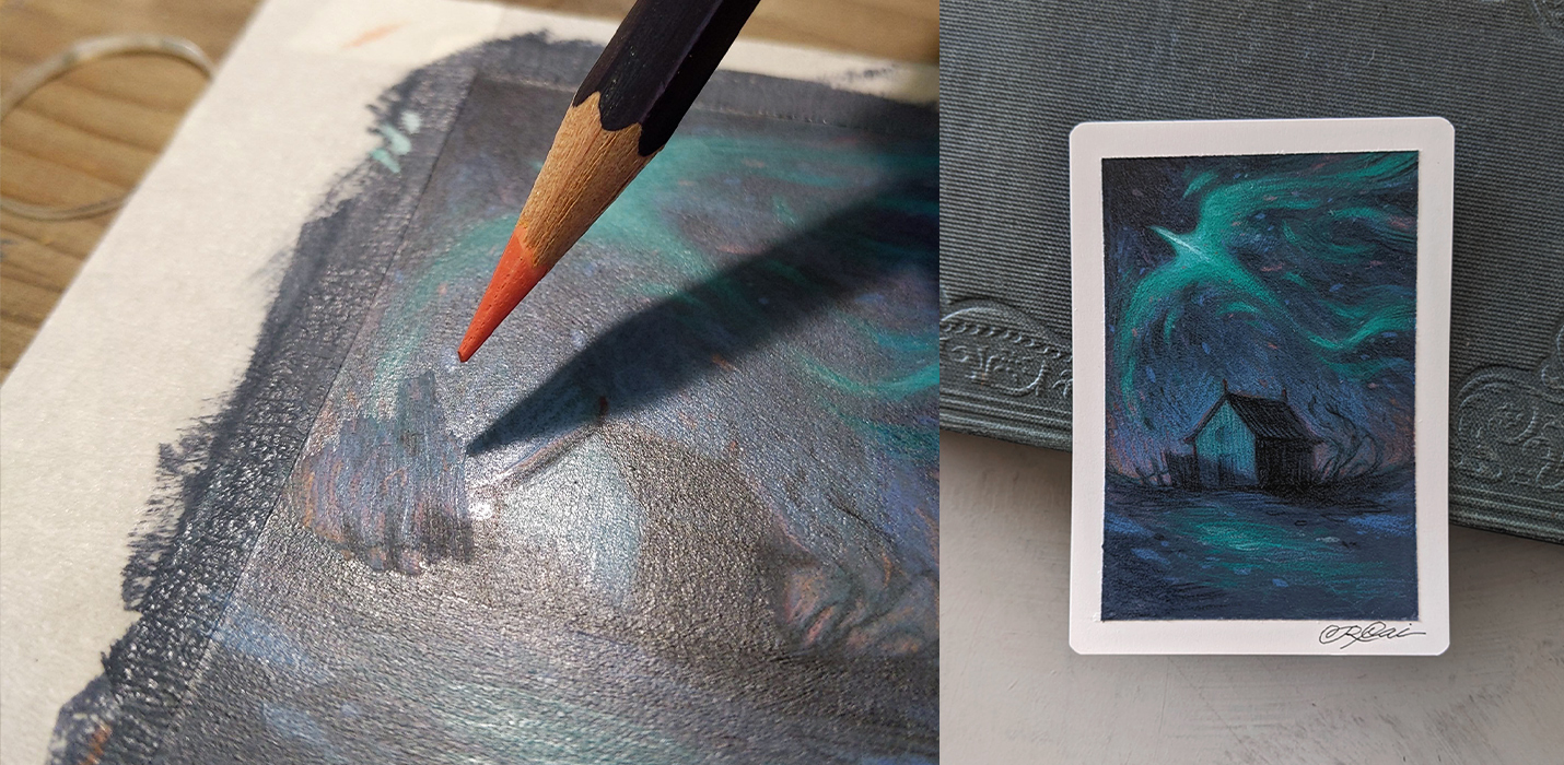
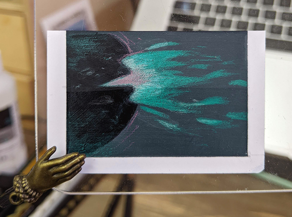
I’ve been using this technique on MTG artist proofs, and since I’m currently working on a batch, here is a step-by-step process for one of these drawings, to show how everything works in practice:
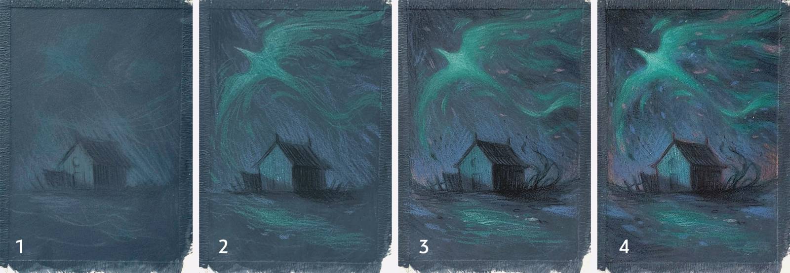
1: I started off with an acrylic base colour, and sketched directly on top (hence the dull pencil lines).
2: I then applied a layer of the UM/CG mix, and blocked in the drawing properly. Once parts of the drawing became too waxy (no longer taking any more colour), I sealed it with fixative, and then applied a layer of pure ultra matte medium over everything.
3: From here I added in smaller details, and continued building up the shading in the bird. Again, when I felt the need to reset my surface, I hit everything with another layer of ultra matte medium.
4: More detailing! After this drawing pass, there was a risk that another full layer of ultra matte medium would make the dark areas cloudy, so instead of applying it to the entire drawing, I only used it in specific parts as needed, like over the bird.
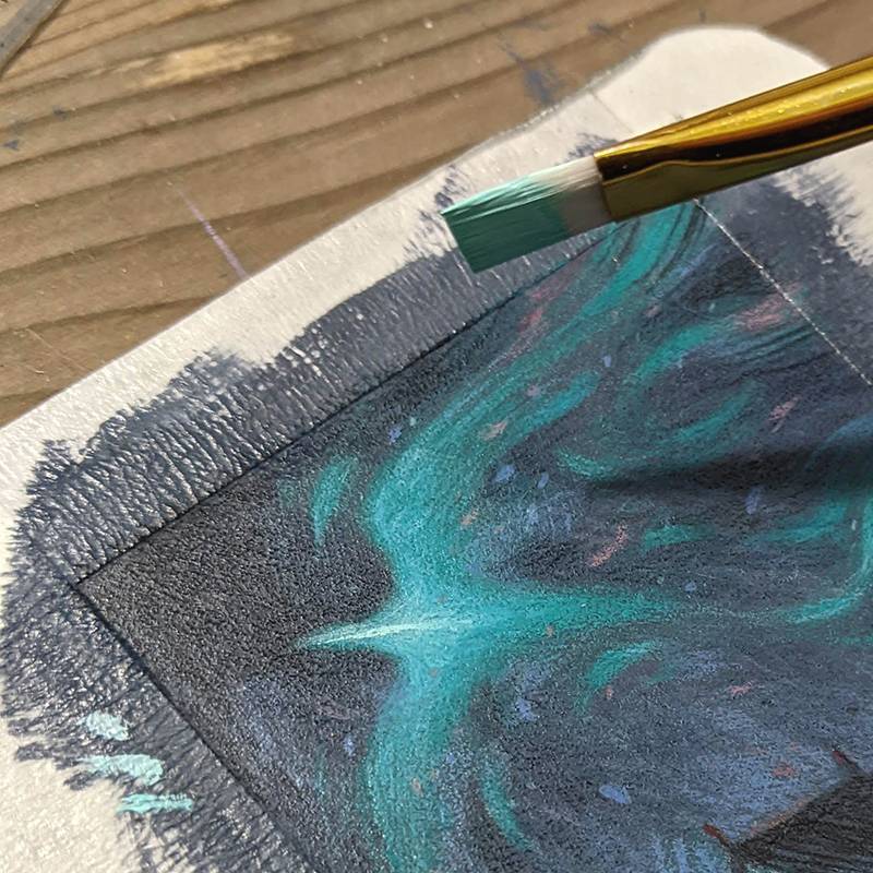
To finish the drawing, I sealed it with fixative, followed by a layer of Golden isolation coat. This serves the same purpose as gloss medium, but I prefer the sheen of the isolation coat, and have found it to be less reactive with the fixatives I use.
I also wanted a really crisp and bright highlight on the bird, which is difficult to achieve with the softness of pencil, so I added that in with acrylics. Once sealed, the surface of the drawing is basically that of an acrylic painting, so in theory you could also start glazing and painting into this further – something I’d like to try in the future!
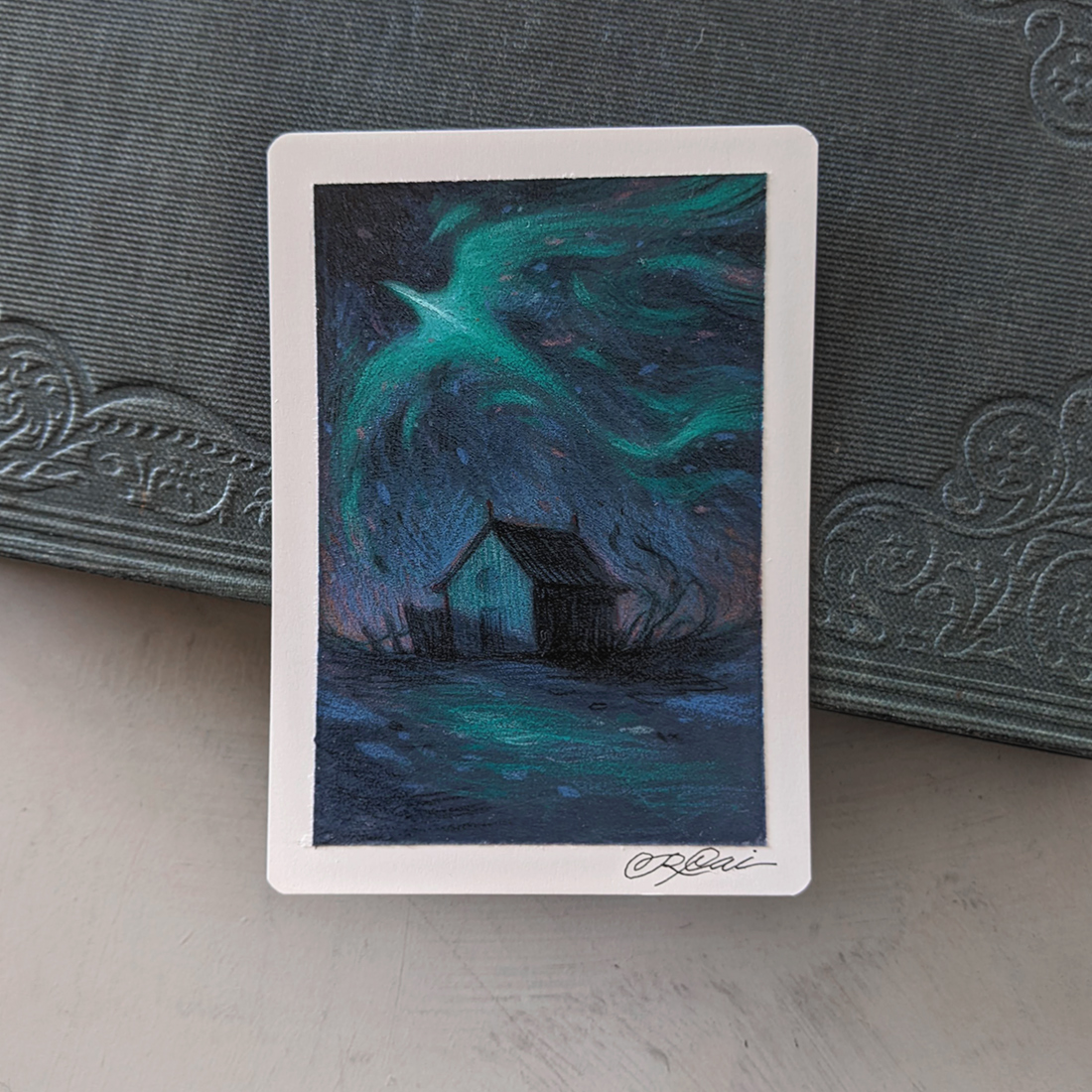
But then, I belatedly decided that I wanted more pink around the house. Can I go back into a sealed drawing? YES! Some ultra matte medium in strategic places brought the surface right back to being able to take pencil, allowing me another drawing pass.

With the new additions complete, I applied another round of spray fixative and isolation coat, bringing the entire painting back to a uniform sheen. And here it is, the completed AP:
I get the feeling that from a distance this process might seem convoluted, and I could just make regular drawings on paper, or paint actual paintings… but that wouldn’t be very interesting! With this technique I get the line-based drawing which is so integral to my style, along with the durability and surface quality of a painting, and I love it!

This is awesome! I agree, mixing the clear gesso with matte medium or ultra matte helps balance it out a lot.
I know Dan uses a mixture of equal parts matte medium, modeling paste, and water, I always wondered how that compares to the ultra matte/clear gesso mix since that feels really good to me.
Something I had to remember for myself (because I’ve been trying to limit the amount of spray fixative I use) is that before I apply any new layer of medium, I need to brush down the surface with a soft brush to remove any loose colored pencil. Not doing that caused some of the color to get mixed around in a slurry onto the surface and make everything soft. Cool accident if you want to lose your drawing a little bit and build it back up – but not great if you’re trying to do a top level finish.
YES! I have been using this technique over sealed oil washes on illustration board for a while now (taught to me by C.F. Payne). It works great for me! It is also a great way to add to my sketchbook drawings. C.F. Payne is a master at this.
So cool you figure out a traditional way of coloring your drawings. What is your ratio of Clear Gesso / ultra matte medium and airbrush medium? I wonder if just the clear gesso and airbrush medium would be a good mix. I find the ultra matte medium a touch too cloudy for my tastes even though I like the tooth better. But I also mostly paint on top of my drawings with gouache and the gesso is a much better surface for that. Will have to try your mix thanks for the tip.
Great post! Yes, CF Payne has been demonstrating this technique for a few years and it’s great that people are picking up on how useful it is and how it can be applied across various genres. You’ve taken it even further by experimenting with the airbrush and different substrates.
Are there brands of colored pencils that work better than others?
Beautiful work!