I really enjoy the process of lettering my comic pages. I usually get the lettering ready at the rough sketch phase before doing pencils so that I know exactly how much space to leave for them, but I like to give them a final pass to make them look as good as possible with the art.
Ready for lettering!
I’ve got a pet peeve about digital word balloons, particularly on art created with traditional media. The overly regular shape when done with the shape tool stands out as a mismatch.

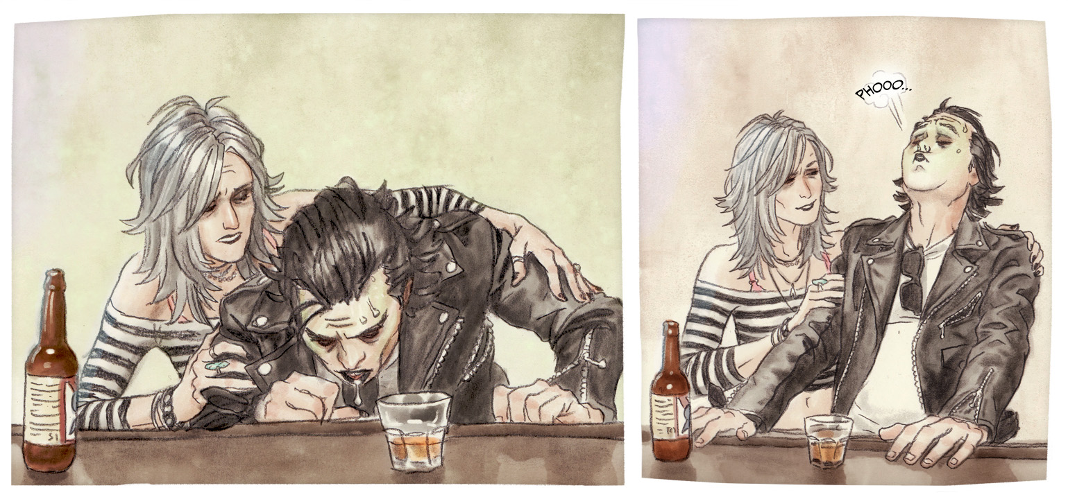
Balloons using Shape tool and Lasso tool… It’s readable, but it doesn’t go well with the art.
But hand-drawing and hand-lettering is so much work! Plus, it’s less readable and you can’t easily edit it – a dialogue change means redoing the whole word balloon.
What I do is in between the two. I use a big round brush to draw an oval on its own layer for the balloon, then use the Type tool to make a rectangle that fits inside the oval and type my dialogue. Sometimes I need to adjust the size of the box to make enough room for the type, and/or use Free Transform on the word balloon oval to fit the text better.
I add a tail on a layer below the oval, also hand-drawn. I like to use a brush with a little bit of texture.

Hand-drawn balloons and tails allow for more expressive shapes!
Since I’m using white balloons, they might not be visible on very light-colored panels. I also like to play with some balloons floating on top of or below the panel borders, or overlapping each other. This can be achieved by putting the balloons into one folder and adding a Layer Style to the folder to add a Stroke edge for a tidy outline around both the oval and tail. Putting the Layer Style on the folder makes it so that you can add, delete, move, or transform balloons and still keep the same line width. Additionally, you can place folders of word balloons above or below the panel border layer if you have one, allowing for more creative word balloon placement.
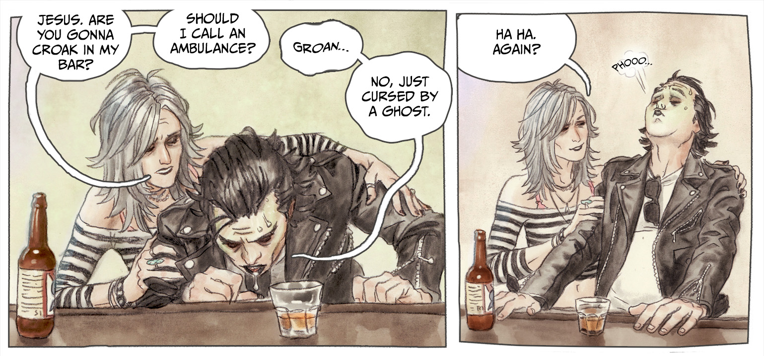
Hand-drawn balloons with Stroke layer style applied.
The Stroke layer style works well for art that has a clear outline, such as inked art. For the softer texture of pencil in my work, I use an Outer Glow layer style to make a shadow all the way around the balloon and tail. With the color set to black and the opacity low, it can be a subtle effect making the balloons pop out even on art that is close in color to the word balloon color. Adding Noise helps it blend in with textured art even better.
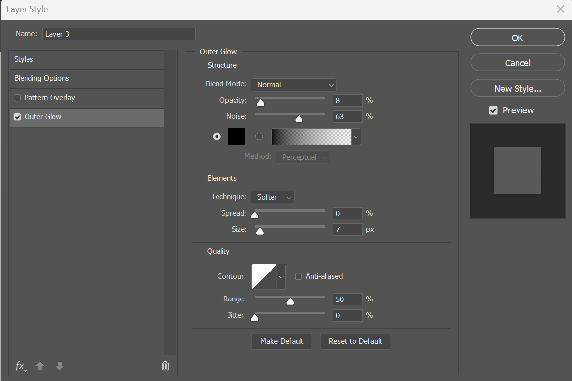
My favorite Layer Style settings for word balloons for my comic.
Here’s how the Outer Glow layer style looks over the traditional art.

The final word balloon look!

Thank you so much for this article! I face the same problem in my comic (traditional media, ink, a lot of white in the background and a very scratchy drawing style that doesnt match well to digital lines and lettering). Your approach gives me a lot of inspiration for playing around with the balloon itself.
I’m glad to hear it! I hope you find an approach you like 🙂
Love that outer glow trick…Thanks for the tip!
Happy to share! It’s so simple and looks really nice 🙂